Mobile Mega Menu
No longer actively maintained. If you have some fixes, feel free to make PR.
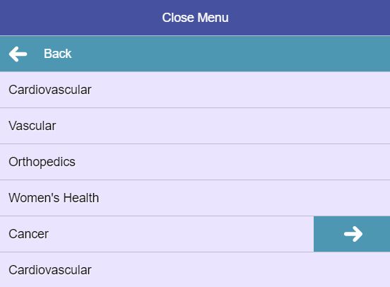
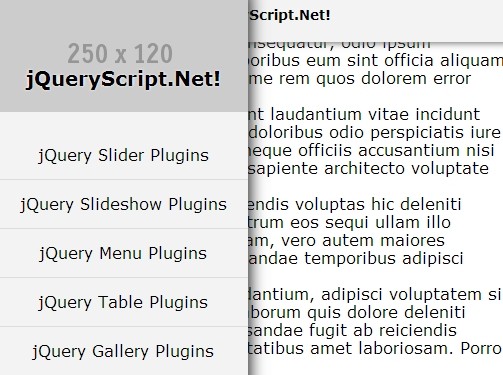
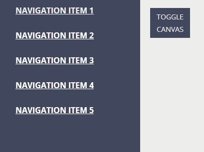
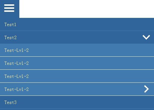
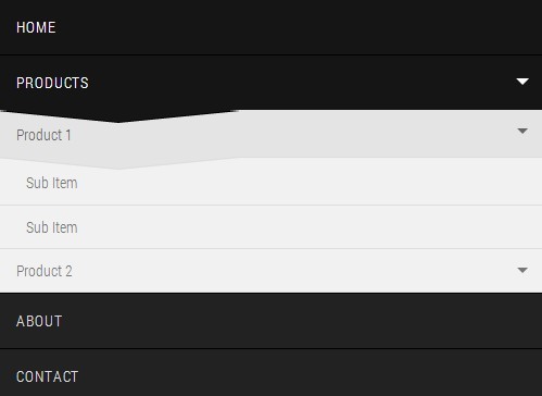
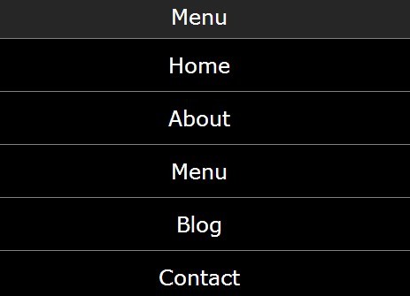
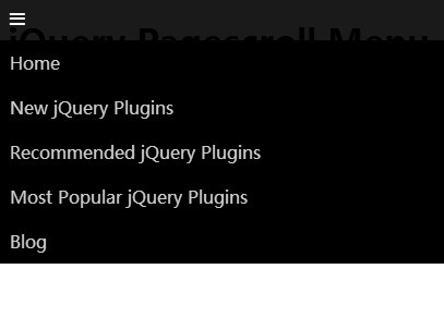
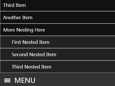
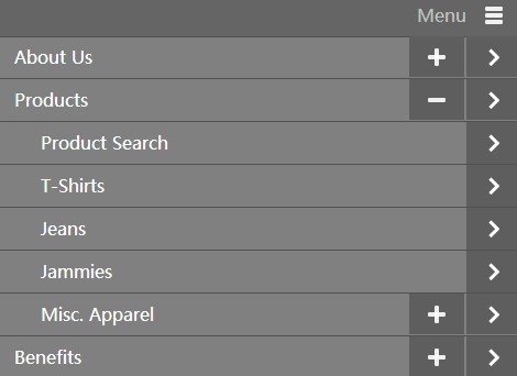
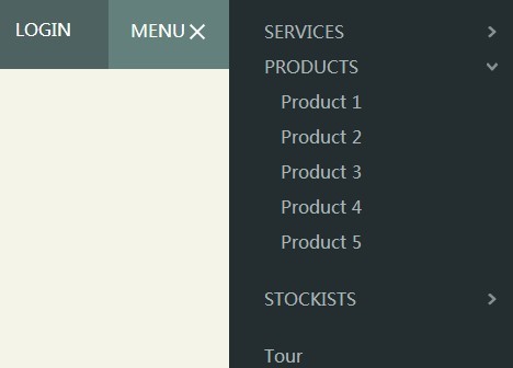
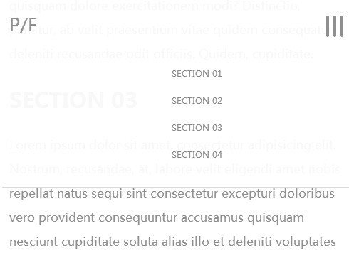
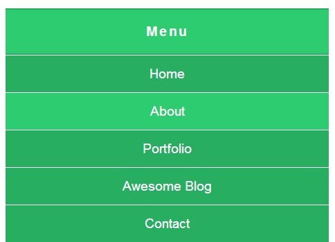
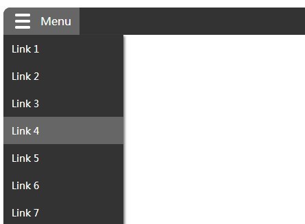
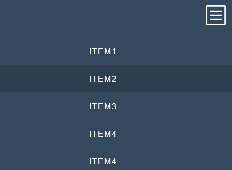
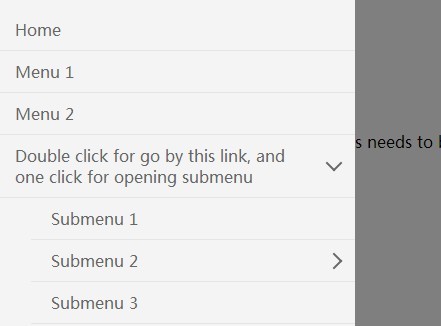
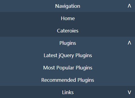
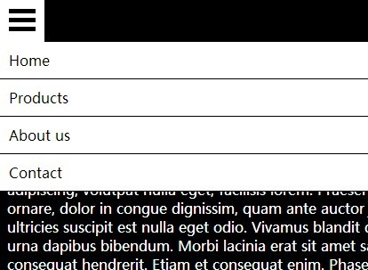
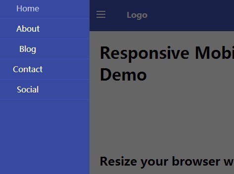
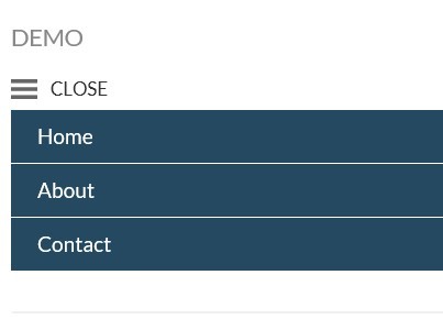
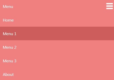
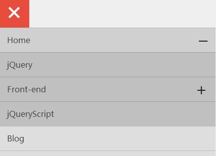
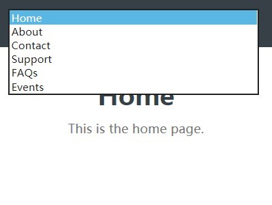
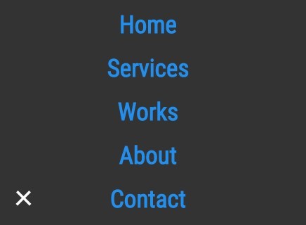
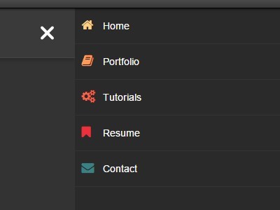
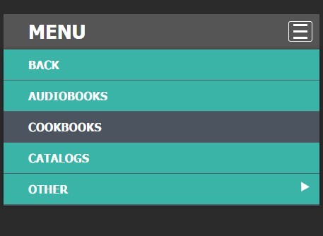
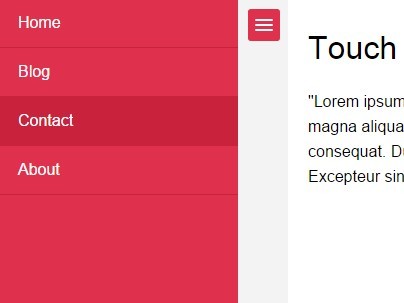
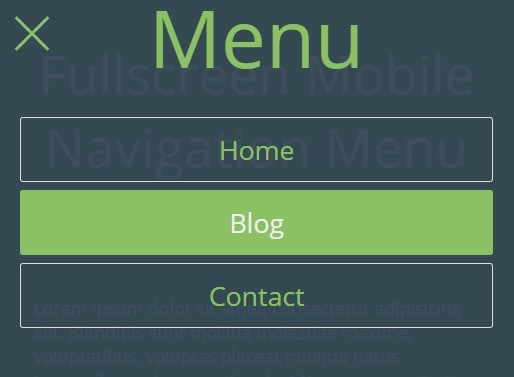
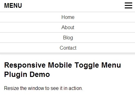
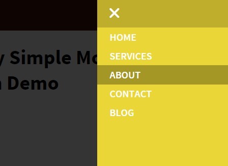
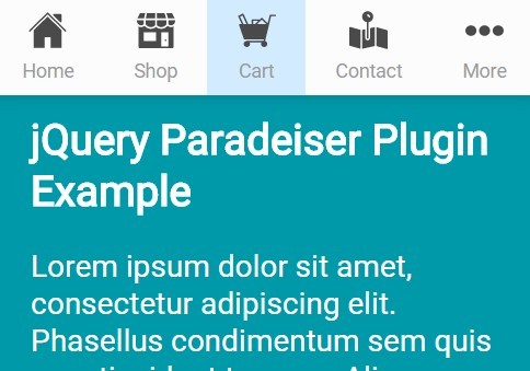
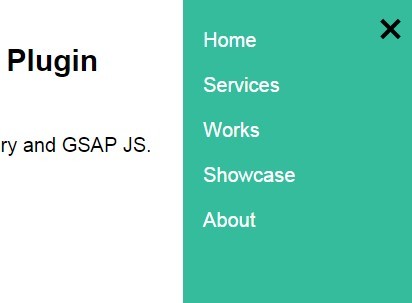
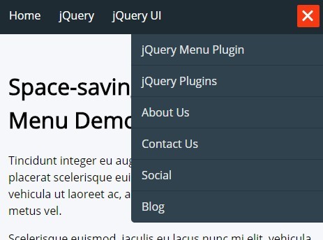
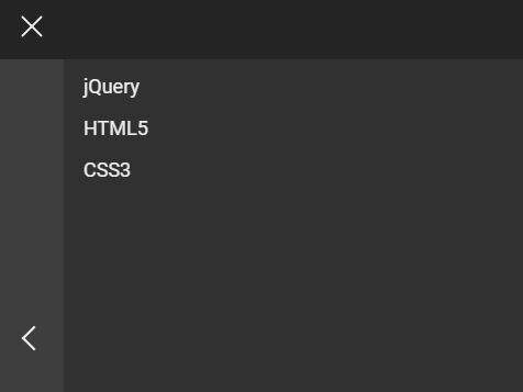
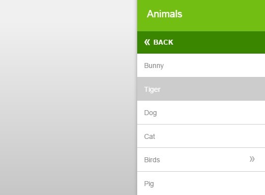
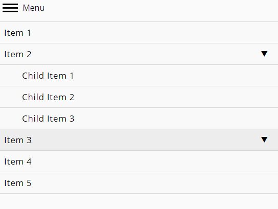
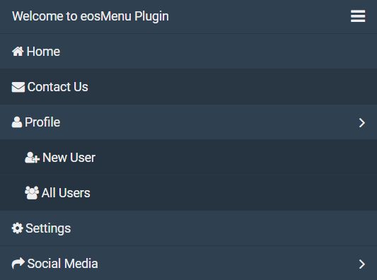
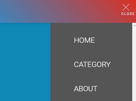
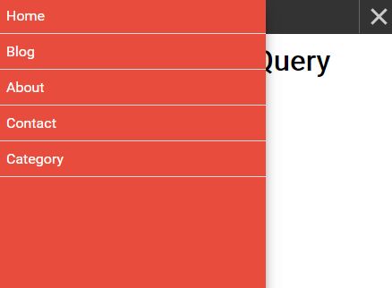
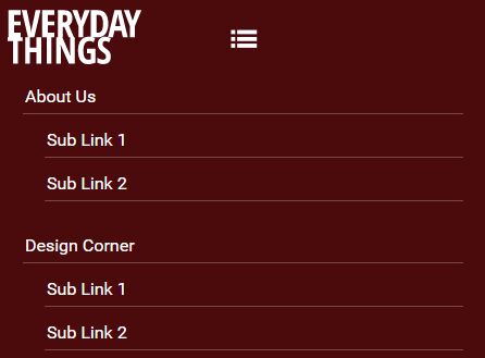
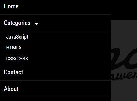
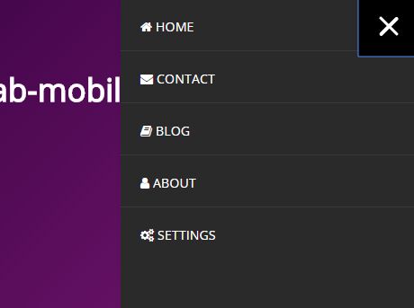
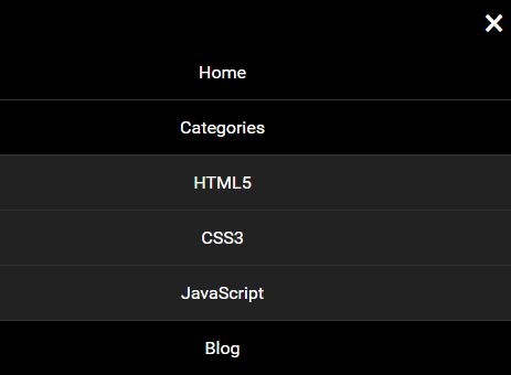
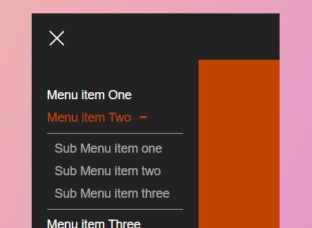
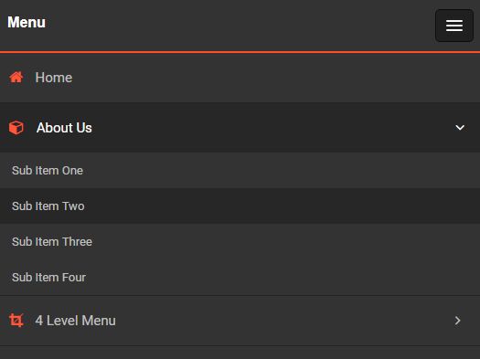
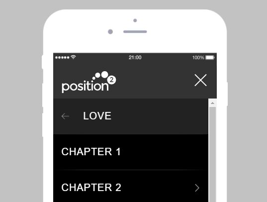
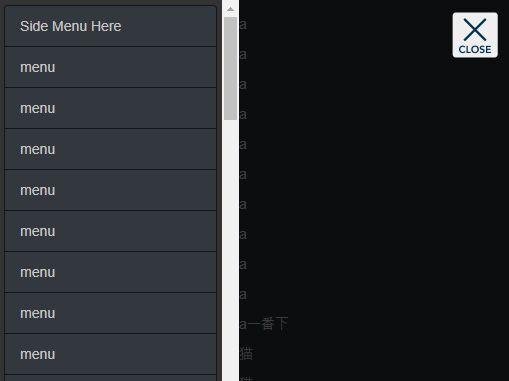
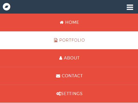
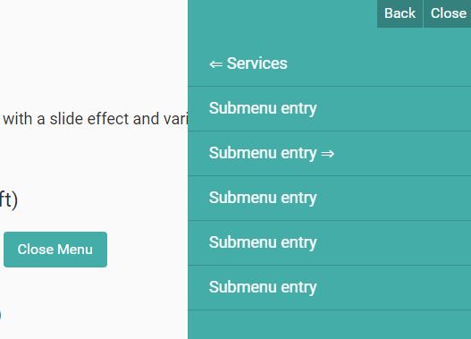
The mobile mega menu is designed to allow for deep menu structures to be navigated easily on mobile devices. It has a left-right animation that makes it easy to understand where you are in the menu hierarchy.
Installation
Install with NPM: npm install mobile-mega-menu --save
Usage
Add Mobile Mega Menu CSS
<link rel="stylesheet" href="css/jquery.mobile-mega-menu.min.css">Additionally if you are using Sass, in the assets/styles directory of this plugin you will find the Sass files that you can include in your project rather than loading a separate CSS file.
Add Scripts to bottom of page
<script src="scripts/modernizr.js"></script> <script src="scripts/jquery.min.js"></script> <script src="scripts/jquery.mobile-mega-menu.min.js"></script>It is best practice to concatenate and minify javascript files. Consider using a tool like Gulp or Grunt as task managers to accomplish this.
Initiate Plugin
$( '.mobile-mega-menu' ).mobileMegaMenu({ changeToggleText: false, enableWidgetRegion: false, prependCloseButton: false, stayOnActive: true, toogleTextOnClose: 'Close Menu', menuToggle: 'toggle-menu' });Options
changeToggleText - default - true
- Use this with toogleTextOnClose to change the text of the button that will open your menu.
toogleTextOnClose - default - Close Menu
- If changeToggleText is true then you can change the toggle text with this option. The initial text that is used on your menu toggle will be the default for when the menu is closed.
enableWidgetRegion - default - false
- Specify a div element with class of widget-region then place other items within that region to then have it appear below the first unordered list item. This can be search fields, social media links, or any valid HTML.
prependCloseButton - default - false
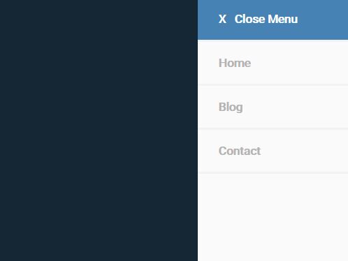
- If the menu will be covering the entire screen you can add a close button at the top of the menu stack.
stayOnActive - default - true
- When set to true, the menu level where you select a page will be present the first time you open the menu after the page loads again.
targetClass - default - mobile-mega-menu
- Target the menu to be used with the plugin.
menuToggle - default - toggle-menu
- Create a class for the button that will toggle the specific menu.
Contact
- Twitter: https://twitter.com/BlakeCerecero
- Portfolio: http://digitalblake.com/
This content is released under the MIT License.
