responsive-menu.js
A simple jQuery plugin for responsive navigation
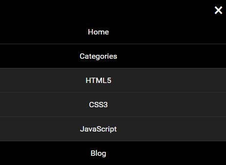
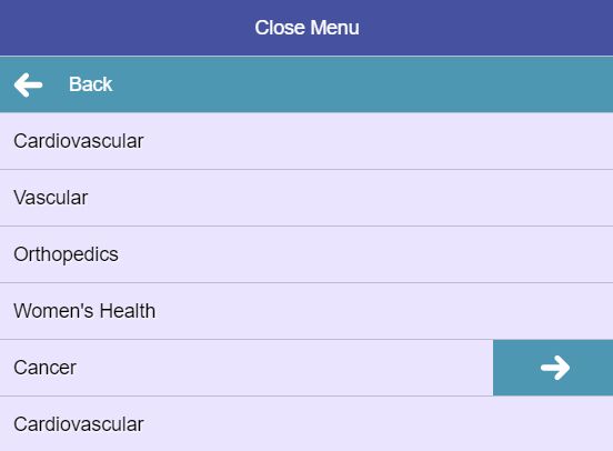
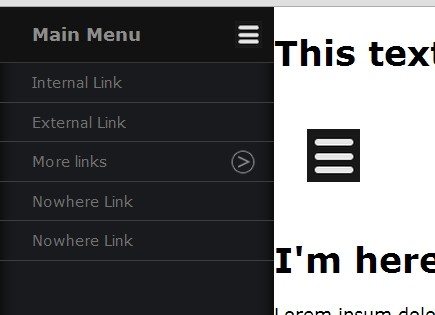
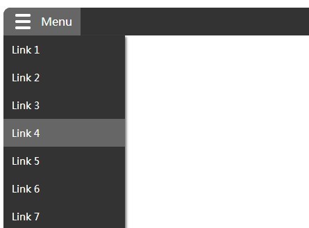
Markup
- The HTML for the menu must contain a parent HTML element (in this case #menu-container).
- The menu itself must be assigned a class attribute value of "menu"
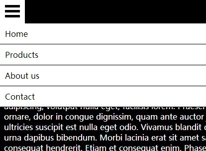
- The "trigger" the element that will open the menu when in mobile view, must be assigned a class of "trigger"
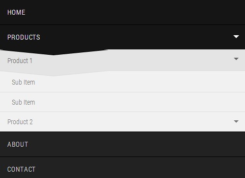
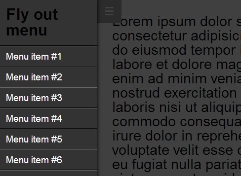
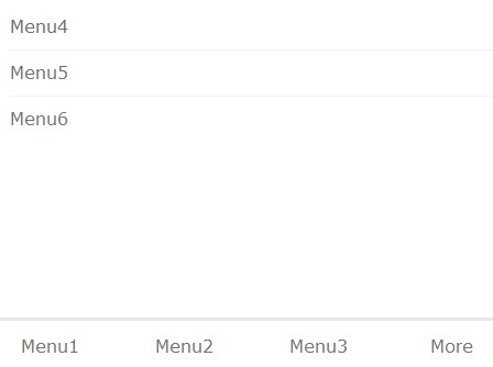
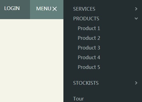
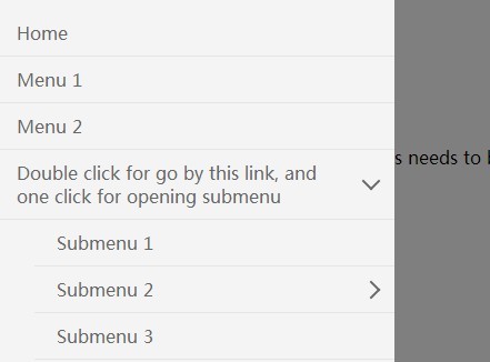
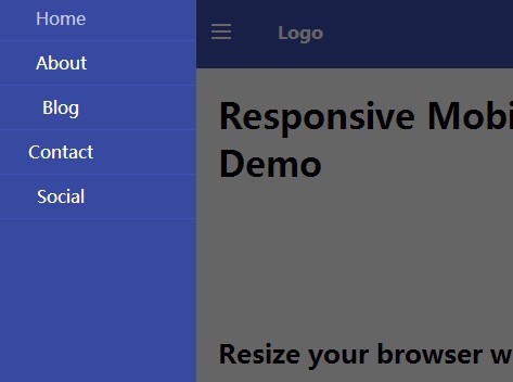
<div id="menu-container"> <ul class="menu"> <li><a href="#">First Item</a></li> <li><a href="#">Second Item</a></li> <li> <a href="#">Third Item</a> <ul> <li><a href="#">First Nested Item</a></li> <li><a href="#">Second Nested Item</a></li> <li><a href="#">Third Nested Item</a></li> </ul> </li> </ul> <a href="#" class="trigger">Menu</a> </div>JS Initialization
- Include jQuery
- Include responsive-menu library
- Select element and initialize menu
<script src="jquery.js"></script> <script src="responsive-menu.js"></script> <script> $('#menu-container').responsiveMenu(); </script>Notes
- Currently the navigation changes from "mobile" to standard navigation at 768px screen width
- Plans to add this a configurable option in later release
- There are no currently configurable options. Later releases will introduce options to configure things such as:
- Responsive design breakpoints
- Mobile animation slide speed
- Background image for trigger element
- Event firing system


