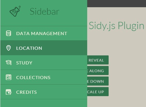
#Sidy.js 
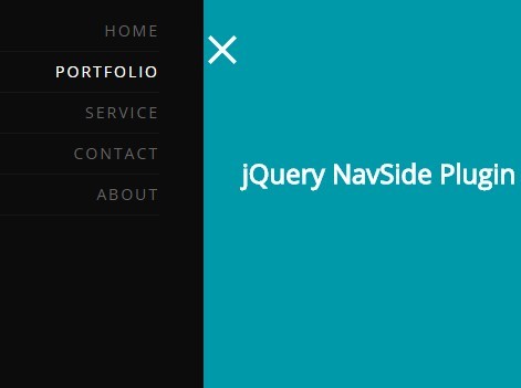
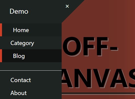
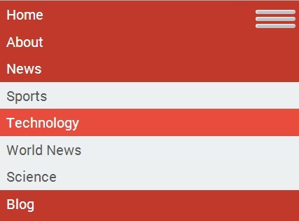
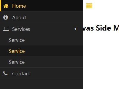
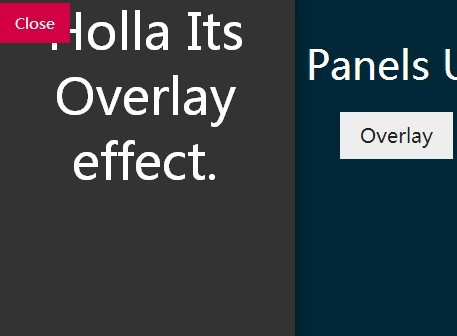
Sidy.js is an off-, on- canvas navigation panels using CSS transforms & transitions. This project was inspired by the SidebarTransitions project seen on SidebarTransitions
- 3.3KB minified and Gzipped -An open-source project by Reactive Design Studio
Features
- Uses CSS3 transforms & transitions
- Smooth performance on mobile devices
- Custom settings for panels: position, size, effect
- an API for custom open and close panel control
- Panel closes when the site overlay is selected
Requirements
Installation
Please use which ever is most comfortable:
- Download ZIP
git clone github.com/reactivestudio/Sidy.js.gitbower install sidy.js
Once you’ve got dist/sidy.js and dist/sidy.css into your project’s JavaScript and CSS directories, let’s instantiate it!
<!DOCTYPE html> <html> <head> <link rel='stylesheet' type='text/css' href='css/sidy.css'/> </head> <body> <div class="sidy"> <div class="sidy__content"> <!-- All your stuff up here... --> </div> </div> <script src='/js/sidy.js'></script> </body> </html>Basic Usage
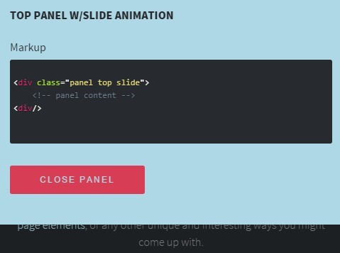
How does it work? Just add <nav id='your-panel-id'></nav> above the div.sidy__content and add .sidy--to-open, .sidy--to-close classes to an opening and closing elements. Also you need to add .sidy__panel class and data-panel='your-panel-id' to openning element. That's all.
<body> <div class="sidy"> <nav class='sidy__panel' id='your-panel-id'> <!-- All your panel stuff up here... --> </nav> <div class="sidy__content"> <!-- All your content/viewport stuff up here... --> <button data-panel="your-panel-id" class="sidy--to-open">Open me</button> </div> </div> <script src='/js/sidy.js'></script> </body>Panel Settings
You can use custom settings for panels
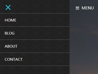
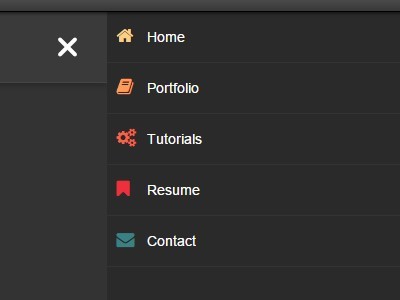
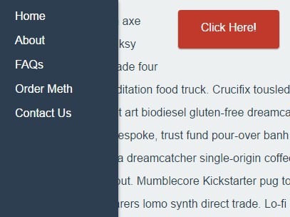
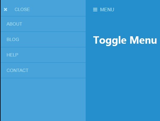
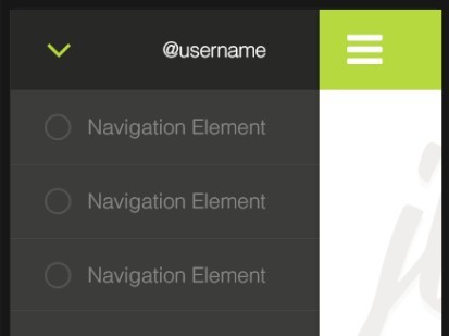
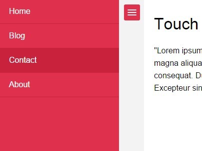
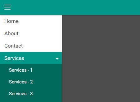
- Position: left, top, right
- Size: px, %, 'auto'
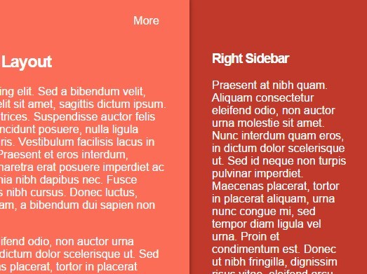
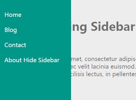
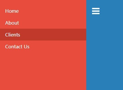
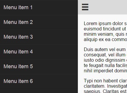
- Effects: slide_overlay, reveal, push, slide_along, slide_reverse, scale_down, scale_up
<nav data-position="left" data-size='300px' data-fx="slide_overlay" class='sidy__panel' id='foo'> Foo </nav> <nav data-position="top" data-size='30%' data-fx="push" class='sidy__panel' id='bar'> Bar </nav> <nav data-position="right" data-size='auto' data-fx="reveal" class='sidy__panel' id='baz'> Baz </nav>


