Bamboo.js
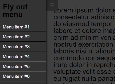
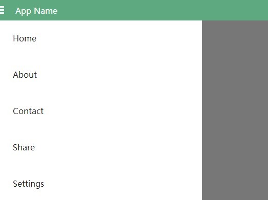
This is a basic structural framework for responsive Web Apps that require a sliding menu and a fixed header with scrollable content area.
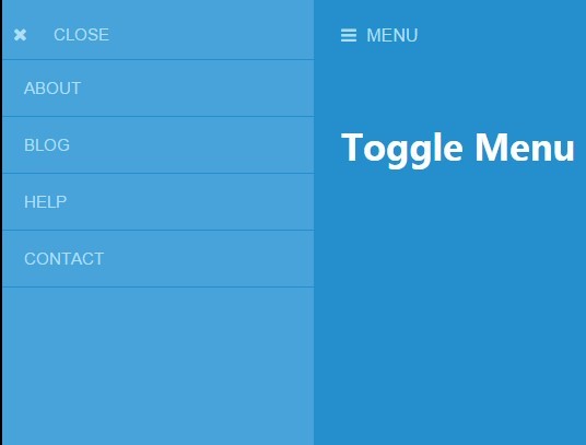
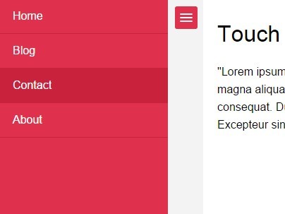
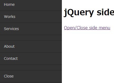
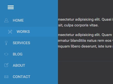
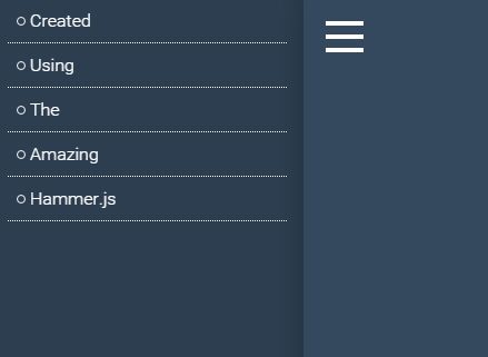
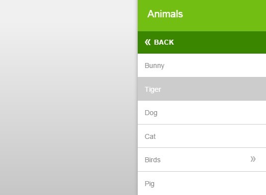
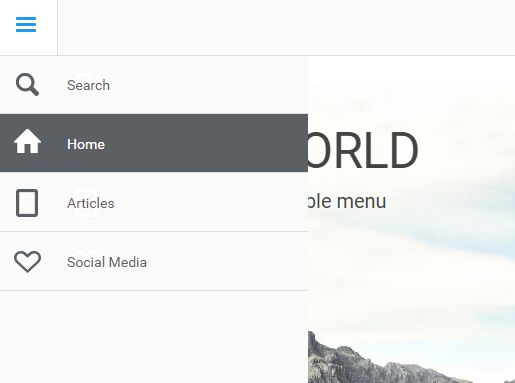
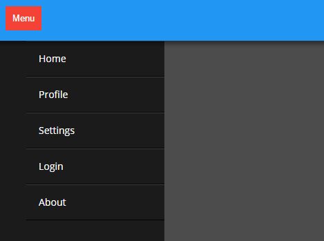
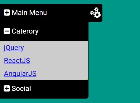
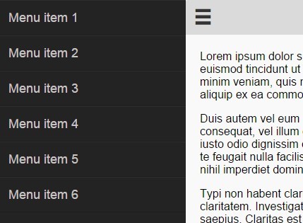
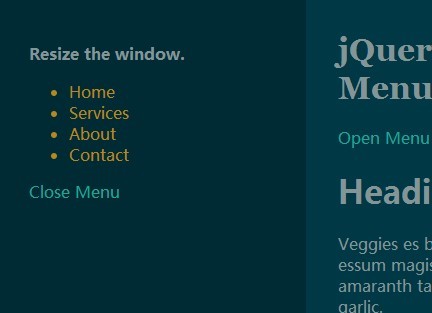
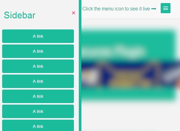
The burger menu button toggles the menu open and close. You can also swipe left or right to interact with the menu. When the browser is greater than a specified breakpoint (desktop) the menu is permanently visible on the left.
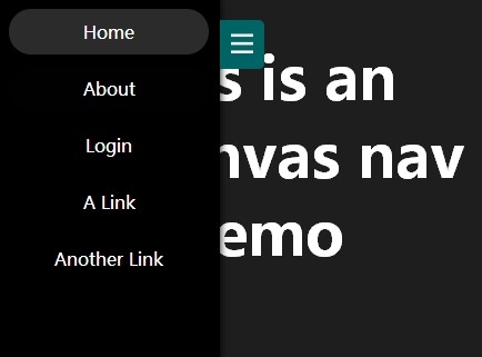
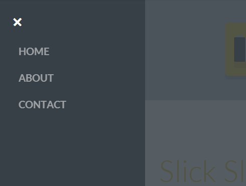
This is an example
How to use
Include the Bamboo.js Script, CSS file and use the index.html as the base.
<nav id="main-nav" class="navigation overflow"> <ul> <li><a href="#">Menu item</a></li> <li><a href="#">Menu item 2</a></li> </ul>; </nav>; <div id="container">; <header class="primary">; <span class="open icon">☰</span> <hgroup><h1>Title</h1></hgroup> </header> <section id="scroller" class="overflow"> <div id="content"> <!-- Content goes in here --> <!-- Content ends --> </div> </section> </div> <script src="http://code.jquery.com/jquery-2.0.0.min.js"></script> <script src="js/bamboo.0.1.js"></script> <script> var site = new Bamboo(); </script> You can define the following properties:
menu: true/false breakpoint: default (768), menuWidth: default (265), headerHeight: default (50), snapThreshold: null or 0-1, resize: null // function to allow a callback Example
var site = new Bamboo({ menu: true, swipeToOpen: false, breakpoint: 768, menuWidth: 265, headerHeight: 50, resize: function(){ // function to call on page resize/orientation change } }); 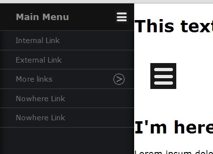

