bootstrap-drawer
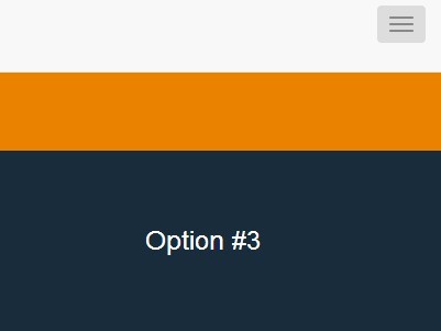
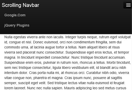
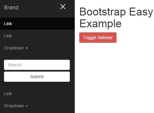
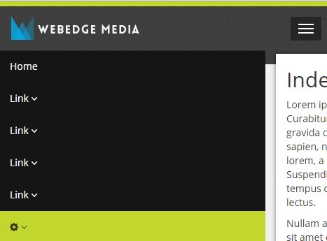
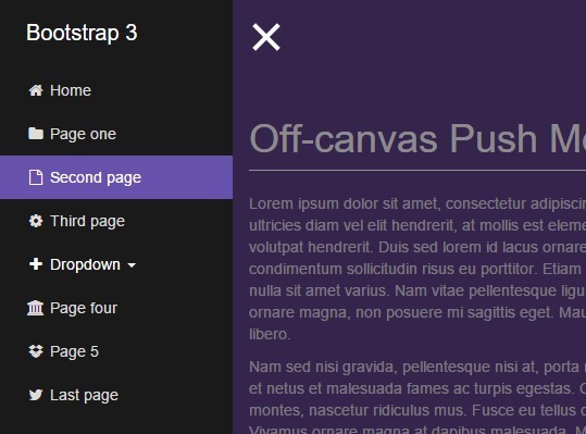
A Bootstrap add-on to create drawer (off-canvas) styled navigation.
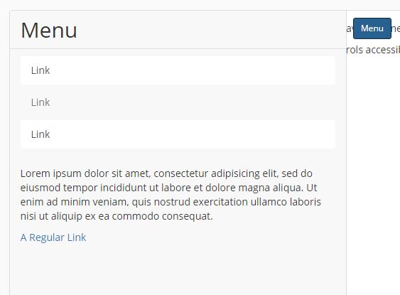
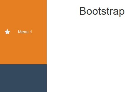
As of Bootstrap 3, there is no "drawer" element - a drawer-like menu that goes off screen. This is an add-on to the core Bootstrap framework that adds various .drawer classes to quickly and easily create the drawer component.
This Readme is actually a quick start. Check out the full documentation for detailed usage and style guide.
Version: 1.0.6
Requirements
- Bootstrap
- jQuery (already a Bootstrap dependency)
- Node & gulp if you want to build your own version.
Download
Get it via Bower or NPM:
bower install bootstrap-drawer / npm install bootstrap-drawer
or you can download the latest release from the release page.
Installing
For more detailed use on the bootstrap-drawer framework, check out the documentation.
When using the full Bootstrap Framework:
<html> <head> <link rel="stylesheet" type="text/css" href="bootstrap.min.css"> <link rel="stylesheet" type="text/css" href="bootstrap-drawer.min.css"> <link rel="stylesheet" type="text/css" href="YOUR_OTHER_STYLES.css"> </head> <body class="has-canvas"> <!-- Off Canvas & other HTML here --> <script src="jquery.min.js"></script> <script src="bootstrap.min.js"></script> <script src="drawer.min.js"></script> <script src="YOUR_CUSTOM_JS.js"></script> </body> </html>Basic Usage
You can check out example/index.html for a more robust example, but the basic usage is very similar to using Bootstrap's col-SIZE-# classes, when it comes to sizing the component. In addition, the inner elements (.drawer-heading, -nav/-navfull, -body, -footer) are similar to how the .panel class family works.
The .fold class starts the drawer closed. Becomes .fold.open when it's opened.
The sizing classes are dictated by the screen size to be responsive. .dw-SIZE-12 will cover the whole screen/canvas of that size. If you want to use the drawer in another container instead of the <body>, check out the full documentation.
<body class="has-drawer"> <!-- add this class to your body for proper sizing --> <div id="drawerExample" class="drawer dw-xs-10 dw-sm-6 dw-md-4 fold" aria-labelledby="drawerExample"> <div class="drawer-controls"> <a href="#drawerExample" data-toggle="drawer" aria-foldedopen="false" aria-controls="drawerExample" class="btn btn-primary btn-sm">Menu</a> </div> <div class="drawer-contents"> <div class="drawer-heading"> <h2 class="drawer-title">Menu</h2> </div> <div class="drawer-body"> <p> This is a properly padded container for content in the drawer that isn't a navigation. </p> <a href="#">A Regular Link</a> </div> <ul class="drawer-nav"> <li role="presentation" class="active"><a href="#">Home</a></li> <li role="presentation"><a href="#">Profile</a></li> <li role="presentation"><a href="#">Messages</a></li> </ul> <div class="drawer-footer"> <small>© Caroline Amaba</small> </div> </div> </div> <div class="container"> <!-- content as per usual --> </div> </body>Using LESS / Building Your Own Drawer
You can find out how to incorporate bootstrap-drawer and builr your own in LESS section of the documentation.
Javascript
The Javascript/jQuery plugin requires the transition.js file from the core Bootstrap framework in order to work. Usage is nearly the same as the collapse component, but checkout out the documentation for more detailed usage for $('.drawer').drawer(). The events emitted are *.bs.drawer.
Latest Changelog
Check out the full changelog for past version changes.
Version 1.0.1
- Optimize LESS to produce smaller css files.
License
Copyright (c) 2015, Caroline Amaba
Permission to use, copy, modify, and/or distribute this software for any purpose with or without fee is hereby granted, provided that the above copyright notice and this permission notice appear in all copies.
THE SOFTWARE IS PROVIDED "AS IS" AND THE AUTHOR DISCLAIMS ALL WARRANTIES WITH REGARD TO THIS SOFTWARE INCLUDING ALL IMPLIED WARRANTIES OF MERCHANTABILITY AND FITNESS. IN NO EVENT SHALL THE AUTHOR BE LIABLE FOR ANY SPECIAL, DIRECT, INDIRECT, OR CONSEQUENTIAL DAMAGES OR ANY DAMAGES WHATSOEVER RESULTING FROM LOSS OF USE, DATA OR PROFITS, WHETHER IN AN ACTION OF CONTRACT, NEGLIGENCE OR OTHER TORTIOUS ACTION, ARISING OUT OF OR IN CONNECTION WITH THE USE OR PERFORMANCE OF THIS SOFTWARE.
