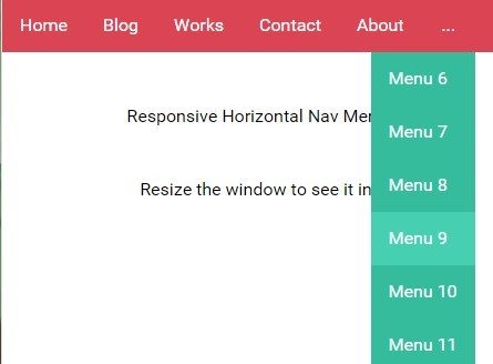
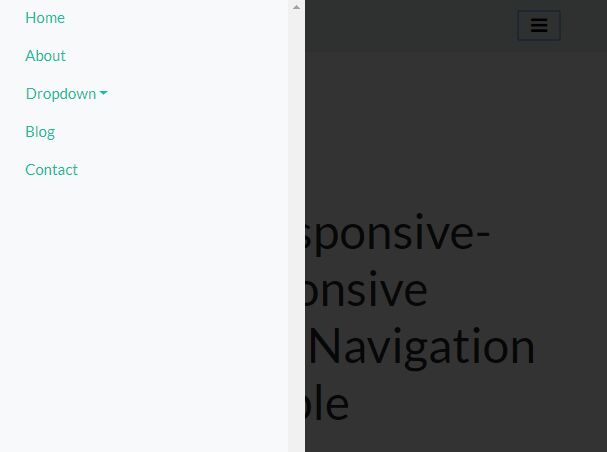
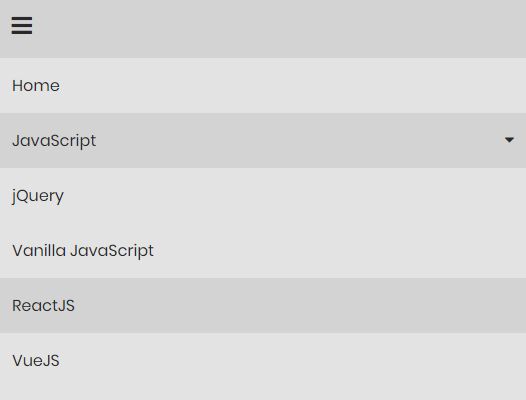
Responsive-jQuery-css3-Navigation-plugin
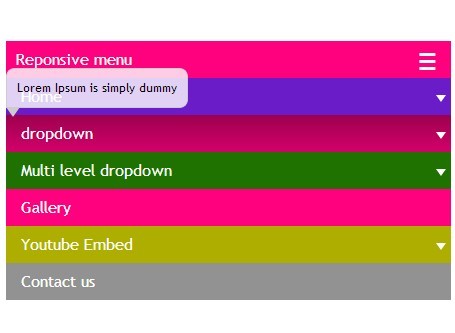
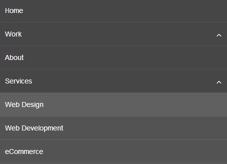
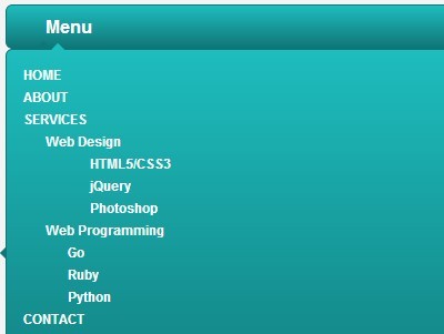
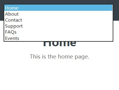
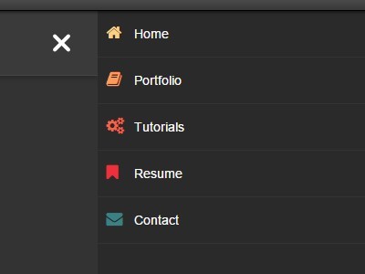
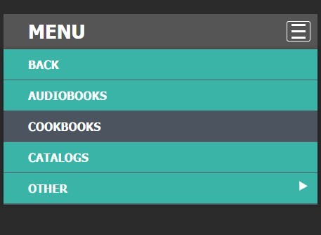
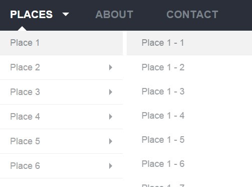
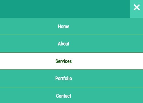
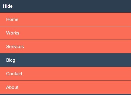
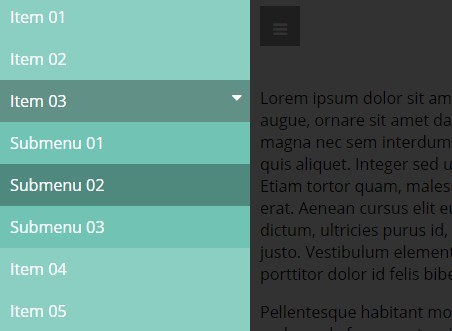
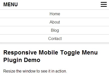
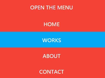
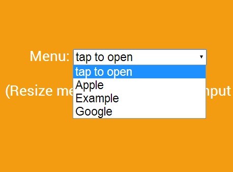
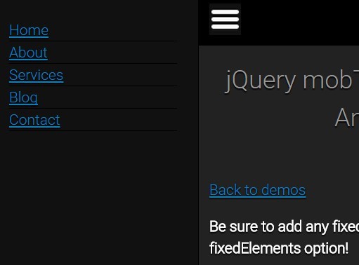
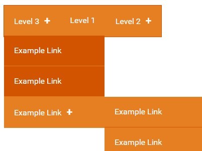
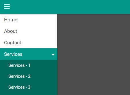
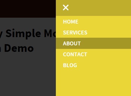
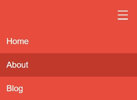
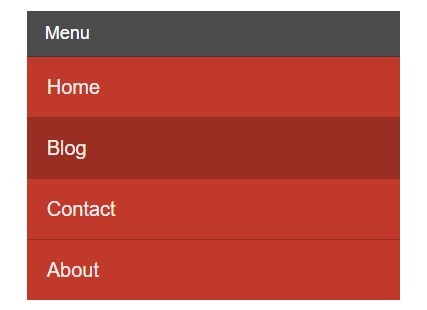
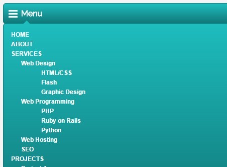
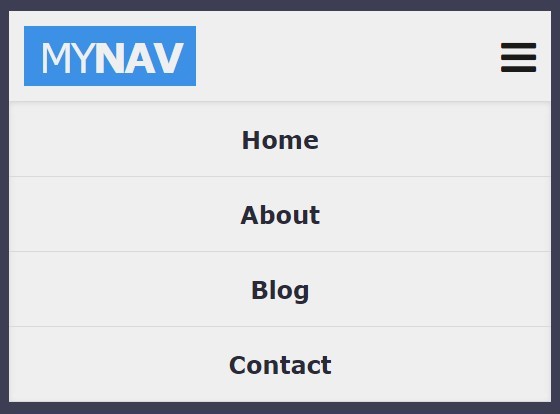
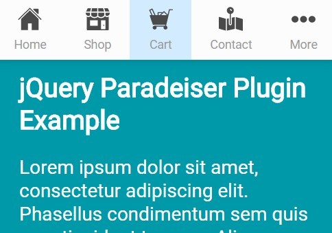
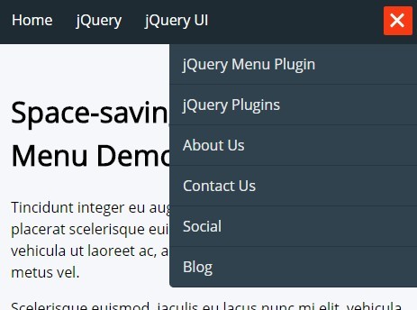
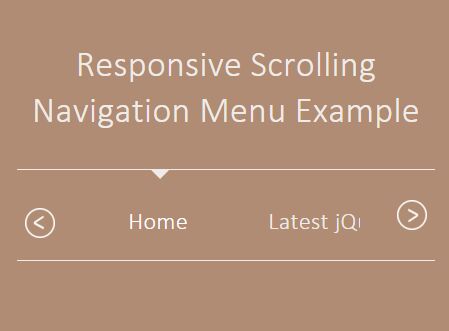
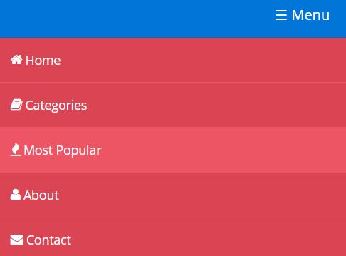
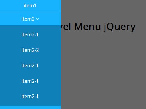
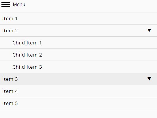
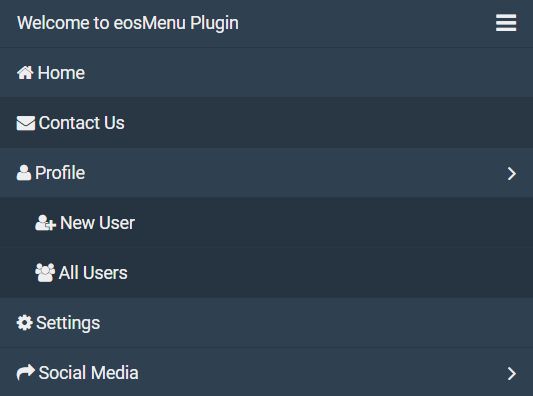
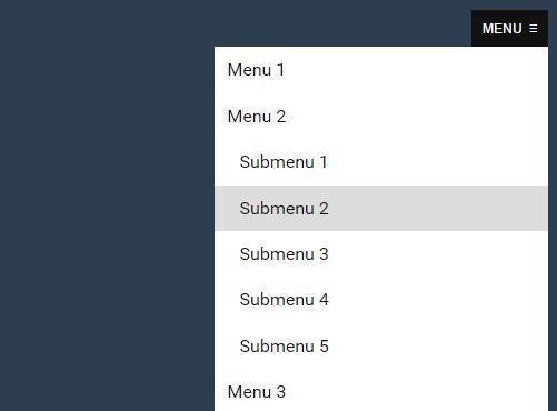
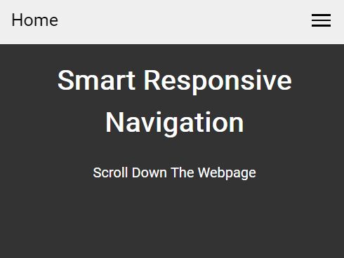
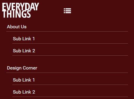
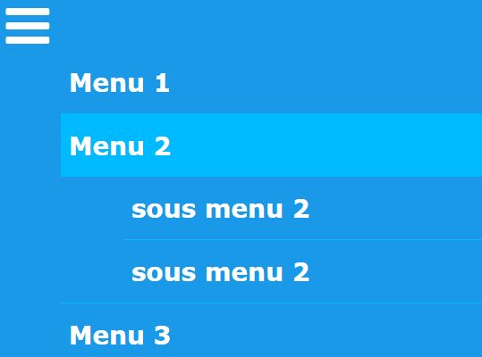
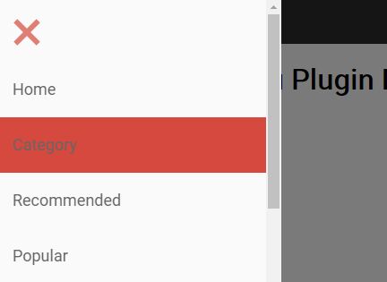
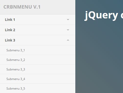
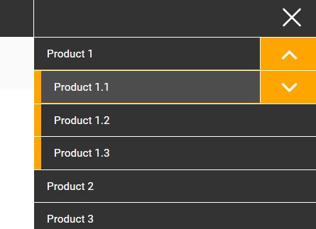
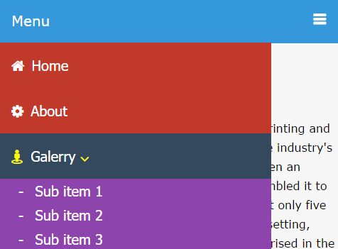
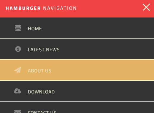
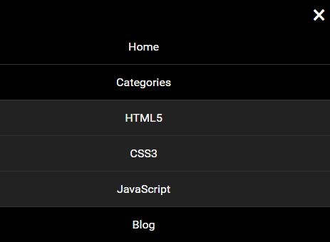
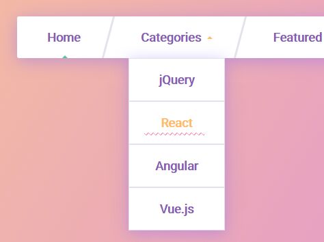
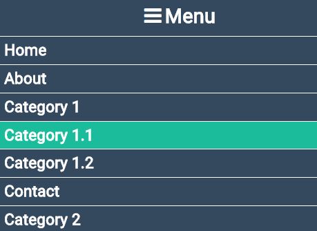
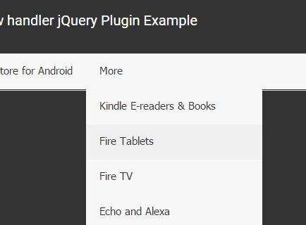
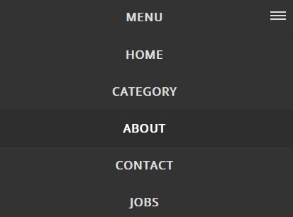
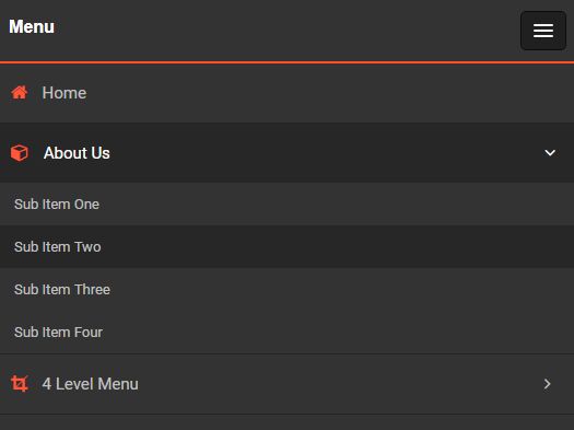
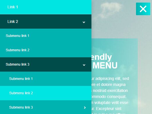
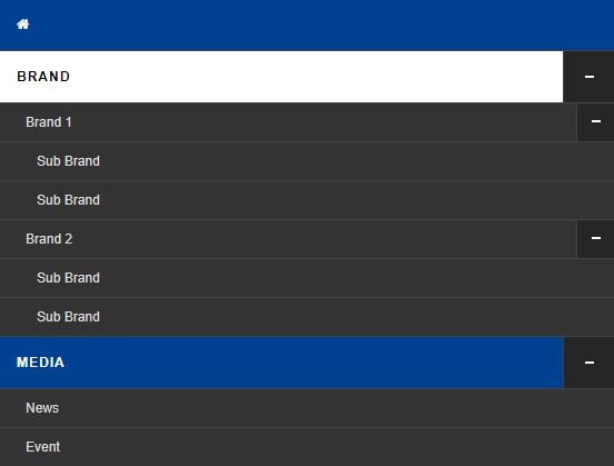
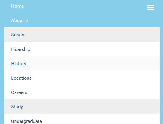
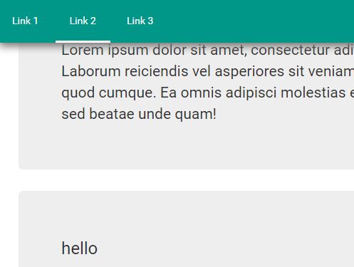
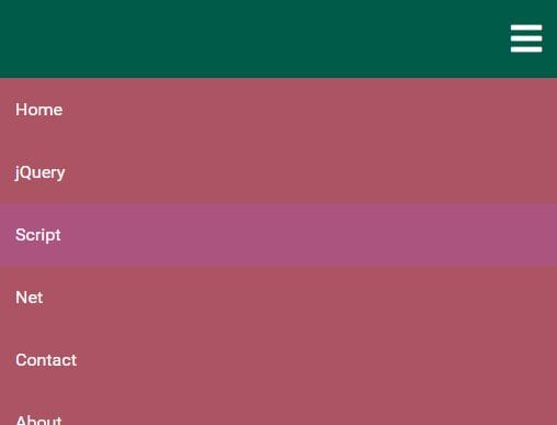
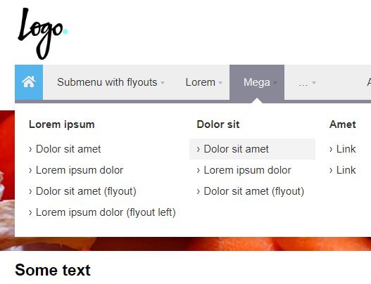
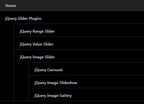
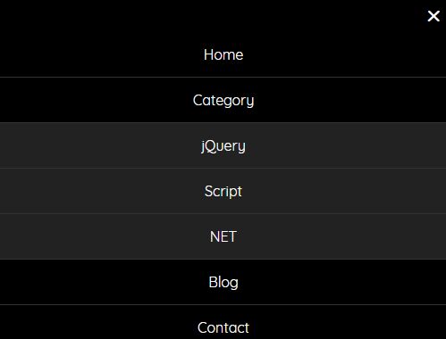
This Responsive jQuery & css3 Navigation plugin dropdown menu has it all. drop down menu structure will keep your users on target. dropdown menu is easy to edit and integrate into any website. dropdown menu has 12 Theme colors, each theme can be used separately without any connection with the others and very easy to update new navigation theme. Menu is responsible and adapts to the screen of the device(computer monitor, tablet, mobile phone) ! also you can use tool trip and multi color on each navigation
1) Firstly, include a copy of jQuery in your document. You can download your own copy of jQuery at http://jquery.com or link to the Google hosted script:
<script src="http://ajax.googleapis.com/ajax/libs/jquery/1.7.1/jquery.min.js"></script>
2) Download and include (Responsive jQuery & css3 Navigation plugin) js plugin and css to the head of your document:
<link href="scriptsellMenu.css" rel="stylesheet" type="text/css" /> <script type="text/javascript" src="js/scriptsellMenu.js"></script>
3) Call the horizontalNav function in your document ready function:
$(document).ready(function() { $('.you_menu_ul').scriptsellMenu(); }); 4) You can override the default settings by passing in parameters like this:
$(document).ready(function() { $('ul').scriptsellMenu({ animationSpeed:150, theme:'light-brown', animation:'slide', arrow:true, tooltrip:'bottom', hoverelements:'', responsivemenutext:'Reponsive menu', dropdownWidth:250, menuheight:37, deviceswidth:768 }); }); There are several settings that let you adjust the behavior of the plugin. Each of these settings is described in this section.
| Key | Default value | Description |
|---|---|---|
| animationSpeed | 150 | The amount of time to wait before re-adjusting the navigation all effects |
theme | default/custom | You can include different theme to you menu. Search as default theme or custom theme Here is all default theme Name : ( deep-blue , light-sky-blue, black ,light-grey , green , amethyst, orange , Apple green , pink , bronze, Light brown ) |
| animation | light-sky-blue | You need to choose a hover animation type from default setting ! here is all default animation list (slide, slide-top , fadeinout , zoom, bounce , rotate , none) |
arrow | True | Enables, diable dropdown arrow ( |
tooltrip | top | Set tooltip display position ( |
hoverelements | <span> | The HTML fragment used for the expander. |
| responsivemenutext | Reponsive menu | You can override Reponsive menu text . |
| dropdownWidth | 250 | Set a Min-dropdown width |
| menuheight | 38 | Set navigation height |
deviceswidth | 768 | Workable responsive width |
HTML Data attribute !
| Key | Default value | Description |
|---|---|---|
| animationSpeed | 150 | The amount of time to wait before re-adjusting the navigation all effects |
theme | default/custom | You can include different theme to you menu. Search as default theme or custom theme Here is all default theme Name : ( deep-blue , light-sky-blue, black ,light-grey , green , amethyst, orange , Apple green , pink , bronze, Light brown ) |
| animation | light-sky-blue | You need to choose a hover animation type from default setting ! here is all default animation list (slide, slide-top , fadeinout , zoom, bounce , rotate , none) |
arrow | True | Enables, diable dropdown arrow ( |
tooltrip | top | Set tooltip display position ( |
hoverelements | <span> | The HTML fragment used for the expander. |
| responsivemenutext | Reponsive menu | You can override Reponsive menu text . |
| dropdownWidth | 250 | Set a Min-dropdown width |
| menuheight | 38 | Set navigation height |
deviceswidth | 768 | Workable responsive width |