elmenu
A lightweight, responsive jQuery menu system
Demo: http://elmenu.elmnt.com
Current Version: 1.1.0
Vanilla JavaScript version coming soon
Features
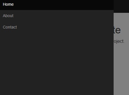
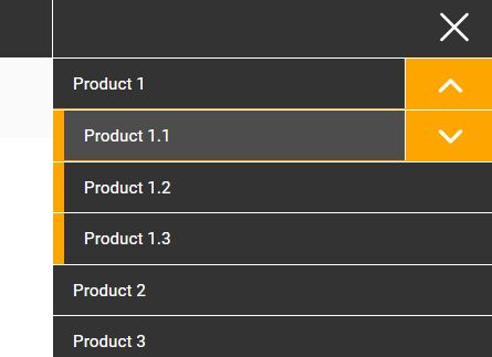
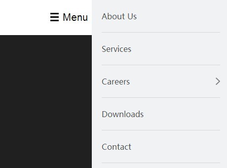
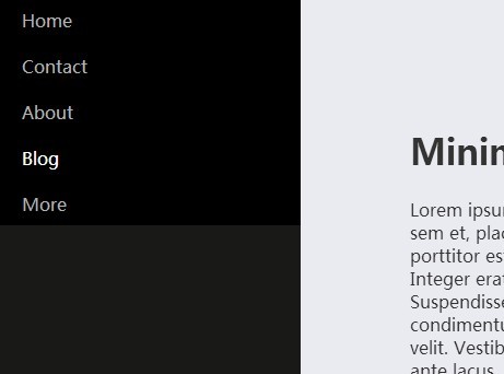
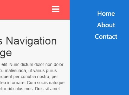
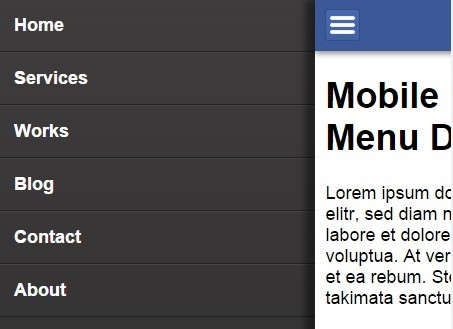
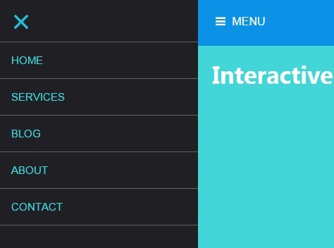
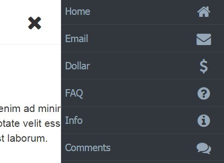
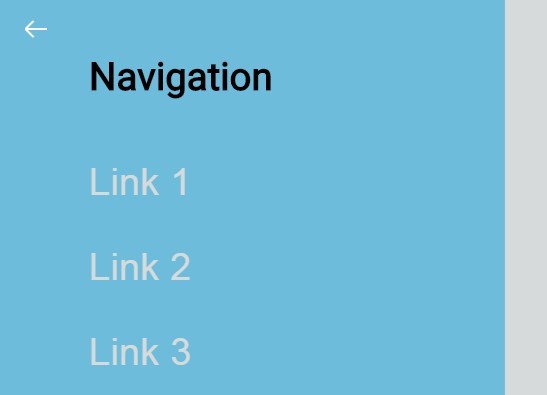
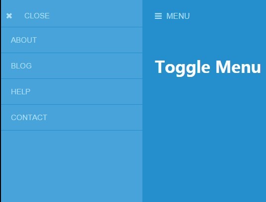
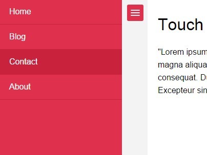
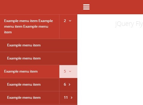
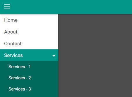
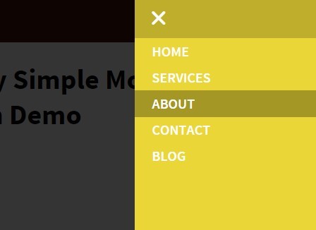
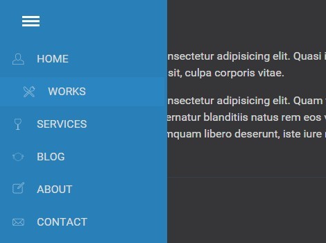
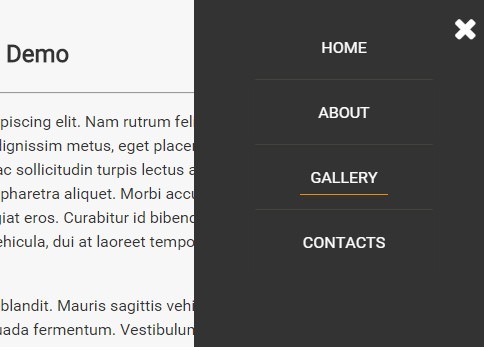
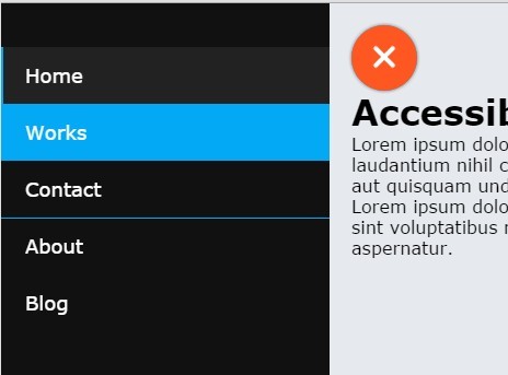
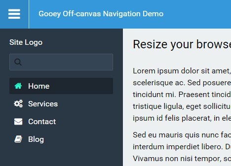
- The slide-in mobile menu auto-populates with the header navigation content.
- The minified elmenu script is just 2kB
- The compiled/minified elmenu Sass partial is 4kB
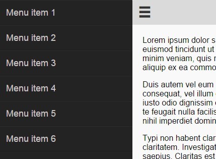
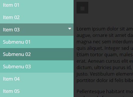
- The mobile nav links that contain a sub-nav (clones of the header nav links with drop-downs) have both a parent anchor link, and a separate toggle trigger for the sub-links.
- The elmenu Sass partial is highly portable. The additional styles in this demo have no effect on the menu system. As long as you use the markup structure & associated BEM classes, you should be able to drop it into your project without too much clean-up.
Changelog
v1.1.0
Fixes a bug where multiple toggle icons where spinning on a single icon click, so individual elements needed to be targeted specifically.


