Reaktion.js
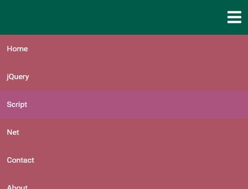
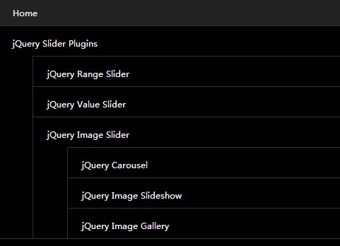
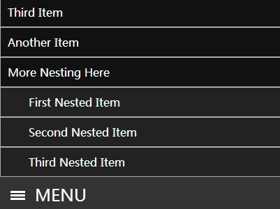
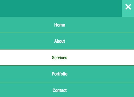
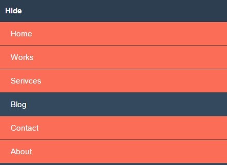
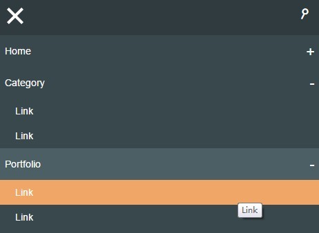
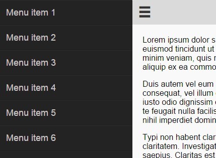
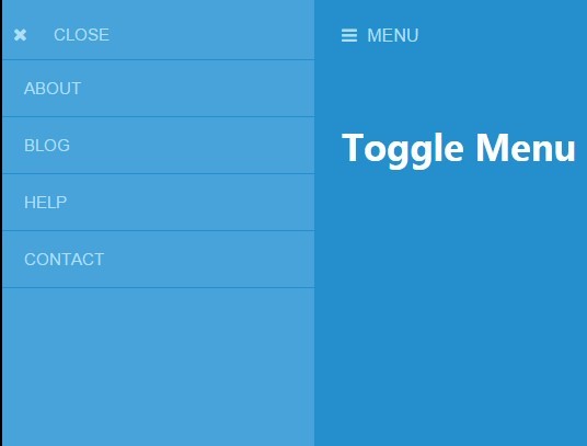
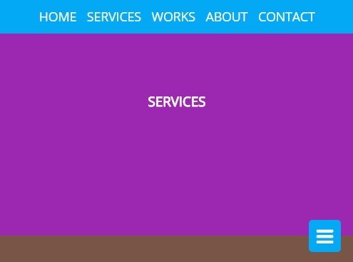
Reaktion.js is a lightweight, flexible jQuery plugin for generating responsive, nested navigation menus. It allows developers to get up and running extremely quickly and is completely customizable. By default it uses Font Awesome instead of images and contains a LESS file with variables for easy customization.
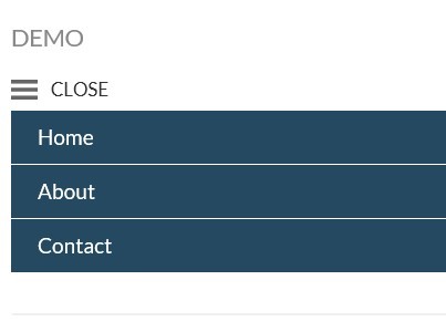
Demo
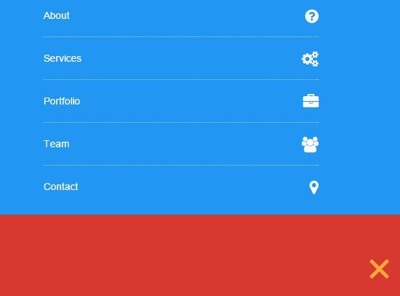
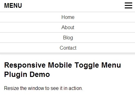
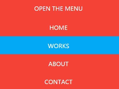
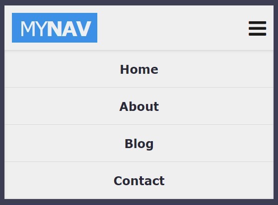
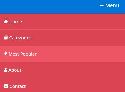
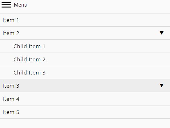
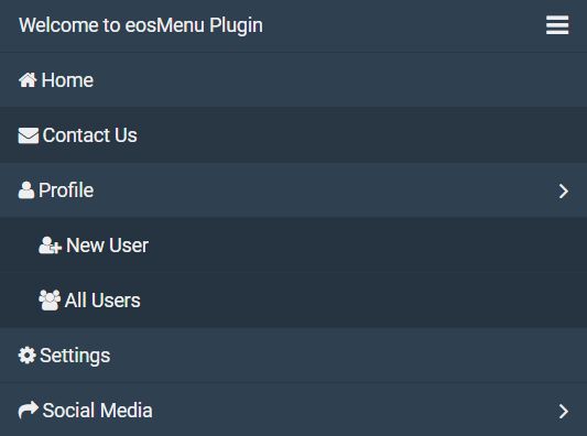
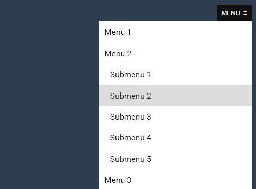
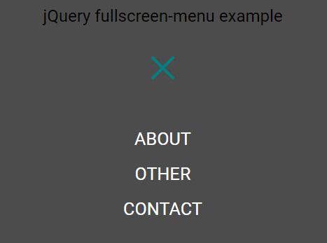
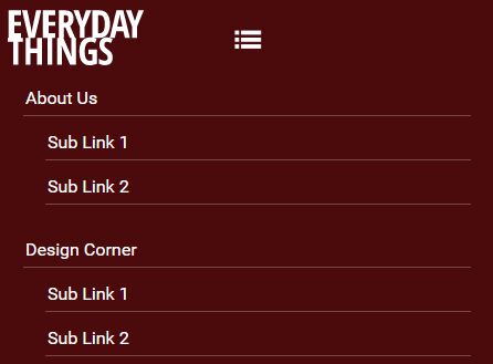
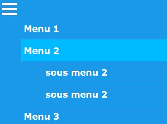
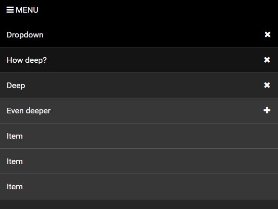
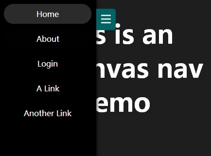
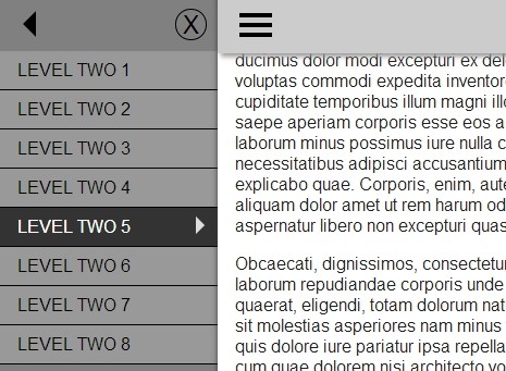
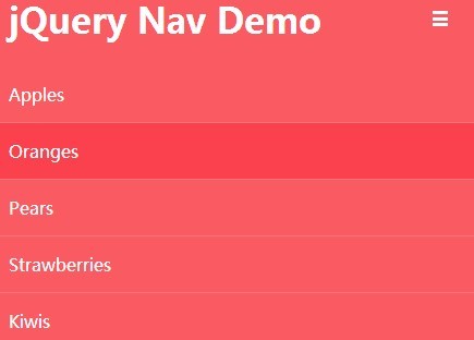
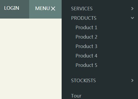
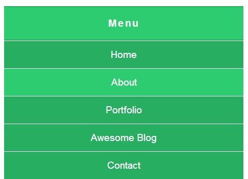
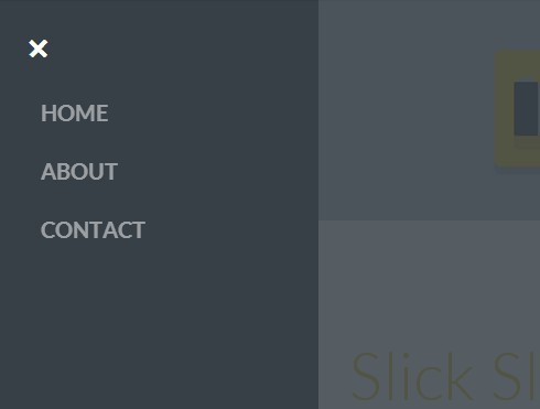
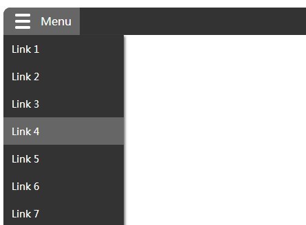
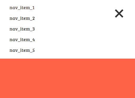
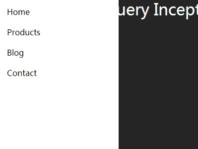
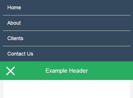
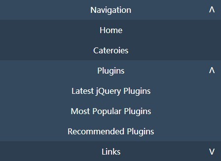
You can view a demo here: http://ryantbrown.io/code/reaktionjs
Usage
There are 3 ways to install Reaktion.js:
- Install the package via Bower with
bower install reaktion.js - Clone the repo with
git clone https://github.com/ryantbrown/reaktion.js.git reaktion - Download the zip file here
Once you have it installed then you need to add the css file to the <head> of your document (Font Awesome is optional but recommended, please see the customization section for details):
<link rel="stylesheet" href="dist/reaktion.min.css" /> <link rel="stylesheet" href="//netdna.bootstrapcdn.com/font-awesome/4.0.3/css/font-awesome.min.css" >Add jQuery and Reaktion.js at the bottom of your document right before the end </body> tag:
<script src="//ajax.googleapis.com/ajax/libs/jquery/1.10.2/jquery.min.js"></script> <script src="dist/reaktion.min.js"></script>Create the HTML markup for the navigation menu:
<div class="nav"> <ul> <li><a href="#">Menu Item</a></li> <li><a href="#">Menu Item</a> <ul> <li><a href="#">Sub Menu Item</a></li> <li><a href="#">Sub Menu Item</a></li> <li><a href="#">Sub Menu Item</a></li> </ul> </li> <li><a href="#">Menu Item</a></li> ... </ul> </div>And last but not least call the plugin:
// Dom ready $(function(){ // Initialize Reaktion.js $('.nav').reaktion(); });Customization
There are several ways to customize Reaktion.js for you needs, the two most common are via plugin options and CSS:
Options
| Option | Default | Type | Description |
|---|---|---|---|
| breakPoint | 768 | number | Refers to the viewport width and determines when the navigation switches to the "mobile" version. |
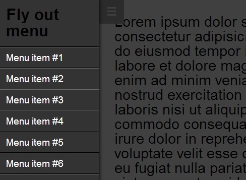
| navIcon | <i class="fa fa-bars"></i> | string | The HTML (text, icon, image, etc.) for the mobile icon (the mobile icon is what the user clicks to reveal the mobile menu. |
| arrows | true | bool | Whether or not to show the sub menu arrows. To include the arrows on the "mobile" version only you can use CSS to hide them (ie: .nav ul li span.arrow { display:none; }) |
| arrowIcon | <i class="fa fa-chevron-down"></i> | string | The HTML (text, icon, image, etc.) for the sub menu arrows. |
| arrowsToggleOnly | true | bool | If true, the arrows are the only element that will toggle the sub menus, if false the parent link of the sub menu will also toggle sub menus. Does not apply if arrows are disabled. |
| animate | true | bool | Whether or not to animate the mobile menu on reveal |
| effect | slide | string | The effect used to animate the mobile menu, can be either slide or fade |
| speed | 300 | number | The speed at which to animate the mobile menu |
| animateSubNav | true | bool | Whether or not to animate when opening the sub menus |
| subNavEffect | slide | string | The effect used to animate the sub menus, can be either slide or fade |
| subNavSpeed | 300 | number | The speed at which to animate the sub menus |
| onOpen | empty | function | Callback function executed whenever the menu is opened |
| onClose | empty | function | Callback function executed whenever the menu is closed |
Below is an example using these options in the plugin call:
$(function(){ $('.nav').reaktion({ breakPoint: 768, navIcon: '<i class="fa fa-bars"></i>', arrows: true, arrowIcon: '<i class="fa fa-chevron-down"></i>', arrowsToggleOnly: true, animate: true, effect: 'slide', speed: 300, animateSubNav: true, subNavEffect: 'slide', subNavSpeed: 300 }); });CSS
Reaktion.js comes with a CSS file (src/css/reaktion.css) that contains the basic styling for the menu. This file is compiled from the LESS file (src/less/reaktion.less) that is also included. You are free to use either one but the LESS file contains a few varibales that make it easier to customize quickly.
LESS
The CSS file for Reaktion.js is compiled directly from the LESS file in (src/less/reaktion.less). If you are familar with LESS then I recommend you use this file to style the plugin. It sets
Font Awesome
Reaktion.js uses Font Awesome to generate the arrows and the menu icon.
API
There are three API methods for opening and closing the menu after initialzation:
// Dom ready $(function(){ // Initialize $('.nav').reaktion(); // open the mobile menu $('.nav').reaktion('open'); // close the mobile menu $('.nav').reaktion('close'); // toggle the mobile menu $('.nav').reaktion('toggle'); });License
Reaktion.js is open-sourced software licensed under the MIT license


