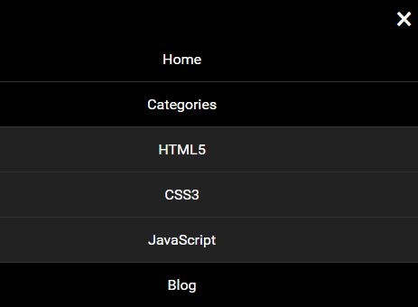
StellarNav.js
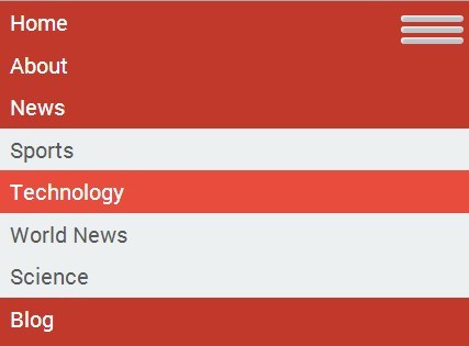
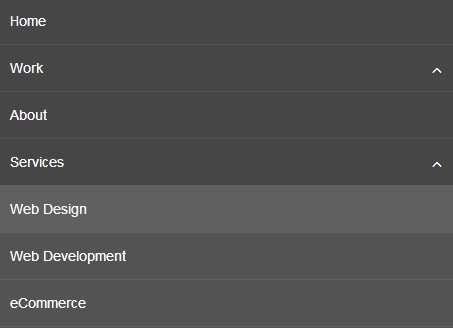
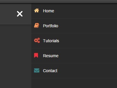
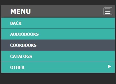
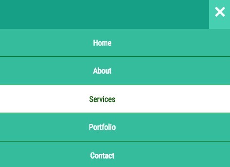
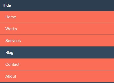
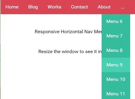
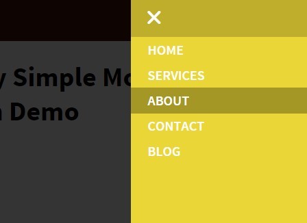
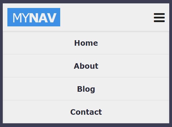
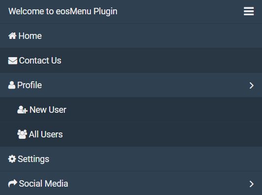
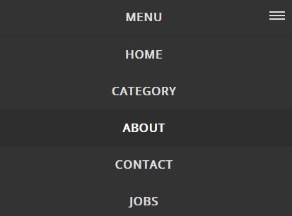
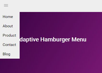
Responsive, lightweight, multi-level dropdown menu. Stellarnav is a great solution for long navigation menus with lots of menu items.
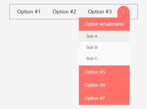
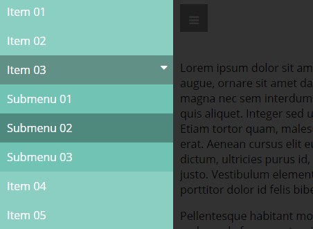
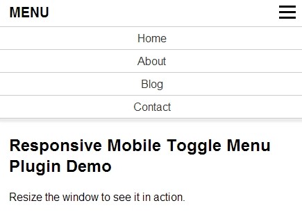
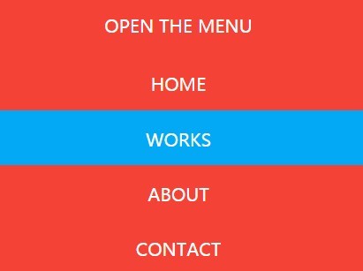
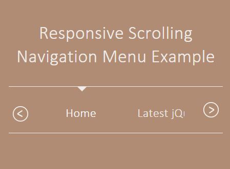
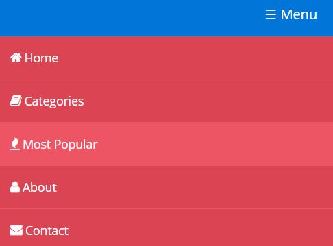
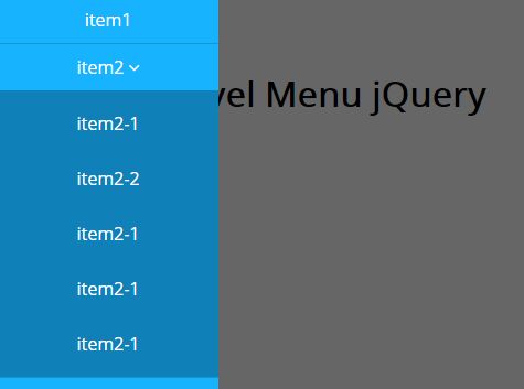
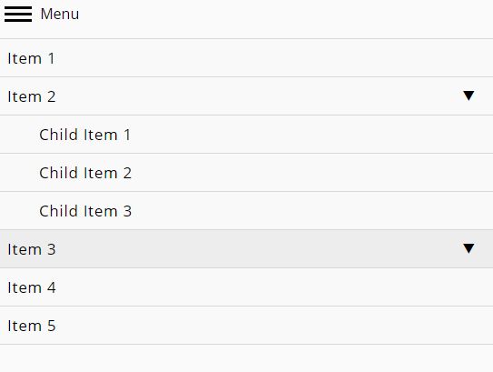
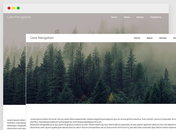
Click here to see StellarNav.js in action.
Installation
CSS
Include the StellarNav stylesheet.
<link rel="stylesheet" type="text/css" media="all" href="css/stellarnav.min.css">HTML
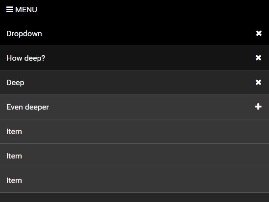
Add a stellarnav class to your menu div.
<div class="stellarnav"> <ul> <li><a href="#">Item</a></li> <li><a href="#">Item</a></li> <li><a href="#">Item</a></li> </ul> </div>Javascript
Include stellarnav.min.js and call stellarNav().
<script type="text/javascript" src="js/stellarnav.js"></script> <script type="text/javascript"> jQuery(document).ready(function($) { jQuery('.stellarnav').stellarNav(); }); </script>Options
Here's a list of available settings.
jQuery('.stellarnav').stellarNav({ theme: 'plain', // adds default color to nav. (light, dark) breakpoint: 768, // number in pixels to determine when the nav should turn mobile friendly menuLabel: 'Menu', // label for the mobile nav sticky: false, // makes nav sticky on scroll (desktop only) position: 'static', // 'static', 'top', 'left', 'right' - when set to 'top', this forces the mobile nav to be placed absolutely on the very top of page openingSpeed: 250, // how fast the dropdown should open in milliseconds closingDelay: 250, // controls how long the dropdowns stay open for in milliseconds showArrows: true, // shows dropdown arrows next to the items that have sub menus phoneBtn: '', // adds a click-to-call phone link to the top of menu - i.e.: "18009084500" phoneLabel: 'Call Us', // label for the phone button locationBtn: '', // adds a location link to the top of menu - i.e.: "/location/", "http://site.com/contact-us/" locationLabel: 'Location', // label for the location button closeBtn: false, // adds a close button to the end of nav closeLabel: 'Close', // label for the close button mobileMode: false, scrollbarFix: false // fixes horizontal scrollbar issue on very long navs });| Attribute | Type | Default | Description |
|---|---|---|---|
theme | String | plain | Adds default color to nav. [plain, light, dark] |
breakpoint | Integer | 768 | Number in pixels to determine when the nav should turn mobile friendly. |
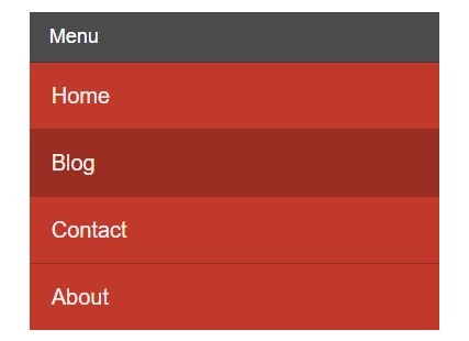
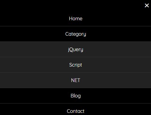
menuLabel | String | Menu | Label (text) for the mobile nav. |
sticky | Boolean | false | Makes nav sticky on scroll. |
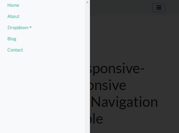
position | String | static | [static, top, left, right] - When set to 'top', this forces the mobile nav to be placed absolutely on the very top of page. When set to 'left' or 'right', mobile nav fades in/out from left or right, accordingly. |
openingSpeed | Integer | 250 | Controls how fast the dropdowns open in milliseconds. |
closingDelay | Integer | 250 | Controls how long the dropdowns stay open for in milliseconds. |
showArrows | Boolean | true | Shows dropdown arrows next to the items that have sub menus. |
phoneBtn | String | '' | Adds a click-to-call phone link to the top of menu - i.e.: "18009084500". |
phoneLabel | String | Call Us | Label (text) for the phone button. |
locationBtn | String | '' | Adds a location link to the top of menu - i.e.: "/location/", "http://site.com/contact-us/". |
locationLabel | String | Location | Label (text) for the location button. |
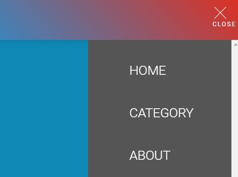
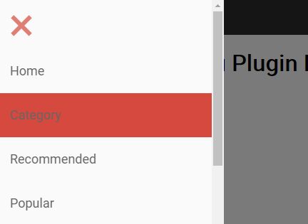
closeBtn | Boolean | false | Adds a close button to the end of nav. |
closeLabel | String | Close | Label (text) for the close button. |
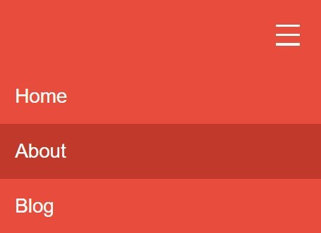
mobileMode | Boolean | false | Turns the menu mobile friendly by default. |
scrollbarFix | Boolean | false | Fixes horizontal scrollbar issue on very long menus. |
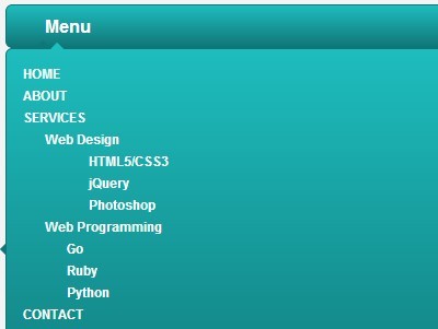
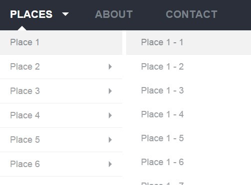
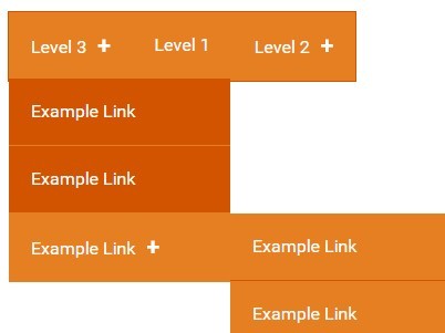
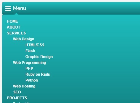
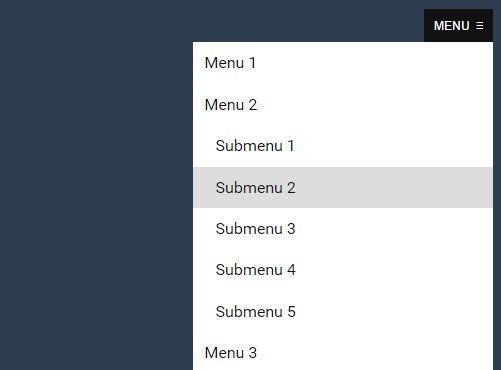
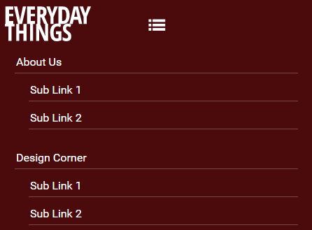
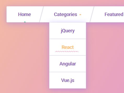
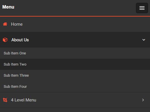
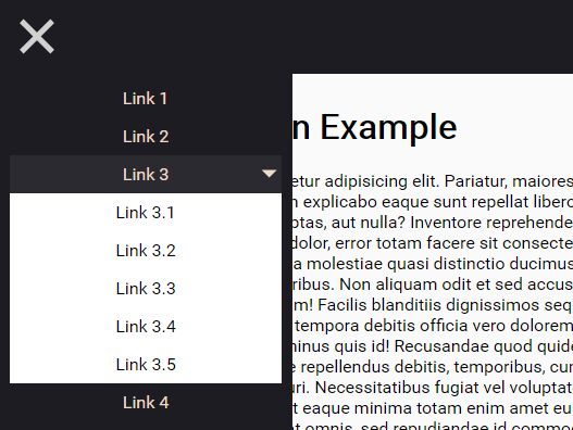
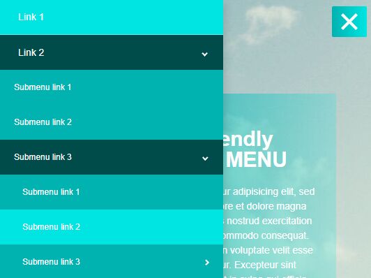
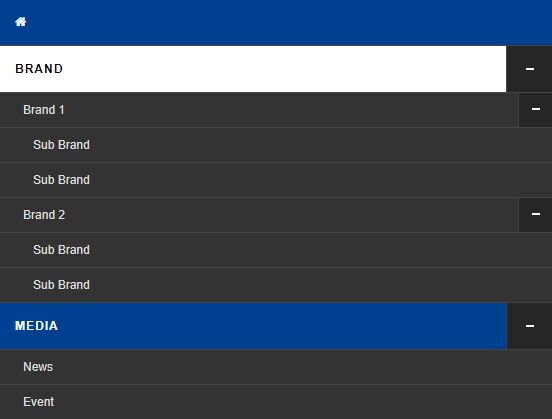
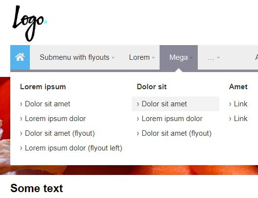
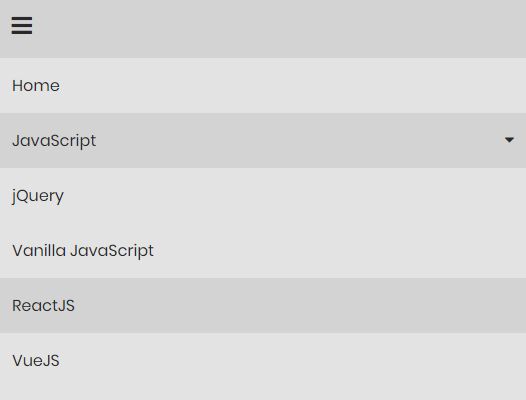
Mega Dropdowns
The mega dropdown feature allows you to fully extend the width of the dropdown and group the sub-dropdown items by a specific number of columns. This is extremely useful when dealing large menus.
You can turn any dropdown into a mega dropdown menu by simply adding a class of mega and an html attribute of data-columns to the top-level item. The number of columns for the data-columns attribute that can be any integer from 2 to 8. Example:
<div class="stellarnav"> <ul> <li class="mega" data-columns="4"> <a href="#">Item</a> <a href="#">Item</a> <a href="#">Item</a> <a href="#">Item</a> <a href="#">Item</a> <a href="#">Item</a> <a href="#">Item</a> <a href="#">Item</a> </li> <li><a href="#">Item</a></li> <li><a href="#">Item</a></li> </ul> </div>*Note: data-columns defaults to 4. If you specify a number other than 2-8 or forget to add the data-columns attribute to the list item, the dropdown menu will automatically be divided into 4 columns.
Extra
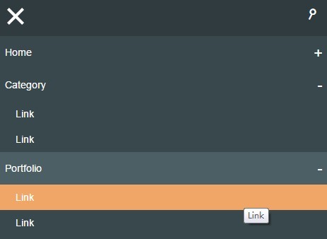
Open / Close Menu
You can add the css classes stellarnav-open or stellarnav-close to any html element on the page to activate opening or closing of menu on click.
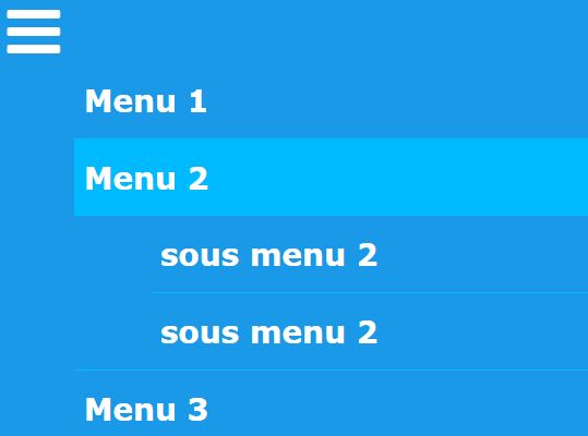
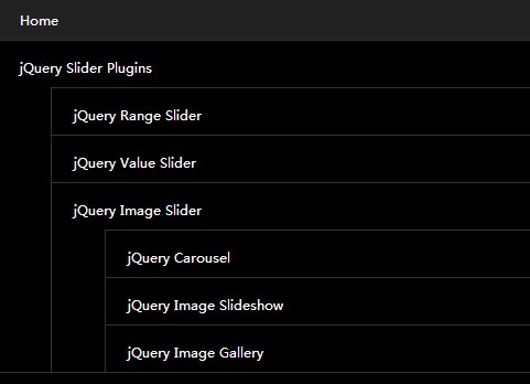
Drop Left
For long dropdown menus and for some of the last navigation items, you may use the class drop-left to the list item so that the dropdown drops leftward. This prevents menu from breaking the grid and getting a horizontal scrollbar.
<div class="stellarnav"> <ul> <li><a href="#">Item</a></li> <li><a href="#">Item</a></li> <li><a href="#">Item</a></li> <li><a href="#">Item</a></li> <li class="drop-left"><a href="#">Last Dropdown Item</a> <ul> <li><a href="#">Item</a></li> <li><a href="#">Item</a> <ul> <li><a href="#">Drop left menu item</a></li> <li><a href="#">Drop left menu item</a></li> </ul> </li> </ul> </li> </ul> </div>If this is not an option and you are still getting a scrollbar, you may also set the scrollbarFix option to true.