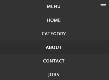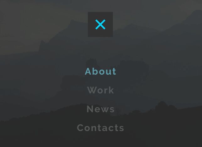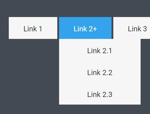
#MenuMaker - Responsive Navigation Plugin
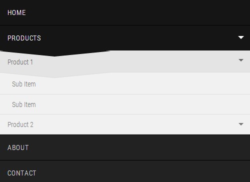
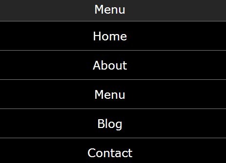
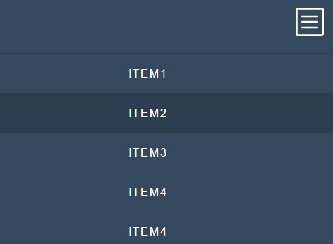
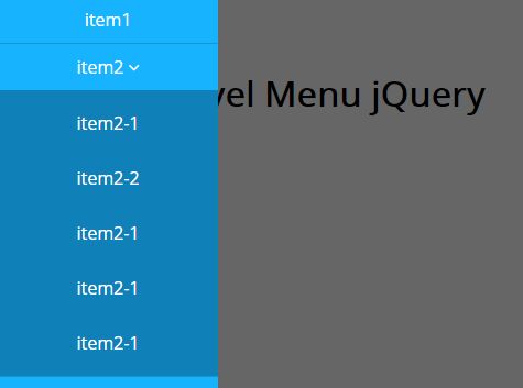
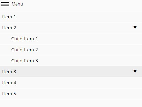
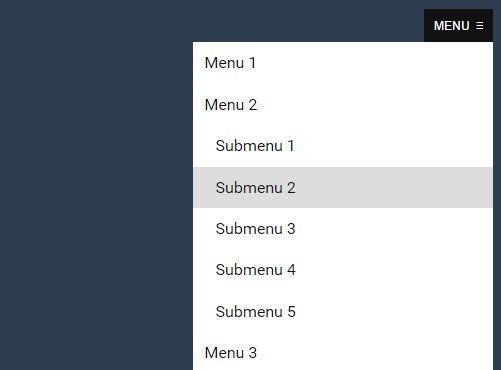
A small jQuery plugin which allows you to create various types of menus for mobile devices. You can create a menu which can be toggled with a tap on mobile devices, a menu where each submenu can be toggled or a select list menu.
##Usage
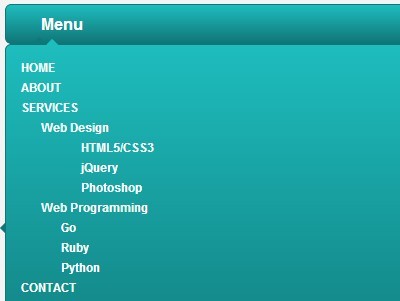
The plugin is very easy to use. First, create the markup (an unordered list of links contained by a div)
<div id="cssmenu"> <ul> <li><a href="">Item</a></li> <li><a href="">Item</a></li> <li><a href="">Item</a></li> <li><a href="">Item</a></li> </ul> </div>Of course, you can create submenus by nesting lists. Next, include the CSS file:
<link rel="stylesheet" type="text/css" href="css/menumaker.css">Link the jQuery script:
<script type="text/javascript" src="js/menumaker.js"></script>And finally, initialize the plugin:
<script type="text/javascript"> $("#cssmenu").menumaker(); </script>##Options
$("#cssmenu").menumaker({ title: "Menu", // The text of the button which toggles the menu breakpoint: 768, // The breakpoint for switching to the mobile view format: "multitoggle" // It takes three values: dropdown for a simple toggle menu, select for select list menu, multitoggle for a menu where each submenu can be toggled separately });