Check this project on Dribbble.

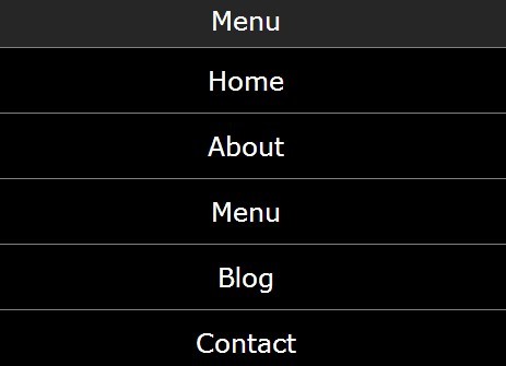
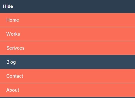
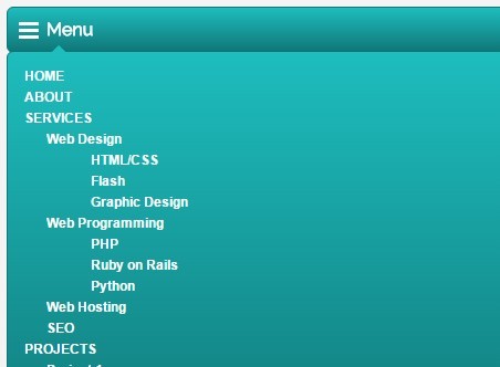
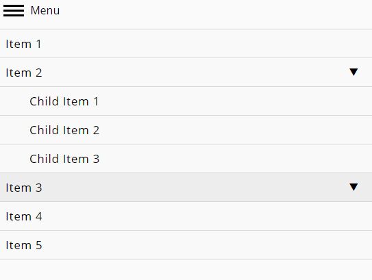
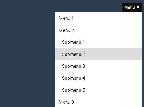
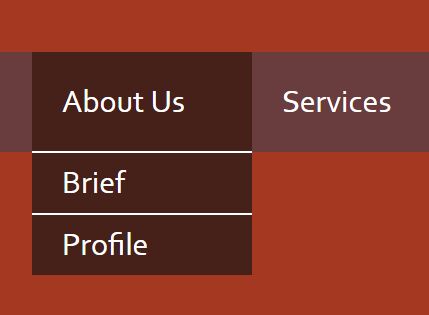
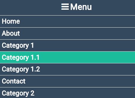
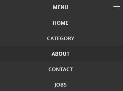
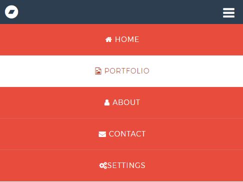
Animated Toggle Menu
Hi, guys!
We’re happy to share our new free open-source Animated Toggle Menu that can be helpful for creating websites. It’s lightweight, easy-to-use and requires minimum lines of code.
Feel free to take full advantage of it during the web site development.

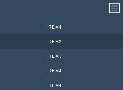
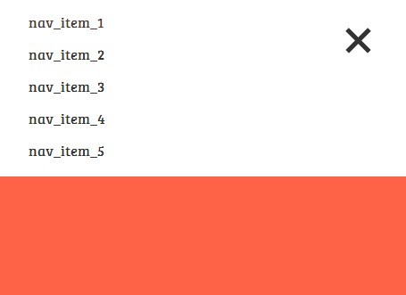
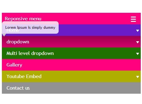
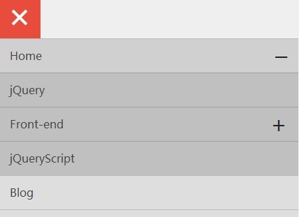
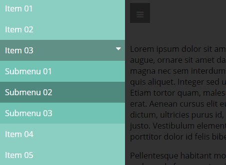
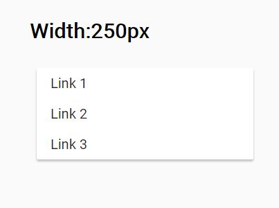
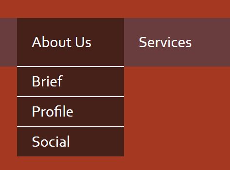
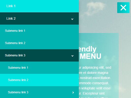
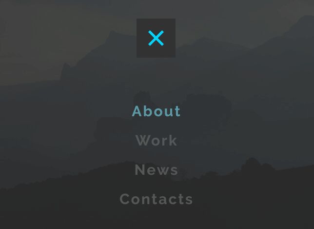
(concept image)
How to use?
Animated Toggle Menu uses css3 animations, as well as the jQuery library. To take the full use of the menu, add the following block after opening the <body> tag:
<div class=“menu-overlay”></div>In order to add the menu itself, you need this code:
<div class="menu"> <div class="hamburger-menu-wrapper"> <button class="hamburger-menu"> <span>toggle menu</span> </button> </div> <div class="menu-list"> <a href="#">Link 1</a><br> <a href="#">Link 2</a><br> <a href="#">Link 3</a><br> <a href="#">Link 4</a><br> </div> </div>Add CSS:
/* Base layout */ body,html{ margin: 0; padding: 0; } html{ height: 100%; } body{ font-family: 'Open Sans', sans-serif; font-size: 12px; color: #FFFFFF; letter-spacing: 0.17px; line-height: 22px; min-height: 100%; background-image: url("../img/clouds.jpg"); background-repeat: no-repeat; background-position: center top; } /* MENU */ .hamburger-menu-wrapper{ margin-top: 40px; background: #323232; padding: 10px; display: inline-block; } .hamburger-menu-wrapper.bounce-effect{ animation: bounce 0.3s ease 1; } .menu-overlay { transition: margin 300ms cubic-bezier(0.17, 0.04, 0.03, 0.94); display: none; position: absolute; top: 0; bottom: 0; right: 0; left: 0; background: rgba(0, 0, 0, 0.6); z-index: 1111; } .menu{ position: relative; min-width: 220px; text-align: center; } .hamburger-menu { border: 0; margin: 0 auto; display: block; position: relative; overflow: hidden; padding: 0; width: 36px; height: 36px; font-size: 0; text-indent: -9999px; cursor: pointer; z-index: 9999; cursor: pointer; background: transparent; } .menu-list{ display: none; position: absolute; top: calc(100% + 40px); width: 100%; text-align: center; z-index: 9999; } .menu-list a{ color: #C6D2D6; text-decoration: none; font-size: 18px; display: inline-block; margin: 15px 0; transition: all 0.5s ease; } .menu-list a:hover{ color: #02D5FD; } .hamburger-menu:focus { outline: none; } .hamburger-menu span { display: block; position: absolute; top: 17px; left: 5px; right: 5px; height: 2px; background: #02D5FD; } .hamburger-menu span:before, .hamburger-menu span:after { position: absolute; display: block; left: 0; width: 100%; height: 2px; background-color: #02D5FD; content: ""; } .hamburger-menu span:before { top: -7px; } .hamburger-menu span:after { bottom: -7px; } .hamburger-menu span:before, .hamburger-menu span:after { transition-duration: 0.3s, 0.3s; transition-delay: 0.3s, 0s; } .hamburger-menu span:before { transition-property: top, transform; } .hamburger-menu span::after { transition-property: bottom, transform; } .hamburger-menu.active span { background: none; } .hamburger-menu.active span:before { top: 0; transform: rotate(225deg); } .hamburger-menu.active span:after { bottom: 0; transform: rotate(135deg); } .hamburger-menu.active span:before, .hamburger-menu.active span:after { transition-delay: 0s, 0.3s; } @keyframes bounce { 0%{ transform: rotate(0); } 45%{ transform: rotate(15deg); } 90%{ transform: rotate(-7deg); } 100%{ transform: rotate(0); } }And, of course, don’t forget to connect jQuery library
Demo
https://agilie.github.io/AnimatedToggleMenu/
Troubleshooting
Problems? Check the Issues block to find the solution or create an new issue that we will fix asap. Feel free to contribute.
Author
This template is open-sourced by Agilie Team [email protected]
Contributors
Contact us
If you have any questions, suggestions or just need a help with web or mobile development, please email us at [email protected]. You can ask us anything from basic to complex questions.
We will continue publishing new open-source projects. Stay with us, more updates will follow!
License
The MIT License (MIT) Copyright © 2017 Agilie Team