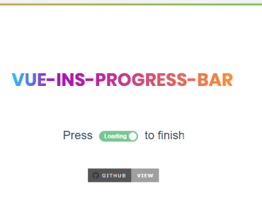


vue-element-loading
👀 Document & Demo Page
💻 Install
npm install --save vue-element-loadingor
yarn add vue-element-loading🕹 Usage
import Vue from 'vue' import VueElementLoading from 'vue-element-loading' Vue.component('VueElementLoading', VueElementLoading)or
import VueElementLoading from 'vue-element-loading' export default { components: { VueElementLoading } }🔎 Example
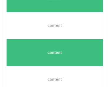
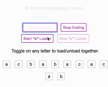
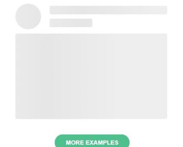
Inside container
<div class="parent"> <vue-element-loading :active="show" spinner="bar-fade-scale"/> <span> This is my content. </span> </div>Full screen
<body> <vue-element-loading :active="show" is-full-screen/> </body>Adjust Spinner Color
Use the color parameter to set the color of the displayed spinner (does not affect custom spinner images).
<div class="parent"> <vue-element-loading :active="show" spinner="bar-fade-scale" color="#FF6700"/> <span> This is my content. </span> </div>Set text
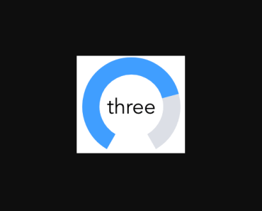
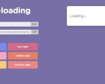
Use the text parameter to set the text which will appear below loader.
<div class="parent"> <vue-element-loading :active="show" spinner="bar-fade-scale" color="#FF6700" text="Please wait..."/> <span> This is my content. </span> </div>Set text style
Use the textStyle parameter to set the style of text( you need to pass css-in-js way using camelCase exp. fontSize, backgroundColor etc).
<div class="parent"> <vue-element-loading :active="show" spinner="bar-fade-scale" color="#FF6700" text="Please textStyle={fontSize: '25px'} wait..."/> <span> This is my content. </span> </div>Adjust Spinner Size
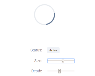
Use the size parameter to set the size of the displayed spinner (does not affect custom spinner images).
<div class="parent"> <vue-element-loading :active="show" spinner="bar-fade-scale" size="128"/> <span> This is my content. </span> </div>Adjust Spinner Animation Speed
Use the duration parameter to set the animation loop duration in seconds (does not affect custom spinner images).
<div class="parent"> <vue-element-loading :active="show" spinner="bar-fade-scale" duration="1.0"/> <span> This is my content. </span> </div>Customize loader
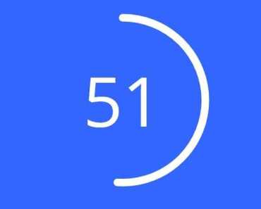
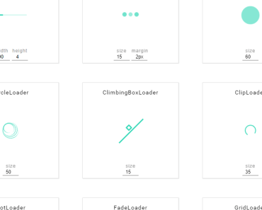
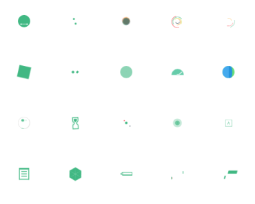
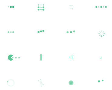
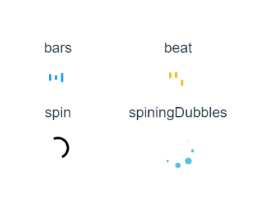
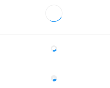
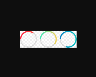
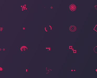
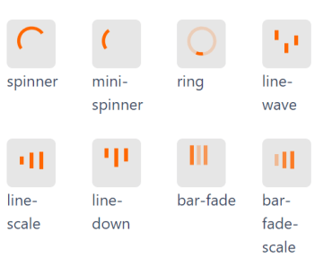
<div class="parent"> <vue-element-loading :active="show"> <img src="/static/pikachu.gif" width="55px" height="55px"> </vue-element-loading> </div>🌀 Spinner
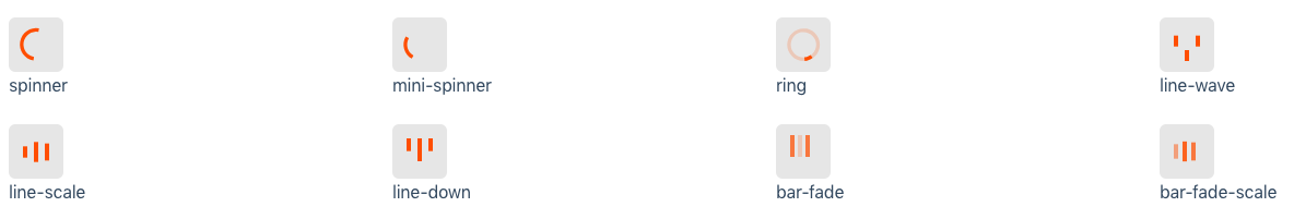
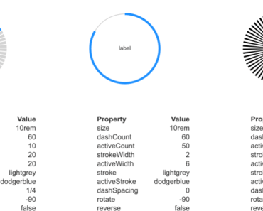
⚙️ Props
| Props | Type | Default | Description |
|---|---|---|---|
| active | Boolean | - | Status for show/hide loading |
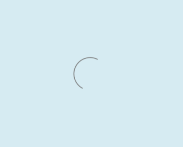
| spinner | String | spinner | Spinner icon name: spinner, mini-spinner, ring, line-wave, line-scale, line-down, bar-fade, bar-fade-scale |
| color | String | #000 | Color of spinner icon |
| background-color | String | rgba(255, 255, 255, .9) | Background color of spinner icon (for overlay) |
| size | String | "40" | The size to display the spinner in pixels (NOTE: this will not affect custom spinner images) |
| duration | String | "0.6" | The duration of one 'loop' of the spinner animation, in seconds (NOTE: this will not affect custom spinner images) |
| is-full-screen | Boolean | false | Loader will overlay the full page |
| text | String | - | Text will appear below loader |
| text-style | Object | {} | Change style of the text below loader |
🤝 Contributing
- Fork this repository.
- Create new branch with feature name.
- Run
npm installandnpm run dev. - Create your feature.
- Commit and set commit message with feature name.
- Push your code to your fork repository.
- Create pull request.
🙂
⭐️ Support
If you like this project, You can support me with starring ⭐ this repository.
📄 License
Developed with