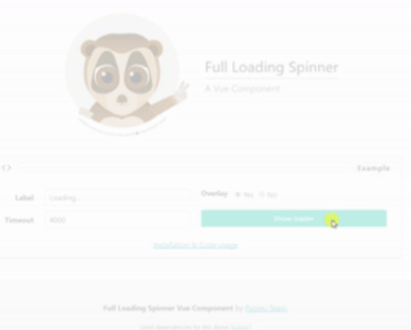
Vue Loading Overlay Component


Vue.js component for full screen loading indicator
v2.x branch.
Demo or JSFiddle
Installation
# npm npm install vue-loading-overlay # Yarn yarn add vue-loading-overlayUsage
As component
<template> <div class="vld-parent"> <loading :active.sync="isLoading" :can-cancel="true" :on-cancel="onCancel" :is-full-page="fullPage"></loading> <label><input type="checkbox" v-model="fullPage">Full page?</label> <button @click.prevent="doAjax">fetch Data</button> </div> </template> <script> // Import component import Loading from 'vue-loading-overlay'; // Import stylesheet import 'vue-loading-overlay/dist/vue-loading.css'; export default { data() { return { isLoading: false, fullPage: true } }, components: { Loading }, methods: { doAjax() { this.isLoading = true; // simulate AJAX setTimeout(() => { this.isLoading = false },5000) }, onCancel() { console.log('User cancelled the loader.') } } } </script>As plugin
<template> <form @submit.prevent="submit" class="vld-parent" ref="formContainer"> <!-- your form inputs goes here--> <label><input type="checkbox" v-model="fullPage">Full page?</label> <button type="submit">Login</button> </form> </template> <script> import Vue from 'vue'; // Import component import Loading from 'vue-loading-overlay'; // Import stylesheet import 'vue-loading-overlay/dist/vue-loading.css'; // Init plugin Vue.use(Loading); export default { data() { return { fullPage: false } }, methods: { submit() { let loader = this.$loading.show({ // Optional parameters container: this.fullPage ? null : this.$refs.formContainer, canCancel: true, onCancel: this.onCancel, }); // simulate AJAX setTimeout(() => { loader.hide() },5000) }, onCancel() { console.log('User cancelled the loader.') } } } </script>Available props
The component accepts these props:
| Attribute | Type | Default | Description |
|---|---|---|---|
| active | Boolean | false | Show loading by default when true, use the .sync modifier to make it two-way binding |
| can-cancel | Boolean | false | Allow user to cancel by pressing ESC or clicking outside |
| on-cancel | Function | ()=>{} | Do something upon cancel, works in conjunction with can-cancel |
| is-full-page | Boolean | true | When false; limit loader to its container^ |
| transition | String | fade | Transition name |
| color | String | #000 | Customize the color of loading icon |
| height | Number | * | Customize the height of loading icon |
| width | Number | * | Customize the width of loading icon |
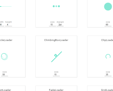
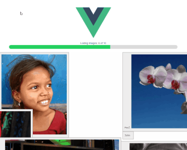
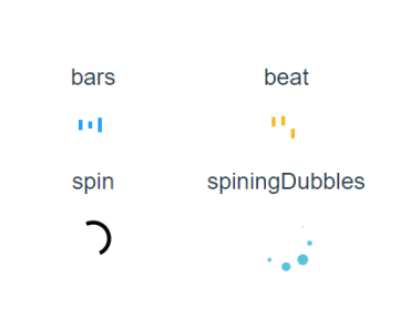
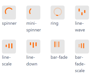
| loader | String | spinner | Name of icon shape you want use as loader, spinner or dots or bars |
| background-color | String | #fff | Customize the overlay background color |
| opacity | Number | 0.5 | Customize the overlay background opacity |
| z-index | Number | 999 | Customize the overlay z-index |
- ^When
is-full-pageis set tofalse, the container element should be positioned asposition: relative. You can use CSS helper classvld-parent. - *The default
heightandwidthvalues may be vary based on theloaderprop value
Available slots
The component accepts these slots:
default: Replace the animated icon with yoursbefore: Place anything before animated icon, you may need to style this.after: Place anything after animated icon, you may need to style this.
API methods
Vue.$loading.show(?propsData,?slots)
let loader = Vue.$loading.show({ // Pass props by their camelCased names container: this.$refs.loadingContainer, canCancel: true, // default false onCancel: this.yourMethodName, color: '#000000', loader: 'spinner', width: 64, height: 64, backgroundColor: '#ffffff', opacity: 0.5, zIndex: 999, },{ // Pass slots by their names default: this.$createElement('your-custom-loader-component-name'), }); // hide loader whenever you want loader.hide();Global configs
You can set props and slots for all future instances when using as plugin
Vue.use(Loading, { // props color: 'red' },{ // slots })Further you can override any prop or slot when creating new instances
let loader = Vue.$loading.show({ color: 'blue' },{ // slots });Install in non-module environments (without webpack)
<!-- Vue js --> <script src="https://cdn.jsdelivr.net/npm/[email protected]/dist/vue.min.js"></script> <!-- Lastly add this package --> <script src="https://cdn.jsdelivr.net/npm/vue-loading-overlay@3"></script> <link href="https://cdn.jsdelivr.net/npm/vue-loading-overlay@3/dist/vue-loading.css" rel="stylesheet"> <!-- Init the plugin and component--> <script> Vue.use(VueLoading); Vue.component('loading', VueLoading) </script>Browser support
- Modern browsers only
Run examples on your localhost
- Clone this repo
- Make sure you have node-js
>=6.10and yarn>=1.xpre-installed - Install dependencies -
yarn install - Run webpack dev server -
yarn start - This should open the demo page at
http://localhost:9000in your default web browser
Testing
- This package is using Jest and vue-test-utils for testing.
- Tests can be found in
__test__folder. - Execute tests with this command
yarn test
License
MIT License