vue-circle-progress
A Vue.js component to draw animated circular progress bars
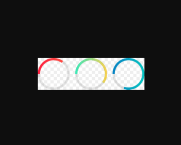
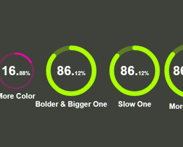
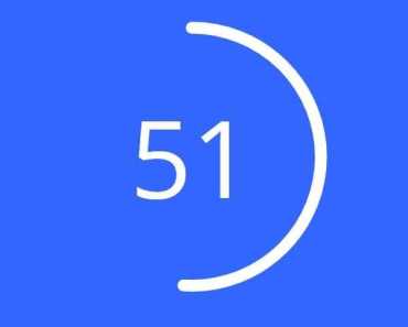
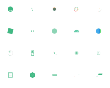
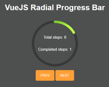
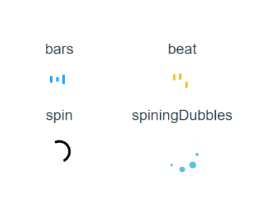
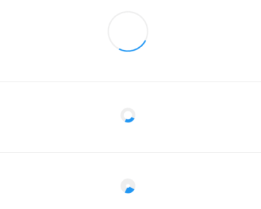
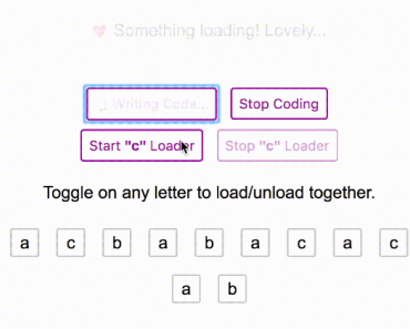
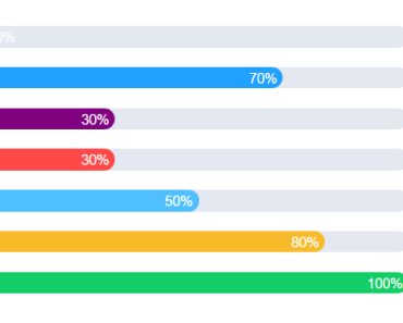
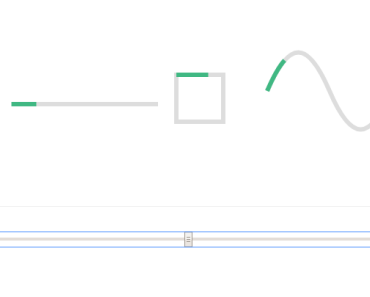
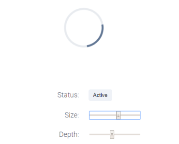
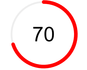
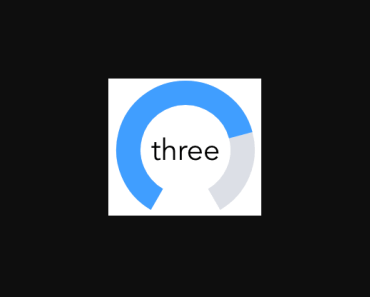
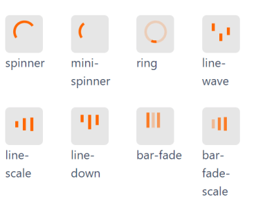
Draw animated progress circle like below,
Install
// For Vue.js 2.0+ npm install vue2-circle-progress Usage
- Import the module
- Register it as a component as you would any other Vue component
- Use it within your template
Example
<template> <div id="app"> <p> A Vue.js component to draw animated circular progress bars! </p> <vue-circle :progress="50" :size="100" :reverse="false" line-cap="round" :fill="fill" empty-fill="rgba(0, 0, 0, .1)" :animation-start-value="0.0" :start-angle="0" insert-mode="append" :thickness="5" :show-percent="true" @vue-circle-progress="progress" @vue-circle-end="progress_end"> <p>Slot!</p> </vue-circle> </div> </template> <script> import VueCircle from 'vue2-circle-progress' export default { components: { VueCircle }, data(){ return{ fill : { gradient: ["red", "green", "blue"] }, } }, methods:{ progress(event,progress,stepValue){ console.log(stepValue); }, progress_end(event){ console.log("Circle progress end"); } } } </script>Props
Follwing props are used while initialization
Note : Only
progressis a required prop. Others are optional
| Prop Name | Type | Description |
|---|---|---|
progress (required) | Number | Total progress of circle (filled area) |
| size | Number | Size of circle Default : 200 |
| reverse | Boolean | Reverse animation and arc draw Default: false |
| line-cap | String | Arc line cap: "butt", "round" or "square" Default: "butt" |
| fill | Object | The arc fill config. You may specify next: - "#ff1e41" - { color: "#ff1e41" } - { color: 'rgba(255, 255, 255, .3)' } - { gradient: ["red", "green", "blue"] } - { gradient: [["red", .2], ["green", .3], ["blue", .8]] } - { gradient: [ ... ], gradientAngle: Math.PI / 4 } - { gradient: [ ... ], gradientDirection: [x0, y0, x1, y1] } - { image: "http://i.imgur.com/pT0i89v.png" }- { image: imageInstance }- { color: "lime", image: "http://i.imgur.com/pT0i89v.png" } Default: { gradient: ["#3aeabb", "#fdd250"] } |
| empty-fill | String | Color of the "empty" arc. Only a color fill supported by now Default: "rgba(0, 0, 0, .1)" |
| animation | Mixed | Animation config. See jQuery animations. You may also set it to false Default: { duration: 1200, easing: "circleProgressEasing" } "circleProgressEasing" is just a ease-in-out-cubic easing |
| animation-start-value | Number | Default animation starts at 0.0 and ends at specified value. Let's call this direct animation. If you want to make reversed animation then you should set animationStartValue to 1.0. Also you may specify any other value from 0.0 to 1.0 Default: 0.0 |
| start-angle | Number | Initial angle (for 0 value) Default: -Math.PI |
| insert-mode | String | Canvas insertion mode: append or prepend it into the parent element Default: "prepend" |
| thickness | Number | Width of the arc. By default it's automatically calculated as 1/14 of size but you may set your own number Default: "auto" |
| show-percent | Boolean | Show loaded percentage inside circle. If inner-text property is set then percentage will not be shown. Default : true |
Events
Events emitted by the component to the parent.
| Event Name | Description |
|---|---|
| vue-circle-init(event) | This event is emmited after the circle is initialized |
| vue-circle-progress(event,progress,stepValue) | This event is emitted on every progress step |
| vue-circle-end(event) | This event is emitted after completing progress |
Methods
Methods you can call on the component.
| Method | Description |
|---|---|
| updateProgress(value) | It will update component progress value and animate the change. It doesn't redraw the widget. |
| updateFill(fill) | It will update component fill color. |
Using Methods
Methods can be called from your parent component by making use of the special tag "ref".
When you initialize the component add a unique ID to the component using the ref tag, like this
<vue-circle ref="myUniqueID"></vue-circle>Then from your parent Vue instance, you can call the methods by using the following:
this.$refs.myUniqueID.updateProgress(21); this.$refs.myUniqueID.updateFill("#ff1e41");Development
If you feel you can make this better, you are welcome to contribute. I'd love to see your ideas.
# install dependencies npm install # serve example at localhost:8080 npm run dev # build any changes made npm run buildThanks
This is a Vue2 component built with wrapper around this library Thanks to Rostyslav Bryzgunov.
