vue-knob-control
A rotary knob control for Vue.js
Install
npm install vue-knob-control -SUsage
import Vue from 'vue' import KnobControl from 'vue-knob-control' Vue.use(KnobControl)Examples
Most basic usage:
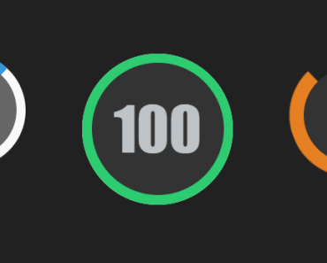
<knob-control v-model="someValue"></knob-control>
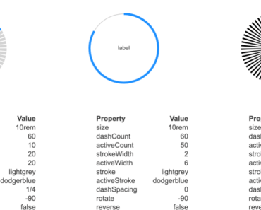
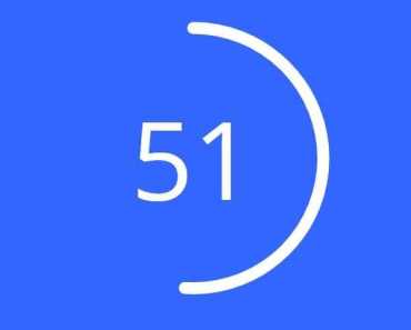
Specifying minimum and maximum values, note that the value arc is drawn from the calculated zero point. We have also made the arc appear thinner:
<knob-control :min="-12" :max="12" :stroke-width="8" v-model="semitone" ></knob-control>
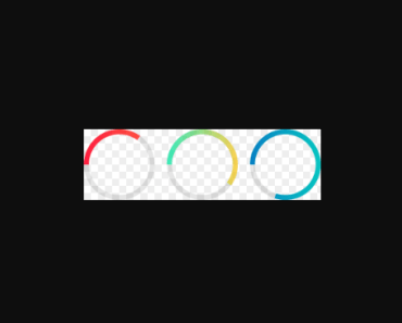
Changing size and colors:
<knob-control :min="-64" :max="63" :size="75" primary-color="#E844C3" secondary-color="#E7B6DC" text-color="#E844C3" v-model="detune" ></knob-control>
You can also pass a function to alter the value text displayed:
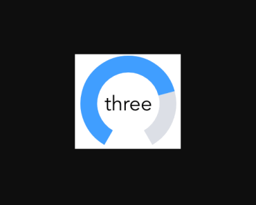
toWord: function(val) { const map = { 0: 'zero', 1: 'one', 2: 'two', 3: 'three', 4: 'four', } return map[val]; }<knob-control :min="0" :max="4" :value-display-function="toWord" v-model="val" ></knob-control>
Responsive
Set the component responsive.
Size property is always available, be careful if size is more than 100, size is expressed in % in this mode
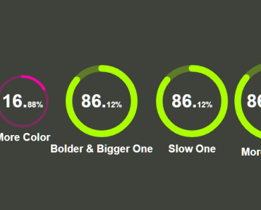
<knob-control :responsive="true" ></knob-control>Animation:
Disabled by default
animated true|false
This will disable/enable knob animation but not value one.
animateValue true|false
Same as animation expect for the value.
animationDuration integer, in milliseconds
set the duration of both animation.
animationFunction string
CSS animation function, all CSS animations are available (eg: linear, ease-in, ease-out, ...).
Examples
Only animate knob itself
<knob-control :animation="{ animated: true }" ></knob-control>Only animate knob value
<knob-control :animation="{ animateValue: true }" ></knob-control>animated and animateValue can be set at the same time
This animation use
CSS linear functionduring 5 sec
<knob-control :animation="{ animated: true, animateValue: true, animationDuration: '5000', animationFunction: 'linear' }" ></knob-control>animationDuration should be expressed in ms (you can use multiplication if you prefer eg: "5 * 1000")
Properties
The only required property is value.
| Option | Type | Description | Default |
|---|---|---|---|
| value | Number | Use the v-model attribute to set the value of the control | none |
| max | Number | Maximum value of the control | 100 |
| min | Number | Minimum value of the control | 0 |
| stepSize | Number | Smallest increment the value can change by | 1 |
| disabled | Boolean | Set to true to disable the knob | false |
| size | Number | Visual size of the control in px (or % if responsive is true) | 100 |
| primaryColor | String | Color of the value arc | #409eff |
| secondaryColor | String | Color of the rest of the control | #dcdfe6 |
| textColor | String | Color of the value text | #000000 |
| strokeWidth | Number | Thickness of the arcs | 17 |
| valueDisplayFunction | Function | Custom function to alter the display text | (v) => v |
| responsive | Boolean | Use % instead of px | false |
| animation | Object | Optional animation config object: { animated: false, animateValue: false, animationDuration: 2000 (in ms), animationFunction: 'ease-in-out' } | null |