vue-slide-for-more


pkg.module supported, which means that you can apply tree-shaking in you project
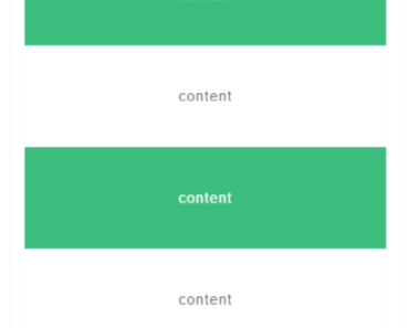
A vuejs(vue2) component for loading more data when the content was slide to the bottom on mobile, provided refresh function, supported SSR.
repository
https://github.com/livelybone/vue-slide-for-more.git
Demo
https://livelybone.github.io/vue/vue-slide-for-more/
Installation
npm i vue-slide-for-more -SGlobal name
VueBtn
Register the component
// import all import {SlideForMore, SlideForMoreBase} from 'vue-slide-for-more'; // import what you just need import SlideForMore from 'vue-slide-for-more/lib/umd/SlideForMore'; // or import SlideForMoreBase from 'vue-slide-for-more/lib/umd/SlideForMoreBase'; // Global register Vue.component('slide-for-more', SlideForMore); Vue.component('slide-for-more-base', SlideForMoreBase); // Local register new Vue({ components:{SlideForMore, SlideForMoreBase} })Use in html, see what your can use in CDN: unpkg
<-- use what you want --> <script src="https://unpkg.com/vue-slide-for-more/lib/umd/<--module-->.js"></script>Apply
SlideForMoreBase
// template <template> <SlideForMoreBase tipHeight="40px" :slideValue="100" :isSearching="isSearching"> <div class="top-tip" slot="topTip">{{isSearching?'正在刷新...':'刷新'}}</div> <div v-for="el in list">{{el}}</div> <div class="bottom-tip" slot="tip">{{isSearching?'正在查询...':'获取更多'}}</div> </SlideForMoreBase> </template>SlideForMore
// template. SlideForMore is a simple packaging of SlideForMoreBase <template> <SlideForMore tipHeight="40px" :slideValue="100" :isSearching="false"> <div v-for="el in list">{{el}}</div> </SlideForMore> </template>Props
| Name | Type | DefaultValue | Description |
|---|---|---|---|
tipHeight | String | 40px | Used to set the height of both div.slide-for-more-top-tip-wrap which shows refreshing and div.slide-for-more-tip-wrap which shows loading more |
slideValue | Number | 100 (px) | Used to set min value of slide distance to trigger events |
isSearching | Boolean | false | Used to tell the component whether you are searching or not. If you are searching, it will show the loading text. This is an important prop |
Events
| Name | EmittedData | Description |
|---|---|---|
refresh | none | Event for refresh |
slideDown | none | An alias of refresh event |
loadMore | none | Event for load more |
slideUp | none | An alias of loadMore event |
style
For building style, you can use the css or scss file in lib directory.
// scss import 'node_modules/vue-slide-for-more/lib/css/index.scss' // css import 'node_modules/vue-slide-for-more/lib/css/index.css'Or
// scss @import 'node_modules/vue-slide-for-more/lib/css/index.scss'; // css @import 'node_modules/vue-slide-for-more/lib/css/index.css';Or, you can build your custom style by copying and editing index.scss