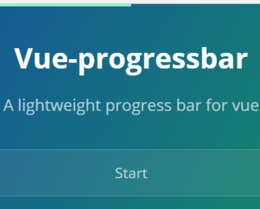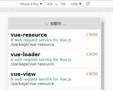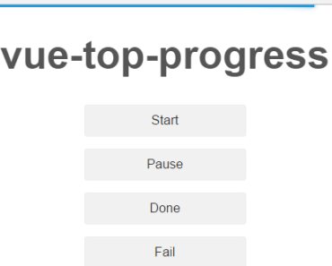
vue-top-progress 

Yet another top progress loading bar component for Vue.js.
Requirements
- Vue.js
^2.0.0
Installation
$ npm install vue-top-progressDemo
Usage
<template> <vue-topprogress ref="topProgress"></vue-topprogress> </template> <script> import vueTopprogress from 'vue-top-progress' Vue.use(vueTopprogress) // or import { vueTopprogress } from 'vue-top-progress' export default { mounted () { this.$refs.topProgress.start() // Use setTimeout for demo setTimeout(() => { this.$refs.topProgress.done() }, 2000) }, components: { vueTopprogress } } </script>Props
speed
Transition speed, in ms. Default: 350
easing
Transition function. Default: linear
color
Color of progress bar. Default: #29d
colorShadow
Shadow of progress bar. If omitted, will use progress bar color.
errorColor
Color of progress bar when status is error. Default: #f44336
height
Height of progress bar. Default: 3
trickle
Turn off the automatic incrementing behavior by setting this to false. Default: true
trickleSpeed
How often to trickle, in ms. Default: 250
minimum
Minimum percentage used upon starting. Default: 0.8
maximum
By default behavior, when progress start, it will never get to 100% until done or fail to be called. Setting this to adjust maximum percentage. Default: 97.5
zIndex
The z-index of component. Default: 9999