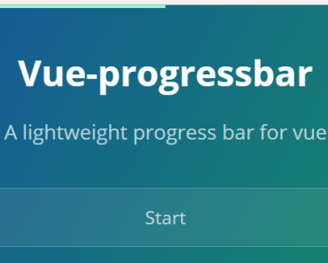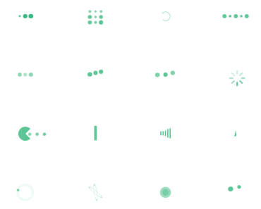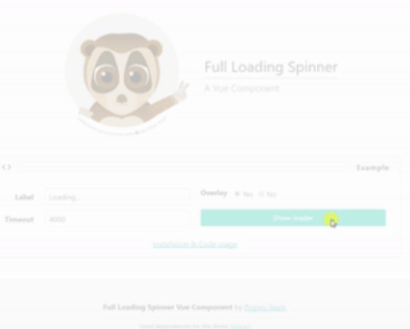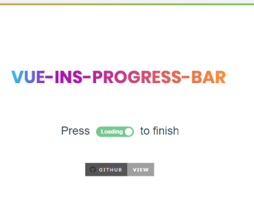
vue-progress-path


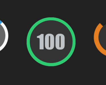
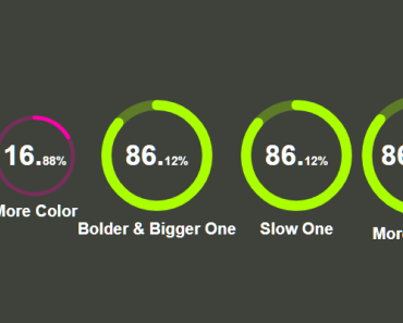
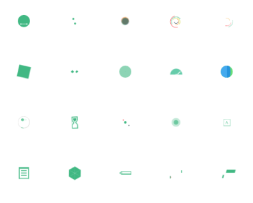
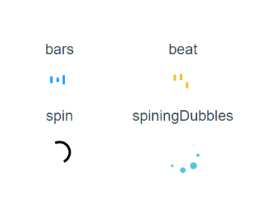
Progress bars and loading indicators that can take any form!
This library is Work In Progress.
Sponsors
Gold
Silver

Bronze
Installation
npm i -S vue-progress-path yarn add vue-progress-path Usage
import 'vue-progress-path/dist/vue-progress-path.css' import VueProgress from 'vue-progress-path' Vue.use(VueProgress, { // defaultShape: 'circle', })You can now use the <loading-progress> component.
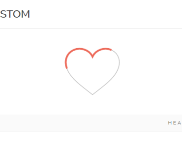
CSS customization example
You can customize the progress components with CSS:
.vue-progress-path path { stroke-width: 12; } .vue-progress-path .progress { stroke: red; } .vue-progress-path .background { stroke: #edd; }Examples
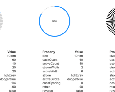
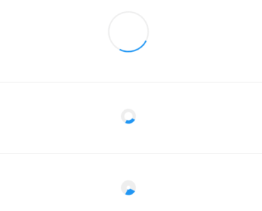
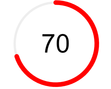
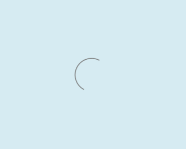
Google Material Design-like spinner:
<loading-progress :progress="progress" :indeterminate="indeterminate" :counter-clockwise="counterClockwise" :hide-background="hideBackground" size="64" rotate fillDuration="2" rotationDuration="1" />Semi-circle:
<loading-progress :progress="progress" :indeterminate="indeterminate" :counter-clockwise="counterClockwise" :hide-background="hideBackground" shape="semicircle" size="64" />Custom SVG path:
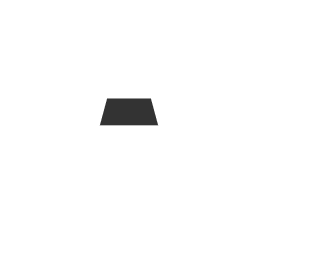
<loading-progress :progress="progress" :indeterminate="indeterminate" :counter-clockwise="counterClockwise" :hide-background="hideBackground" shape="M10 80 C 40 10, 65 10, 95 80 S 150 150, 180 80" size="180" fill-duration="2" />