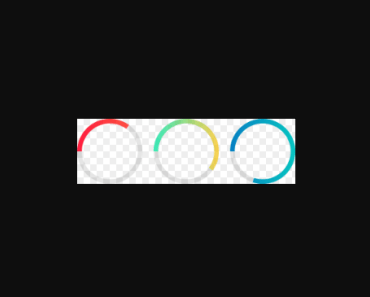
vue-progress
Progressbar.js as a Vue Component
How to use
install
npm i vue-progress -Simport as a vue plugin
import VueProgress from 'vue-progress' Vue.use(VueProgress)hello <progress-bar>
<template> <progress-bar type="line" ref="line" :options="options"></progress-bar> <!-- or --> <!-- <progress-bar type="line" ref="line" color="#007AFF" strokeWidth="0.5"></progress-bar> --> </template> <script> export default { data: { options: { color: '#007AFF', strokeWidth: 0.5 } }, mounted: function () { this.$refs.line.animate(1.0) } } </script> <style> html, body { margin: 0; padding: 0; } </style>ProgressBar component attributes
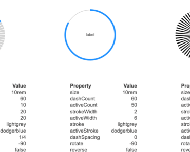
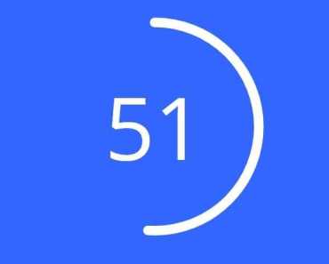
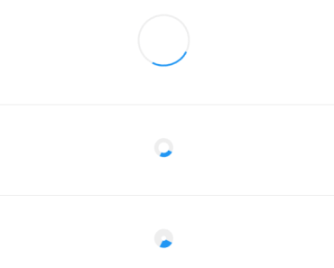
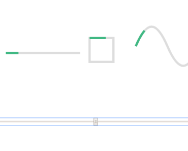
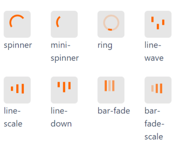
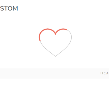
type: type of path line, circle, custom
options: Options for path drawing.
{ // Stroke color. // Default: '#555' color: '#3a3a3a', // Width of the stroke. // Unit is percentage of SVG canvas' size. // Default: 1.0 // NOTE: In Line shape, you should control // the stroke width by setting container's height. // WARNING: IE doesn't support values over 6, see this bug: // https://github.com/kimmobrunfeldt/progressbar.js/issues/79 strokeWidth: 2.1, // If trail options are not defined, trail won't be drawn // Color for lighter trail stroke // underneath the actual progress path. // Default: '#eee' trailColor: '#f4f4f4', // Width of the trail stroke. Trail is always centered relative to // actual progress path. // Default: same as strokeWidth trailWidth: 0.8, // Inline CSS styles for the created SVG element // Set null to disable all default styles. // You can disable individual defaults by setting them to `null` // If you specify anything in this object, none of the default styles // apply svgStyle: { display: 'block', // Important: make sure that your container has same // aspect ratio as the SVG canvas. See SVG canvas sizes above. width: '100%' }, // Text options. Text element is a <p> element appended to container // You can add CSS rules for the text element with the className // NOTE: When text is set, 'position: relative' will be set to the // container for centering. You can also prevent all default inline // styles with 'text.style: null' // Default: null text: { // Initial value for text. // Default: null value: 'Text', // Class name for text element. // Default: 'progressbar-text' className: 'progressbar__label', // Inline CSS styles for the text element. // If you want to modify all CSS your self, set null to disable // all default styles. // If the style option contains values, container is automatically // set to position: relative. You can disable behavior this with // autoStyleContainer: false // If you specify anything in this object, none of the default styles // apply // Default: object speficied below style: { // Text color. // Default: same as stroke color (options.color) color: '#f00', position: 'absolute', left: '50%', top: '50%', padding: 0, margin: 0, // You can specify styles which will be browser prefixed transform: { prefix: true, value: 'translate(-50%, -50%)' } }, // Only effective if the text.style is not null // By default position: relative is applied to container if text // is set. Setting this to false disables that feature. autoStyleContainer: true, // Only effective if the shape is SemiCircle. // If true, baseline for text is aligned with bottom of // the SVG canvas. If false, bottom line of SVG canvas // is in the center of text. // Default: true alignToBottom: true }, // Fill color for the shape. If null, no fill. // Default: null fill: 'rgba(0, 0, 0, 0.5)', // Duration for animation in milliseconds // Default: 800 duration: 1200, // Easing for animation. See #easing section. // Default: 'linear' easing: 'easeOut', // See #custom-animations section // Built-in shape passes reference to itself and a custom attachment // object to step function from: { color: '#eee' }, to: { color: '#000' }, step: function(state, circle, attachment) { circle.path.setAttribute('stroke', state.color); }, // If true, some useful console.warn calls will be done if it seems // that progressbar is used incorrectly // Default: false warnings: false }ProgressBar vm methods
svg()
Reference to SVG element where progress bar is drawn.
path()
Reference to SVG path which presents the actual progress bar.
trail()
Reference to SVG path which presents the trail of the progress bar. Returns null if trail is not defined.
text()
Reference to p element which presents the text label for progress bar. Returns null if text is not defined.
animate(progress, [options], [cb])
Animates drawing of a shape.
progress: progress from 0 to 1.options: Animation options. These options override the defaults given in initialization.
{ // Duration for animation in milliseconds // Default: 800 duration: 1200, // Easing for animation. See #easing section. // Default: 'linear' easing: 'easeInOut', // See #custom-animations section // Built-in shape passes reference to itself and a custom attachment // object to step function from: { color: '#eee' }, to: { color: '#000' }, step: function(state, circle, attachment) { circle.path.setAttribute('stroke', state.color); } }cb: Callback function which is called after animation ends.
set(progress)
Sets progress instantly without animation. Clears all animations for path.
stop()
Stops animation to its current position.
value()
Returns current shown progress from 0 to 1. This value changes when animation is running.
setText(text)
Sets text to given a string. If you need to dynamically modify the text element, see .text attribute.