


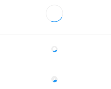
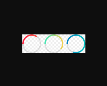
easy-circular-progress
Install
npm install easy-circular-progress --save Quick Start
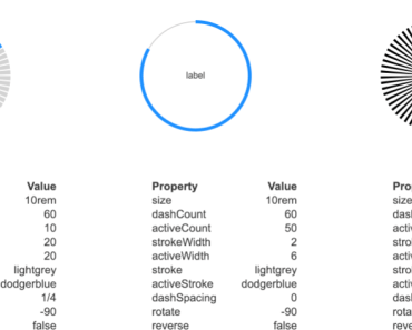
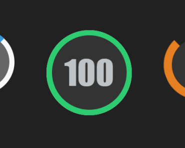
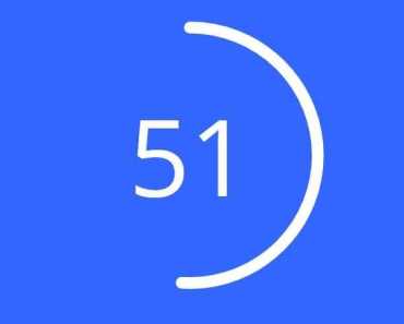
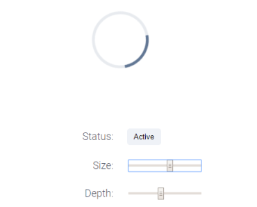
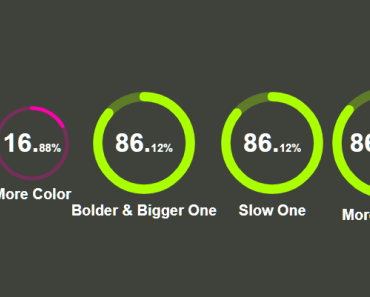
<template> <div id="app"> <Progress value="16.88"> <!-- <template v-slot:footer> <b>goood</b> </template>--> </Progress> <Progress strokeColor="#FF00AA" value="16.88"> <template v-slot:footer> <b>More Color</b> </template> </Progress> <Progress :radius="50" :strokeWidth="10" value="86.12"> <template v-slot:footer> <b>Bolder & Bigger One</b> </template> </Progress> <Progress :transitionDuration="5000" :radius="50" :strokeWidth="10" value="86.12" > <template v-slot:footer> <b>Slow One</b> </template> </Progress> <Progress :transitionDuration="5000" :radius="55" :strokeWidth="10" value="86.12567" > <template v-slot:footer> <b>More Precise</b> </template> </Progress> <Progress :transitionDuration="5000" :radius="55" :strokeWidth="10" value="86.12567"> <div class="content">hello</div> <template v-slot:footer> <b>More Precise</b> </template> </Progress> </div> </template> <script> import Progress from "./index.vue"; export default { name: "app", components: { Progress } }; </script> <style lang="scss"> #app { font-family: "Avenir", Helvetica, Arial, sans-serif; -webkit-font-smoothing: antialiased; -moz-osx-font-smoothing: grayscale; text-align: center; height: 100vh; color: #fff; background: #3e423a; display: flex; justify-content: center; align-items: center; } body { margin: 0; padding: 0; } </style> Prop Types
| Property | Type | Required? | Description |
|---|---|---|---|
| strokeWidth | Number | default is 4, the width of the progress circle, the bigger the bolder | |
| radius | Number | the inner circle radius, default is 38 | |
| transitionDuration | Number | default is 1000, transitionDuration for the animation | |
| strokeColors | String | default is "#aaff00" | |
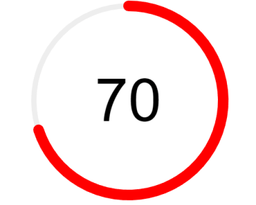
| value | Number | String | default is 0.0, should be less or equal then 100 |
Slot
| Slot Name | Description |
|---|---|
| footer | we can add a footer for the circle |
| default | the content displayed in the circle |
if default slot provided, the coutdown effect will be ignored.
Advance Guide
Customized Theme
- In your customized scss file (demo.scss)
$--circular-progress-int-fz: 28px; $--circular-progress-dec-fz: 12px; @import '~easy-circular-progress/src/index';- import the scss to override the default theme in main.js (entry file) before you import the Draw component
import './demo.scss';variables
We split the number into two parts (int, dec) We can define the font-size for each part
- $--circular-progress-int-fz: 28px;
- $--circular-progress-dec-fz: 12px;
Possibly Polyfill
Number.isNaN = Number.isNaN || function(value) { return value !== value; };License

Contributors
Thanks goes to these wonderful people (emoji key):
Vincent Guo |
This project follows the all-contributors specification. Contributions of any kind welcome!