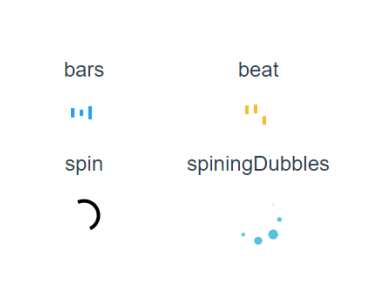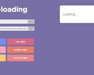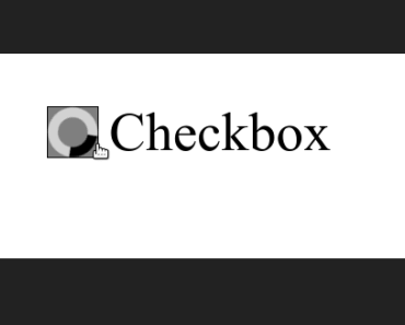

vue-loading-checkbox
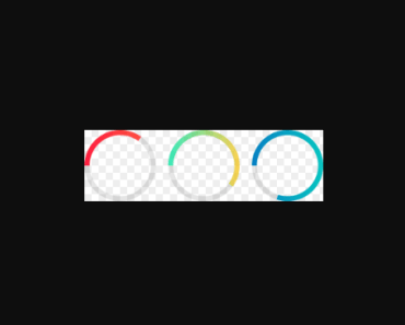
A vue UI component for loading checkbox
How to install
npm install vue-loading-checkbox --save How to use
Inside your .vue files
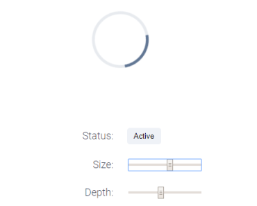
<template> <div id="your-component"> <!-- Using Component --> <loading-checkbox :checked="checked" :loading="loading" label="Title of checkbox" @click.native="toggleStatus" /> </div> </template> <script> // Importing Component and style import LoadingCheckbox from 'vue-loading-checkbox' import 'vue-loading-checkbox/dist/LoadingCheckbox.css' export default { name: 'YourComponentName', data() { return { checked: false, loading: false } }, methods: { toggleStatus() { this.loading = true setTimeout(() => { this.loading = false this.checked = !this.checked }, 2000) } }, components: { LoadingCheckbox // Registering Component } } </script>Component props
| prop | description | default |
|---|---|---|
borderColor | Color of checkbox border | black |
borderRadius | Border radius of checkbox | 0 |
borderStyle | Style of checkbox border, (solid, dashed, dotted, ...) | solid |
borderWidth | width of checkbox border. You have to insert unit (px,em...) | 1px |
checkColor | Color of check mark | white |
checked | Status of component. can be true(checked) or false(unchecked) | false |
checkedBackgroundColor | Background color of checkbox when status is checked | gray |
checkedBorderColor | Border color of checkbox when status is checked | null (same as borderColor) |
checkedBorderRadius | Border radius of checkbox when status is checked | null (same as borderRadius) |
checkedBorderStyle | Border style of checkbox when status is checked | null (same as borderStyle) |
checkedBorderWidth | Border width of checkbox when status is checked | null (same as borderWidth) |
checkIcon | Custom check mark image (.svg, png, etc). you have to pass it with require function | null A default pure css check |
checkIconPadding | Padding of the given custom check mark image (This will not affect the size) | null |
fontColor | Text color of label | black |
fontSize | Font size of label | null (calculated based on size) |
gap | Gap size between checkbox and its label in px. | null (calculated based on size) |
label | Label of checkbox | null (no label) |
loading | If true component is in loading state. it has a higher priority than checked | false |
loadingBackgroundColor | Background color of checkbox when status is loading | white |
loadingBorderColor | Border color of checkbox when status is loading | null (same as borderColor) |
loadingBorderRadius | Border radius of checkbox when status is loading | null (same as borderRadius) |
loadingBorderStyle | Border style of checkbox when status is loading | null (same as borderStyle) |
loadingBorderWidth | Border width of checkbox when status is loading | null (same as borderWidth) |
size | Size of component in px. | 30 |
spinnerColor | Color of spinner | black |
spinnerRingColor | Color of loading ring | lightgray |
uncheckedBackgroundColor | Background color of checkbox when status is unchecked | white |
uncheckedBorderColor | Border color of checkbox when status is unchecked | null (same as borderColor) |
uncheckedBorderRadius | Border radius of checkbox when status is unchecked | null (same as borderRadius) |
uncheckedBorderStyle | Border style of checkbox when status is unchecked | null (same as borderStyle) |
uncheckedBorderWidth | Border width of checkbox when status is unchecked | null (same as borderWidth) |
require function:
v-bind:checkIcon="require(@/assets/path/to/icon.svg)"
:checkIcon="require(@/assets/path/to/icon.svg)"
checkIcon="@/assets/path/to/icon.svg"
checkIcon="require(@/assets/path/to/icon.svg)"
Contributing
Visit CONTRIBUTING Page
Project setup
npm install Compiles and hot-reloads for development
npm run serve Compiles and minifies for production
npm run build-bundle Lints and fixes files
npm run lint License
MIT