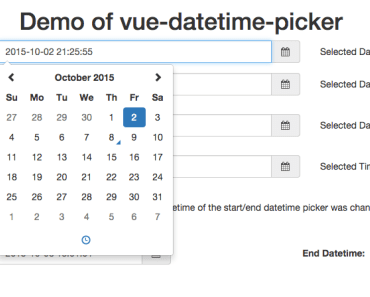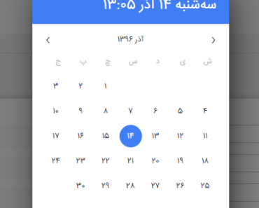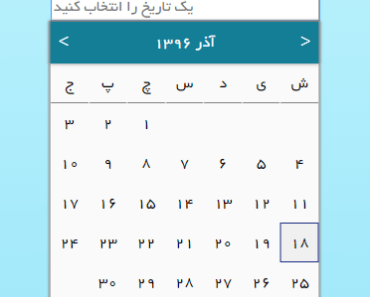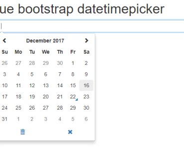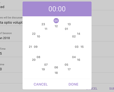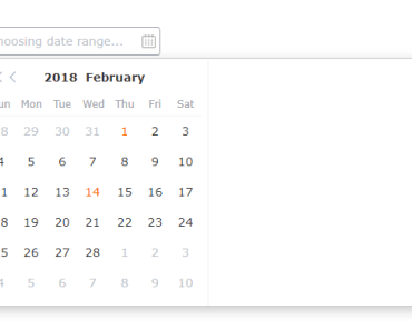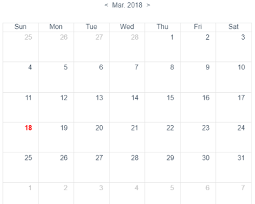
VueCtkDateTimePicker
A vue component for select dates (range mode available) & time
This documentation is for v2.*. Find v1 documentation here

Dark mode

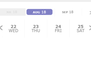
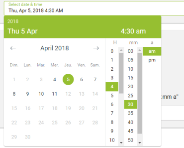
Demo
Installation
Yarn
yarn add vue-ctk-date-time-pickerNPM
npm i --save vue-ctk-date-time-pickerUsage
ES6 Modules / CommonJS
import VueCtkDateTimePicker from 'vue-ctk-date-time-picker'; import 'vue-ctk-date-time-picker/dist/vue-ctk-date-time-picker.css'; Vue.component('VueCtkDateTimePicker', VueCtkDateTimePicker);<VueCtkDateTimePicker v-model="yourValue" />UMD
<link rel="stylesheet" type="text/css" href="${YOUR_PATH}/vue-ctk-date-time-picker.css"> <div id="app"> <VueCtkDateTimePicker v-model="yourValue"></VueCtkDateTimePicker> </div> <script src="https://unpkg.com/vue" charset="utf-8"></script> <script src="${YOUR_PATH}/vue-ctk-date-time-picker.umd.min.js" charset="utf-8"></script> <script type="text/javascript"> Vue.component('vue-ctk-date-time-picker', window['vue-ctk-date-time-picker']); new Vue({ el: '#app', data () { return { yourValue: null } } }); </script>Here is an example of UMD implementation: https://codepen.io/louismazel/pen/jQWNzQ
Use custom element to trigger the component
<VueCtkDateTimePicker :no-value-to-custom-elem="(true|false)" /> ... <input type="text" /> ... or <button type="button">Label</button> ... </VueCtkDateTimePicker>Props API
| Props | Type | Required | Default |
|---|---|---|---|
| v-model | String | yes | - |
| id | String | no | DateTimePicker |
| format | String | no | 'YYYY-MM-DD hh:mm a' |
| formatted | String | no | 'llll' (momentjs format) |
| label | String | no | Select date & time |
| disabled | Boolean | no | false |
| hint (1) | String | no | - |
| error (2) | Boolean | no | false |
| color (3) | String (hex) | no | dodgerblue |
| button-color (4) | String (hex) | no | #00C853 |
| position | String | no | null |
| locale (5) | String | no | Browser Locale |
| persistent | Boolean | no | false |
| minute-interval | Integer | no | 1 |
| output-format | String | no | null |
| only-time | Boolean | no | false |
| only-date | Boolean | no | false |
| no-label | Boolean | no | false |
| no-header | Boolean | no | false |
| no-value-to-custom-elem (6) | Boolean | no | false |
| min-date (7) | String | no | - |
| max-date (7) | String | no | - |
| no-weekends-days | Boolean | no | false |
| auto-close | Boolean | no | false |
| inline | Boolean | no | false |
| overlay | Boolean | no | false |
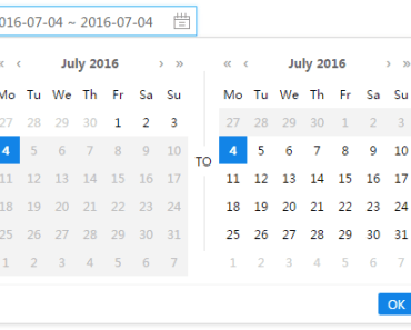
| range | Boolean | no | false |
| dark | Boolean | no | false |
| no-shortcuts | Boolean | no | false |
| no-button | Boolean | no | false |
| input-size | String (sm or lg) | no | null |
| button-now-translation | String | no | 'Now' |
| no-button-now | Boolean | no | false |
| first-day-of-week | Int (0 to 7) | no | - |
| disabled-dates (8) | Array<string> | no | [] |
| disabled-hours (9) | Array<string> | no | - |
| custom-shortcuts (10) | Array<object> | no | - |
| disabled-weekly (11) | Array<integer> | no | [] |
| no-keyboard (12) | Boolean | no | false |
| right (13) | Boolean | no | false |
| noClearButton | Boolean | no | false |
(1) hint : Is a text that replaces the label/placeholder (Ex : Error designation)
(2) error : When is true --> Input border & label are red
(3) color: Replace color for the hint, the borders & picker color
(4) button-color: Replace color for the buttons on bottom (validation & 'now')
(5) locale : Default value is the locale of the browser - Ex : Set locale="fr" to force to French language
(6) no-value-to-custom-elem : No value will set to your elem (you can get the formatted value with @formatted-value event)
(7) min-date && max-date should be in the same format as property format specified. If format not set - it is set to 'YYYY-MM-DD hh:mm a' by default
(8) Disabled-Dates is an Array of dates in 'YYYY-MM-DD' format (ex: ['2018-04-03', '2018-04-07', '2018-04-09'])
(9) disabled-hours : Must be an Array of hours in 24h format ('00' to '23') : ['00','01','02','03','04','05','06','07','19','20','21','22','23']
(10) custom-shortcuts - It's an Array of Objects like this :
[ { label: `Aujourd'hui`, value: 'day', isSelected: false }, { label: 'Yesterday', value: '-day', isSelected: false }, { label: 'This Week', value: 'week', isSelected: true }, { label: 'Last Week', value: '-week', isSelected: false }, { label: 'This iso Week', value: 'isoWeek', isSelected: true }, { label: 'Last iso Week', value: '-isoWeek', isSelected: false }, { label: 'This Month', value: 'month', isSelected: false }, { label: 'Last Month', value: '-month', isSelected: false }, { label: 'This Month', value: 'year', isSelected: false }, { label: 'Last Month', value: '-year', isSelected: false }, { label: 'Last 5 days', value: 5, isSelected: false } ]Shortcut types allowed : ['day', '-day', 'isoWeek', '-isoWeek', 'month', '-month', 'year', '-year', 'week', '-week']
If the value of shortcut is a number (Integer), this number correspond to number of day (for 5 --> Last 5 days)
You can use this feature for translate the shortcuts
When you set isSelected to true, the shortcut is selected by default
(11) disabled-weekly : Days of the week which are disabled every week, in Array format with day index, Sunday as 0 and Saturday as 6: [0,4,6]
(12) no-keyboard : Disable keyboard accessibility & navigation
(13) right : add this attribute to align the picker on right
Events API
| Event | Return |
|---|---|
| input | value (formatted with 'format' props) |
| formatted-value | value (formatted with 'formatted' props) |
| is-shown | Component is shown |
| is-hidden | Component is hidden |
| validate | Click on validate button (so component is closed) |
| destroy | Component is destroy |
Keyboard Accessible
| Key | Action |
|---|---|
| Arrow Right | Next Day |
| Arrow Left | Previous Day |
| Arrow Down | Same day on next week |
| Arrow Up | Same day on previous week |
| Page Down | Same day on previous month |
| Page Up | Same day on next month |
| Enter or Space | Select day |
| Escape | Close component |
Upcoming features (Todo)
- Double Calendar on RangeDatePicker (issue : #33)
- Inputs Text to choose values (issue #30)
- TimePicker seconds support (issue : #79)
Contribution
Project setup
npm installCompiles and hot-reloads for development
npm run serveLints and fixes files
npm run lintTests
Work in progress
License
This project is licensed under MIT License
Credit
Open source time proudly sponsored by Chronotruck