vue2-datepicker
A Datepicker Component For Vue2


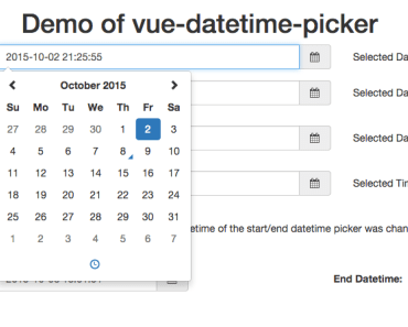
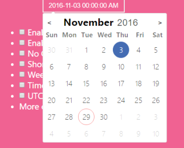
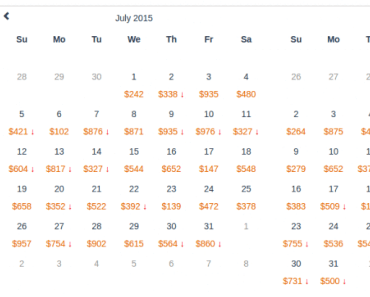
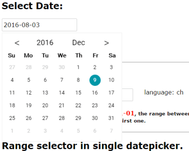
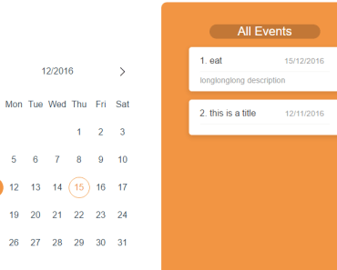
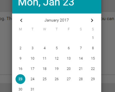
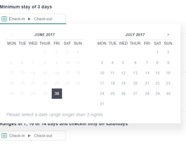
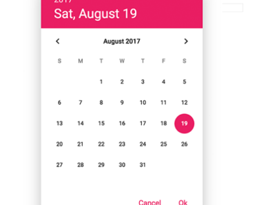
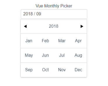
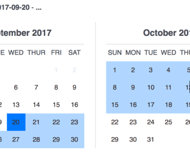
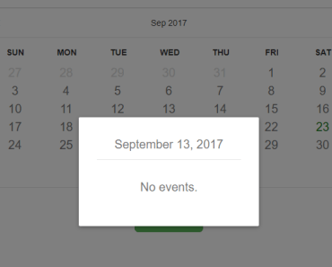
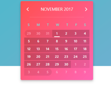
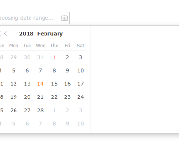
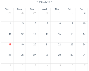
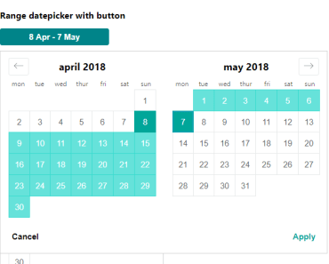
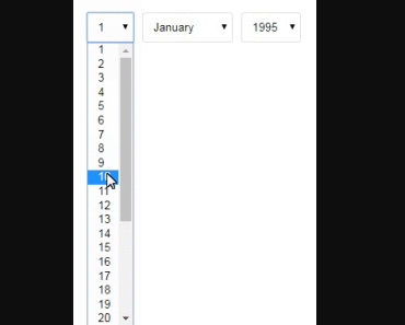
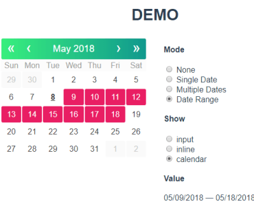
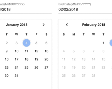
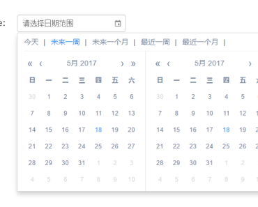
Demo
https://mengxiong10.github.io/vue2-datepicker/index.html

Install
$ npm install vue2-datepicker --saveUsage
<script> import DatePicker from 'vue2-datepicker'; import 'vue2-datepicker/index.css'; export default { components: { DatePicker }, data() { return { time1: null, time2: null, time3: null, }; }, }; </script> <template> <div> <date-picker v-model="time1" valueType="format"></date-picker> <date-picker v-model="time2" type="datetime"></date-picker> <date-picker v-model="time3" range></date-picker> </div> </template>Theme
If your project uses SCSS, you can change the default style variables.
To create a scss file. e.g. datepicker.scss:
$default-color: #555; $primary-color: #1284e7; @import '~vue2-datepicker/scss/index.scss';Internationalization
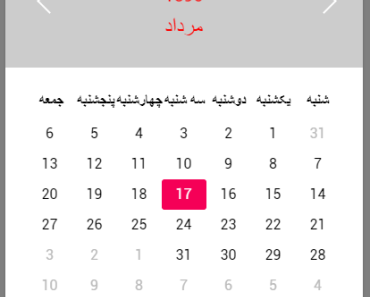
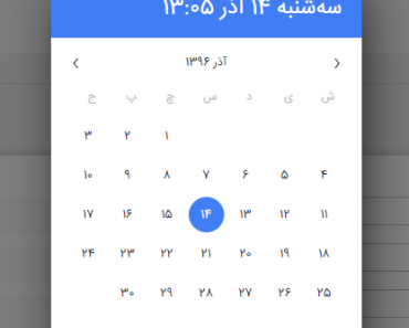
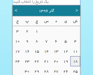
The default language of v3.x is English. If you need other locales. You can import locale file. Once you import a locale, it becomes the active locale.
import DatePicker from 'vue2-datepicker'; import 'vue2-datepicker/index.css'; import 'vue2-datepicker/locale/zh-cn';You can also override some of the default locale by lang. Full config
<script> export default { data() { return { lang: { formatLocale: { firstDayOfWeek: 1, }, monthBeforeYear: false, }, }; }, }; </script> <template> <date-picker :lang="lang"></date-picker> </template>Props
| Prop | Description | Type | Default |
|---|---|---|---|
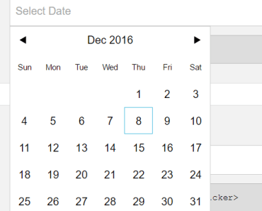
| type | select the type of picker | date |datetime|year|month|time|week | 'date' |
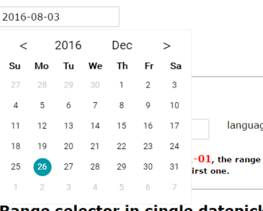
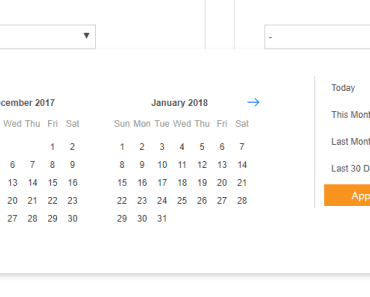
| range | if true, pick the range date | boolean | false |
| format | to set the date format. similar to moment.js | token | 'YYYY-MM-DD' |
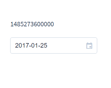
| value-type | data type of the binding value | value-type | 'date' |
| default-value | default date of the calendar | Date | new Date() |
| lang | override the default locale | object | |
| placeholder | input placeholder text | string | '' |
| editable | whether the input is editable | boolean | true |
| clearable | if false, don't show the clear icon | boolean | true |
| confirm | if true, need click the button to change value | boolean | false |
| confirm-text | the text of confirm button | string | 'OK' |
| disabled | disable the component | boolean | false |
| disabled-date | specify the date that cannot be selected | (date) => boolean | - |
| disabled-time | specify the time that cannot be selected | (date) => boolean | - |
| append-to-body | append the popup to body | boolean | true |
| inline | without input | boolean | false |
| input-class | input classname | string | 'mx-input' |
| input-attr | input attrs(eg: { name: 'date', id: 'foo'}) | object | — |
| open | open state of picker | boolean | - |
| popup-style | popup style | object | — |
| popup-class | popup classes | — | |
| shortcuts | set shortcuts to select | Array<{text, onClick}> | - |
| title-format | format of the tooltip in calendar cell | token | 'YYYY-MM-DD' |
| partial-update | whether update date when select year or month | boolean | false |
| range-separator | text of range separator | string | ' ~ ' |
| show-week-number | determine whether show week number | boolean | false |
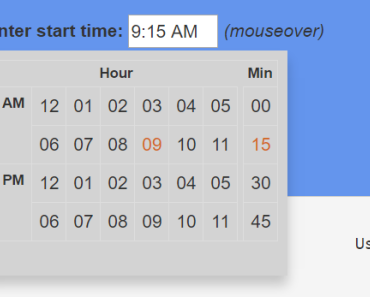
| hour-step | interval between hours in time picker | 1 - 60 | 1 |
| minute-step | interval between minutes in time picker | 1 - 60 | 1 |
| second-step | interval between seconds in time picker | 1 - 60 | 1 |
| hour-options | custom hour column | Array<number> | - |
| minute-options | custom minute column | Array<number> | - |
| second-options | custom second column | Array<number> | - |
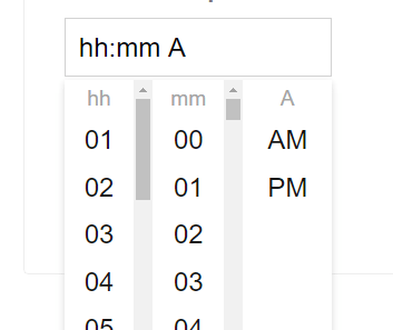
| show-hour | whether show hour column | boolean | base on format |
| show-minute | whether show minute column | boolean | base on format |
| show-second | whether show second column | boolean | base on format |
| use12h | whether show ampm column | boolean | base on format |
| show-time-header | whether show header of time picker | boolean | false |
| time-title-format | format of the time header | token | 'YYYY-MM-DD' |
| time-picker-options | set fixed time list to select | time-picker-options | null |
Token
| Uint | Token | output |
|---|---|---|
| Year | YY | 70 71 ... 10 11 |
| YYYY | 1970 1971 ... 2010 2011 | |
| Y | -1000 ...20 ... 1970 ... 9999 +10000 | |
| Month | M | 1 2 ... 11 12 |
| MM | 01 02 ... 11 12 | |
| MMM | Jan Feb ... Nov Dec | |
| MMMM | January February ... November December | |
| Day of Month | D | 1 2 ... 30 31 |
| DD | 01 02 ... 30 31 | |
| Day of Week | d | 0 1 ... 5 6 |
| dd | Su Mo ... Fr Sa | |
| ddd | Sun Mon ... Fri Sat | |
| dddd | Sunday Monday ... Friday Saturday | |
| AM/PM | A | AM PM |
| a | am pm | |
| Hour | H | 0 1 ... 22 23 |
| HH | 00 01 ... 22 23 | |
| h | 1 2 ... 12 | |
| hh | 01 02 ... 12 | |
| Minute | m | 0 1 ... 58 59 |
| mm | 00 01 ... 58 59 | |
| Second | s | 0 1 ... 58 59 |
| ss | 00 01 ... 58 59 | |
| Fractional Second | S | 0 1 ... 8 9 |
| SS | 00 01 ... 98 99 | |
| SSS | 000 001 ... 998 999 | |
| Time Zone | Z | -07:00 -06:00 ... +06:00 +07:00 |
| ZZ | -0700 -0600 ... +0600 +0700 | |
| Week of Year | w | 1 2 ... 52 53 |
| ww | 01 02 ... 52 53 | |
| Unix Timestamp | X | 1360013296 |
| Unix Millisecond Timestamp | x | 1360013296123 |
custom format
the format accepts an object to customize formatting.
<date-picker :format="momentForamt" />data() { return { // Use moment.js instead of the default momentForamt: { // Date to String stringify: (date) => { return date ? moment(date).format('LL') : '' }, // String to Date parse: (value) => { return value ? moment(value, 'LL').toDate() : null } } } } value-type
set the format of binding value
| Value | Description |
|---|---|
| 'date' | return a Date object |
| 'timestamp' | return a timestamp number |
| 'format' | returns a string formatted using pattern of format |
| token(MM/DD/YYYY) | returns a string formatted using this pattern |
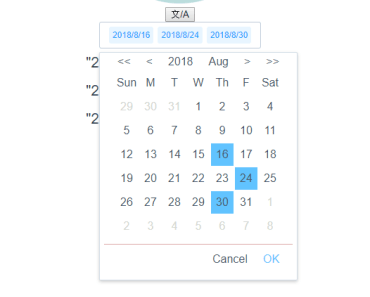
shortcuts
the shortcuts for the range picker
[ { text: 'today', onClick: () => new Date() }, { text: 'Yesterday', onClick: () => { const date = new Date(); date.setTime(date.getTime() - 3600 * 1000 * 24); return date; }, }, ];| Attribute | Description |
|---|---|
| text | title of the shortcut |
| onClick | callback function , need to return a Date |
time-picker-options
set fixed time list to select;
{start: '00:00', step:'00:30' , end: '23:30'}| Attribute | Description |
|---|---|
| start | start time |
| step | step time |
| end | end time |
Events
| Name | Description | Callback Arguments |
|---|---|---|
| input | When the value change(v-model event) | date |
| change | When the value change(same as input) | date, type(date, hour, minute, second, ampm) |
| open | When panel opening | |
| close | When panel closing | |
| confirm | When click 'confirm' button | date |
| clear | When click 'clear' button | |
| input-error | When user type a invalid Date | the input text |
| focus | When input focus | |
| blur | When input blur |
Slots
| Name | Description |
|---|---|
| icon-calendar | custom the calender icon |
| icon-clear | custom the clear icon |
| input | replace input |
| header | popup header |
| footer | popup footer |
| sidebar | popup sidebar |
ChangeLog
License
Copyright (c) 2017-present xiemengxiong