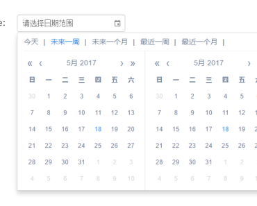
vue-date-range-picker
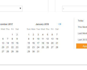
A vue component using Bootstrap 4 styles for date range selection
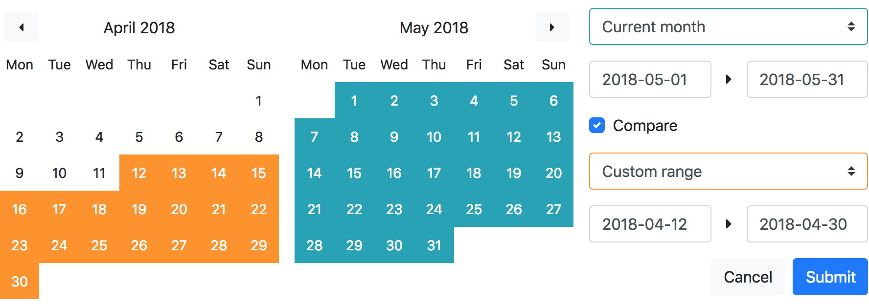
Features
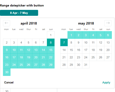
- Date range selection
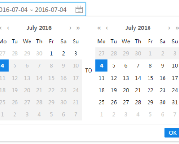
- Compare feature: select a second date range
- No integration: DIY with your favorite vue components or js libraries
- Bootstrap 4 styles (requires Bootstrap 4 CSS)
- Returns Moment.js instances (requires moment.js)
Installation
npm install --save @owumaro/vue-date-range-picker Usage
Webpack
JavaScript
// Import the component import DateRangePicker from '@owumaro/vue-date-range-picker' export default { // Register the component components: { DateRangePicker }, // Create a method for the submit event methods: { updateRanges: function(range) { ... } }, ... }HTML template
<date-range-picker v-on:submit="updateRanges" />API
Events
As the component needs to transmit multiple values (startDate, endDate, compare, startDateCompare, endDateCompare), it can not use v-model.
Instead, it triggers 2 events:
submit: when the submit button is clicked; provides anObjectargument with the 5 attributes mentioned abovecancel: when the cancel button is clicked
Props
| Prop | Type | Default | Description |
|---|---|---|---|
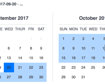
calendar-count | Number | 2 | Number of calendars to display |
allow-compare | Boolean | true | Enable/disable the comparison feature |
ranges | Object | { currentMonth: { ... }, lastMonth: { ... } } | Predefined ranges displayed in select menu(s) |
default-range-select | String | currentMonth | Key of the range to select by default |
default-range-select-compare | String | lastMonth | Key of the range to select by default (compare) |
Development
Project setup
npm install Compiles and hot-reloads for development
npm run serve Compiles and minifies
npm run build Inspiration
- Google Analytics date range picker
- https://github.com/dangrossman/daterangepicker
TODO
- Tests
- CSS without bootstrap dependency