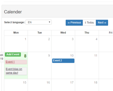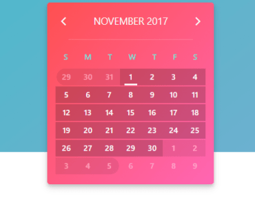
Kalendar


Your best friend when it comes to events managment in Vue, React or Angular. This is the Vue version of this plugin.
Live Demo
Getting Started
- Install plugin from npm
npm install kalendar-vue -S - Import plugin in your component
import { Kalendar } from 'kalendar-vue'; import 'kalendar-vue/dist/KalendarVue.css'; ... components: { Kalendar, ... },- Provide Appointments array. This array will be the source of the appointments which are rendered in the calendar.
<template> <kalendar :configuration="calendar_settings" :appointments="appointments"/> </template> <script> ... data: () => ({ appointments: [], calendar_settings: { style: 'material_design', // ['flat_design', 'material_design'] view_type: 'Month', // ['Month', 'Day'] split_value: 20, // Value % 60 === 0 cell_height: 20, // !isNaN(Value) scrollToNow: true, // Boolean current_day: new Date(), // Valid date military_time: true, // Boolean }, ... }) </script>Using Slots
The plugin can turn incredibly useful using scoped slots. You can customize all the essential parts of it.
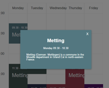
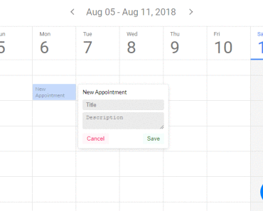
<kalendar :configuration="calendar_settings" :appointments="appointments" class="generate-shadow"> <div slot="creating-card" slot-scope="{appointment_props}"> <!-- This is the card that is displayed while the user is dragging mouse on cells --> <!-- You can access various attributes of that selection using the slot scope appointment_props. It contains fields like: start_value, end_value and status. --> <h4 class="appointment-title" style="text-align: left;">New Appointment</h4> <span class="time">{{appointment_props.start_value.value}} - {{appointment_props.end_value.value}} </span> </div> <div slot="popup-form" slot-scope="{popup_scope}" style="display: flex; flex-direction: column;"> <!-- This is the popup that is displayed when user has finished dragging(selecting) appointment start and end values. --> <!-- You can use the popup_scope variable to access various fields, such as: appointment_data (similar to appointment_props) and close. --> <!-- There is a listener attached to the close field. Whenever it gets a false value, the popup closes. --> <!-- You can add as many fields as you want. When saving them, make sure to insert them in the data field of the payload for appointments array. In that way you can access them even in the *details-card* slot.--> <h4 style="margin-bottom: 10px">New Appointment</h4> <input v-model="new_appointment['title']" type="text" name="title" placeholder="Title"> <textarea v-model="new_appointment['description']" type="text" name="description" placeholder="Description" rows="2"></textarea> <div class="buttons"> <button class="cancel" @click="popup_scope.close_popup = true">Cancel</button> <button @click="completeAppointment(popup_scope, new_appointment)">Save</button> </div> </div> <div slot="details-card" slot-scope="{appointment_props}"> <!-- Similar to creating-card, except that this one is displayed for existing appointments. --> <!-- Here you can access the data object, aswell as other fields. Data field is where you save the values from the popup form, which are then accessible here. --> <h4 class="appointment-title">{{appointment_props.data.title}}</h4> <small v-show="(appointment_props.end - appointment_props.start) > 2">{{appointment_props.data.description}}</small> <span class="time">{{appointment_props.start_value.value | normalizeDate('hh:mm A')}} - {{appointment_props.end_value.value | normalizeDate('hh:mm A')}}</span> </div> <!-- Date formatting --> <template slot="first-date" slot-scope="{ date }"> <!-- Displays first date in week navigation header --> {{ date | normalizeDate('MMM DD') }} </template> <template slot="last-date" slot-scope="{ date }"> <!-- Displays last date in week navigation header --> {{ date | normalizeDate('DD MMM, YYYY') }} </template> <template slot="current-date" slot-scope="{ date }"> <!-- Displays current date in single day navigation --> {{ date | normalizeDate('DD MMM, YYYY') }} </template> <template slot="number-date" slot-scope="{ date }"> <!-- Day number in day indicators --> {{ date | normalizeDate('D') }} </template> <template slot="letters-date" slot-scope="{ date }"> <!-- Weekday name in day indicators --> {{ date | normalizeDate('ddd') }} </template> </kalendar> <script> ... completeAppointment(popup_data, form_data) { let payload = { data: { title: form_data.title, description: form_data.description, }, from: popup_data.appointment_props.start_value.value, to: popup_data.appointment_props.end_value.value, date: format(popup_data.appointment_props.start_value.value, 'YYYY-MM-DD'), }; this.appointments.push(payload); this.new_appointment = { title: null, description: null, }; popup_data.close_popup = true; }, </script>Slots summary
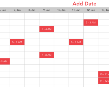
Appointment cards
| Slot name | Slot scope | Description |
|---|---|---|
| creating‑card | { appointment_props } | Displayed while the user is dragging mouse on cells |
| details‑card | { appointment_props } | Similar to creating-card, except that this one is displayed for existing appointments |
| popup‑form | { popup_scope } | Displayed when user has finished dragging (selecting appointment start and end values) |
Date representations
Useful for localizing dates
| Slot name | Slot scope | Description |
|---|---|---|
| first‑date | { date } | Displays first date in week navigation |
| last‑date | { date } | Displays last date in week navigation |
| current‑date | { date } | Displays current date in single day navigation |
| number‑date | { date } | Displays day number in day indicators |
| letters‑date | { date } | Displays weekday name in day indicators |
Roadmap
⚠️ Refactor so code is readable/understandable and others can help- Add Read-Only mode
- Remove date-fns dependency
- Improve performance
- Hard-code split value to 5mins, and use split-value-prop to only mark current_min%split-value-prop === 0
- Using upmentioned technique, day hours can be hardcoded into JSON, while the date part would come in from
for inloop - Use event delegation and remove listeners from every cell. Use event target instead, to manipulate the cell DOM object.
- Add month view
- Write docs
- Write unit-tests
- Write the React version of this plugin
- Write the Angular version of this plugin