- Introduction
- Demo
- Features
- Browser Compatibility
- Installation and Usage
- Props
- Calendar Event Properties
- Component Events
- Slots
- event
- Customizing the Look and Feel
- Future plans
- Day classes
- FAQ
- Build Setup
Introduction
vue-simple-calendar is a flexible, themeable, lightweight event calendar component for Vue.
The current release is 4.2.2. The master branch of this document and the code may contain unreleased changes. See the CHANGELOG for details.
There are other great calendar components out there, but most are either intended to be used as date pickers, or had way too many features for me. I wanted something that would simply show a month as a grid, and show events (including multi-day events) on that grid. While the component goes beyond that simple use case, that is still the core focus.
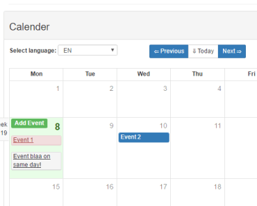
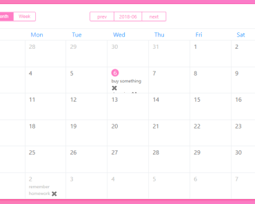
Demo
Here's a live demo page, and the repo for it: https://www.tallent.us/vue-simple-calendar/ https://github.com/richardtallent/vue-simple-calendar-sample
Features
- Shows a traditional month-grid calendar--or week, or year, or multiples of those.
- Can show "events," including multi-day events, with optional times.
- If there are too many events to see in a week, you can scroll to see the others.
- If there are too many weeks to see in the calendar component, you can scroll to see the others.
- Optional support for dragging and dropping events between dates.
- Automatic localization / internationalization (can be overridden).
- Lightweight!
- Flexbox layout (look ma, no tables!).
- No external dependencies (Moment, JQuery, etc.).
- User events (clicks, drags, etc.) are emitted to the parent component.
- Weeks can start on any day of the week (defaults to Sunday).
- Easy to theme (using CSS) to integrate with your own site
- Easy to customize using Vue slots
What this component doesn't try to do:
- There will be no "agenda" view (time-of-day grid). Adding this view would require too much additional complexity.
- There is no interface for managing events. This is far too use-specific.
- There is no built-in AJAX mechanism. This is also far too use-specific.
- Only the Gregorian calendar is supported (7-day weeks, etc.).
- It is not yet possible to drag events in a way that would add or remove days. This may be added in the future.
- There is no ability to drag and select a set of days (only single-day clicks are emitted as events). This may be added in the future.
Browser compatibility
The intent is to maintain compatibility with Chrome, Firefox, IE11, Edge, OS X Safari, iOS Safari, and the Android Silk browser. Note that this component is designed first for desktop web applications, not mobile, so while the component may operate on a mobile device, the limited resolution may not allow for much in the way of useful functionality.
The ES6 language features used in this component are converted to ES5 by Babel using webpack. However, if you're targeting IE11 or another ancient browser, you'll need to import babel-polyfill in your webpack entry file so it sets up the additional functions not supported by your browser. These polyfills can't be included in a project more than once, which is why they are not used in the compilation step for this component prior to being published on npm. If you aren't using webpack, you'll need to include the polyfill using a <script> tag. The details of using these polyfills is outside the scope of this documentation.
Drag and drop only works on desktop browsers -- the drag events on touch devices are very different, I haven't had time to dig into them yet.
Browsers and Localization
Note that Intl is not supported for Safari 9.1, iOS 9.3, and Opera Mini. For these browsers, the month names and weekday names will be blank and the calendar will have a nointl class. Use CSS content to provide the appropriate month and weekday names for the languages you support. For example:
.calendar.nointl.locale-en.m01 .monthName::after { content: 'January'; }Installation and Usage
(This assumes you already have a web application set up for using Vue. If you're starting a new project, look up the documentation for the Vue CLI, which will allow you to initialize a new project with webpack, etc.)
Install the component using npm:
npm i --save vue-simple-calendarIn your application, you'll need to:
- import the component and register it with Vue
- import the default theme or any other theme you want to use (CSS)
- create the
calendar-viewandcalendar-view-headerelements - wire up the properties and events
Tips:
- The component will fill its parent's height and width, so be sure the parent has a minimum height that is appropriate for the number of weeks and average events per week being shown.
- The default calendar header emits an
inputevent when a user clicks a button in the header to move the calendar backward or forward through time. The event's argument is the new date to be shown. You have to handle this event and pass the date back to the calendar to change the view. - To minimize impact of ancestor element layout on the calendar's functionality, it is recommended that the parent of the
<calendar-view>component only contain the component, and that the parent have the following styles (#71):
display: flex; flex-direction: column; flex-grow: 1;Here's a minimal application example for a calendar with no events, but styled with the default theme and the US holidays theme:
<template> <div id="app"> <h1>My Calendar</h1> <calendar-view :show-date="showDate" class="theme-default holiday-us-traditional holiday-us-official"> <calendar-view-header slot="header" slot-scope="t" :header-props="t.headerProps" @input="setShowDate" /> </calendar-view> </div> </template> <script> import { CalendarView, CalendarViewHeader } from "vue-simple-calendar" // The next two lines are processed by webpack. If you're using the component without webpack compilation, // you should just create <link> elements for these. Both are optional, you can create your own theme if you prefer. require("vue-simple-calendar/static/css/default.css") require("vue-simple-calendar/static/css/holidays-us.css") export default { name: 'app', data: function() { return { showDate: new Date() } }, components: { CalendarView, CalendarViewHeader, }, methods: { setShowDate(d) { this.showDate = d; }, } } </script> <style> #app { font-family: 'Avenir', Helvetica, Arial, sans-serif; color: #2c3e50; height: 67vh; width: 90vw; margin-left: auto; margin-right: auto; } </style>Props
The following properties are supported, roughly in order of popularity. Remember to use kebab-case when specifying these properties using attributes on the calendar-view element (e.g., <calendar-view month-name-format="long">:
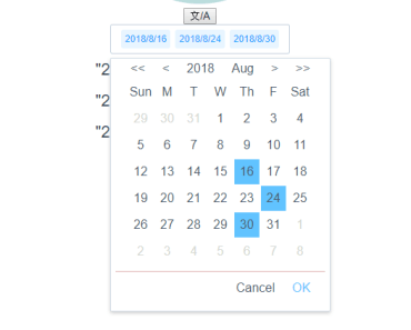
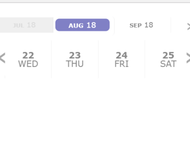
showDate- The period to show by default. Defaults to today's date (user local time). Any time component is ignored.displayPeriodUom- The period type to show. By default this ismonth, i.e., it shows a calendar in month-sized chunks. Other allowed values areyearandweek.displayPeriodCount- The number of periods to show within the view. For example, ifdisplayPeriodUomisweekanddisplayPeriodCountis 2, the view will show a two-week period.events- An array of events to show on the calendar. See Calendar Event Properties below for more details.showEventTimes- If true, shows the start and/or end time of an event beside the event title. Midnight is not shown, a midnight time is assumed to indicate an all-day or indeterminate time. (If you want to show midnight, use00:00:01and don't choose to show seconds.) The default isfalse.enableDragDrop- If true, events are draggable, and dragging and dropping them emits events you can catch and respond to. Default isfalse. (Note: since this is a Boolean value, you should usev-bindon the attribute.)disablePast- If true, prevents the user from navigating to previous periods. Default isfalse. (Note: since this is a Boolean value, you should usev-bindon the attribute.)disableFuture- If true, prevents the user from navigating to future periods. Default isfalse. (Note: since this is a Boolean value, you should usev-bindon the attribute.)locale- The BCP 47 language tag used to determine the month and day names. Defaults to the user's browser language setting.startingDayOfWeek- The day of the week that starts each week. Defaults to0(Sunday), valid range is 0-6. Common non-default values would be1(Monday) for Europe or6(Saturday) for much of the Middle East.monthNameFormat- The format to use for the month names. Possible values arenumeric,2-digit,narrow,short, orlong, and the default islong.weekdayNameFormat- The format to use for the names of the days of the week. Possible values arenarrow,short, orlong, and the default isshort.timeFormatOptions- This takes an object containingIntl.DateTimeFormatoptions to be used to format the event times. Thelocalesetting is automatically used. This option is ignored for browsers that don't supportIntl(they will see the 24-hour, zero-padded time).dateClasses- Optional object, where the key is a date in ISO form (e.g., "2018-04-15") and the value is a string or array of additional CSS classes that should be applied to the main element for that date. This could be useful for dynamically highlighting selected dates, holidays, blocked-off dates, etc.eventTop- Optional string of a CSS height to be used as the baseline for where events are positioned relative the top of the week. By default, this is1.4em, the height of the standardcv-day-numberelement.eventContentHeight- Optional CSS string of the total height of your events, not including borders. The default is1.4em(1.0 from the font, 0.2 * 2 from the padding.). You would only set this if you're overriding the event height. This doesn't actually change the event height, it is only used to position the events below one another.eventBorderHeight- Optional CSS string of the sum of your events' top and bottom borders. The default is2px. You would only set this if you're overriding the event top and/or bottom border width. This doesn't actually change the borders, it is only used to position the events below one another.periodChangedCallback- Optional function to be called calendar updates initially and any time thereafter where the date range shown on the calendar changes. This is intended to allow your application to, say, query a back-end server to update theeventsproperty based on the date range visible in the calendar. When your function is called, it is passed an object as the argument, with four keys:periodStart/periodEnd(the dates that fall within the range of the months being shown) anddisplayFirstDate/displayLastDate(the dates shown on the calendar, including those that fall outside the period). See CHANGELOG for details on why I'm using a functional property rather than emitting an event.currentPeriodLabel- Optional label for the "Today" button (the button in the header to return to the current period). If blank, this will show the current date period (i.e., the period where today's date would fall). If this has the special valueicons, it will display an icon, where the icon depends on whether the current date period is in the past, is the displayed period, or is in the future. The default icons for this are⇤,-, and⇥, respectively. If you use any other string, the button will show the literal value you provide.currentPeriodLabelIcons- Optional replacement for the above three icons. Pass this as a three-character string.
Calendar Event Properties
Each event shown on the calendar can have the following properties. id and startDate are required, and title is strongly recommended.
id- A unique identifier for the event. This is required and must be unique.startDate- The date the event starts on the calendar. This must be either passed as a JavaScript date object, or as a string following an ISO-like form of "yyyy-mm-dd HH:MM:SS" (time is optional, and within time, minutes and seconds are both optional).endDate- The date the event ends on the calendar. Defaults to the same date asstartDate. This must be either passed as a JavaScript date object, or as a string following an ISO-like form of "yyyy-mm-dd HH:MM:SS" (time is optional, and within time, minutes and seconds are both optional).title- The name of the event shown on the calendar. Defaults to "Untitled".url- The URL associated with the event. The component has no built-in action associated with this, but it does add a "hasUrl" class to the event. To "follow" the URL, you'll need to listen for theclick-eventevent and take the appropriate action.classes- A String with any additional CSS classes you wish to assign to the event.style- A String with any additional CSS styles you wish to apply to the event.
Component Events
The following Vue events are raised by the component, which you can catch in your calling application to respond to user actions:
click-date(date, windowEvent): fired when user clicks a dateclick-event(calendarEvent, windowEvent): fired when user clicks on an eventdrag-start(calendarEvent): fires when user starts dragging an eventdrag-enter-date(calendarEvent, date): fires when an event is dragged over a datedrag-leave-date(calendarEvent, date): fires when an event is dragged out of a date without dropping it theredrag-over-date(calendarEvent, date): fires multiple times as an event is hovered over a datedrop-on-date(calendarEvent, date): fired when an event is dropped on a date
*Note in the above, calendarEvent refers to the normalized version of the calendar "event" involved in the activity. For more information, see the "event" slot below.
Slots
header
This named slot contains the component you want to use as the calendar's header. Generally, this would show the current date range, and allow the user to navigate back and forth through time. If you don't provide a component for this slot, there will be no header, just the calendar grid. This component comes with a nice default header component, CalendarViewHeader, which you can either use directly, or use as a template for creating your own. (Prior to 4.0, if you didn't provide a component, a default header would be shown. That is no longer the case for reasons explained in the CHANGELOG.)
<calendar-view :show-date="myShowDate"> <calendar-view-header slot="header" slot-scope="{ headerProps }" :header-props="headerProps" @input="setMyShowDate" /> </calendar-view>The parent calendar-view passes a property called headerProps to the header component. This property includes all of these values (basically, anything you would normally need to render a calendar header):
- periodStart: the first date of the
displayPeriodUomcontainingshowDate - periodEnd: the last date of the
displayPeriodUomcontainingshowDate(thedisplayPeriodCountsetting impacts this) - previousYear: one year before
periodStart - previousPeriod: one
displayPeriodUombeforeperiodStart(regardless of thedisplayPeriodCountsetting) - nextPeriod: one
displayPeriodUomafterperiodStart(regardless of thedisplayPeriodCountsetting) - previousFullPeriod: one
displayPeriodUombeforeperiodStart(takes thedisplayPeriodCountsetting into consideration) - nextFullPeriod: one
displayPeriodUomafterperiodStart(takes thedisplayPeriodCountsetting into consideration) - nextYear: one year after
periodStart - currentPeriod: the date at the beginning of the
displayPeriodUomcontaining today's date (user local time) - currentPeriodLabel: the computed label (using the logic described for the property of the same name on the calendar component above) of the period containing today's date.
- displayLocale: the user's locale setting
- displayFirstDate: the first date shown in the calendar (may differ from
periodStart--e.g., if periodStart is June 1, 2018, displayFirstDate will be May 27, 2018) - displayLastDate: the last date shown in the calendar (ditto)
- monthNames: an array of the formatted names of the months to use based on the locale and month format settings
- fixedEvents: an copy of the
eventsproperty, normalized to all have start/end dates, "Untitled" if there is no title, etc.
Since CalendarView has some logic around whether the user should be able to navigate to the past or the future, some of these dates will be null if the corresponding action is disabled.
The developer implementing her own header simply needs to create a header component that, like the default header component:
- Receives this information and displays it with appropriate UI elements (suggested property name:
headerProps) - Emits an event when the user wants to change the calendar period (suggested event name:
input)
Note above that both previousPeriod and previousFullPeriod are provided, as well as nextPeriod and nextFullPeriod. The reason for this distinction is to allow the developer to decide how the calendar's Previous and Next buttons should move through time if displayPeriodCount is greater than 1. My personal preference is to move forward and backward by one week / month, allowing the user to pinpoint the exact date window they wish to see. But in some applications (a "quarterly" calednar, for example, or a calendar with set two-week periods), it may be better for the buttons to jump backward and forward based on the displayPeriodCount setting. This gives the developer both options -- just choose which interaction you want to use, and use those dates to set the new showDate.
dayHeader
This optional named slot replaces the default div.day elements that appear in the column headers for each day of the week. If all you need to do is change how the names are shown, it's probably better to override the locale and/or weekdayNameFormat property. This slot is intended for situations where you need to override the markup within each header cell. For example, if you want each day of the week to be clickable.
This slot passes two scoped variables: index, 0-7, and label, the text it would have used in the header based on the current locale and weekdayNameFormat.
dayContent
This optional named slot allows you to provide your own contents within the date cell. The day of the month is rendered in a separate (sibling) element with the class cv-day-number, so you should use CSS to hide this class if you want your slot to be the only content in the cell. Note that events are rendered above the individual date cells, so your slot content will appear below any events on that day.
This slot passes one scoped variable: day, the date associated with the cell.
event
This optional named slot replaces the div.event for each event (not just the contents of the event element, the entire element). Use this if you want to override entirely how events are rendered. For example, on a small mobile device, you may want to show just a thin stripe, dots, or icons to indicate events, without titles or times. This slot passes three scoped variables:
event: the normalized calendar eventweekStartDate: the date of the first day of the week being renderedtop: the CSStopvalue that you should apply to the style of your event element so it appears in the proper place. Assumes standard metrics for events, so if you have your own metrics, you'll need to compute and apply the top position yourself using theeventRowvalue passed in the event.
Note that event is a version of the calendar event normalized to be shown on that week's row, it's not the bare event pulled from the events prop. This customized version parses and defaults the startDate and endDate, defaults missing id to a random number, defaults a blank title to "Untitled", and adds a number of classes values based on the position and role of the event as shown for that week (whether it continues from the previous week, etc.). The original event is passed back as event.originalEvent.
Customizing the Look and Feel
In addition to slots, this component is designed to allow for significant customization of the look and feel solely through CSS. Here's the structure of the markup generated by the component (combined with the default header component). Each line represents a Vue SLOT (all caps) or an HTML element (first word on the line). Indentation represents the hierarchy. Each word after the first word is a class applied to the element. Classes in (parenthesis) are conditional. Loops (i.e., v-for) are shown in [brackets].
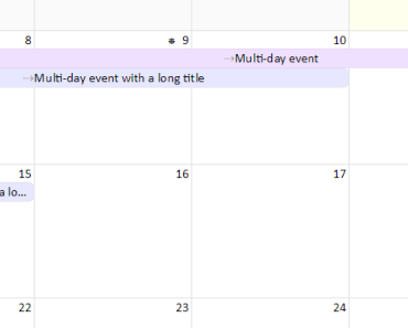
Note that the events are not child nodes of the days, they are children of the week and positioned above the days. This allows events to span multiple days.
div cv-wrapper locale-X yYYYY mMM (past|future) period-X periodCount-X wrap-event-title-on-hover HEADER div cv-header div cv-header-nav button previousYear button previousPeriod button nextPeriod button nextYear button currentPeriod div periodLabel div startMonth div startDay div startYear div endMonth div endDay div endYear div cv-header-days div cv-header-day dowX [x7] div cv-weeks div cv-week weekX wsYYYY-MM-DD [x # weeks in visible period] div cv-day dowX dYYYY-MM-DD dMM-DD dDD wmX (past|today|future|last|outsideOfMonth|lastInstance) [x 7] div cv-day-number DAYCONTENT EVENT div cv-event offsetX spanX (continued|toBeContinued|hasUrl) [x # of events] span startTime (hasEndTime) span endTime (hasStartTime) where:
Calendar classes
locale-X
Two locale classes are added--one for the user's full locale, the other for just the first two letters (the language), both in lowercase. You could use this information to hide or show specific holidays, or to localize text using CSS content. Example:
locale-en locale-en-us
yYYYY
The full year of the starting period of the current view.
mMM
The month (01-12) of the starting period of the current view.
(future|past)
When the period shown does not include today's date (local time), one of these classes is added. By default, this shows and hides and determines the label for the button that returns the view to the current period.
period-X
The current displayPeriodUom value (year, month, or week).
periodCount-X
The current displayPeriodCount value (a number, usually 1).
Week classes
weekX
Each week is numbered, starting with the first week of the visible period.
wsYYYY-MM-DD
Each week also has a class representing the date of the Sunday starting that week. This could be used to style entire weeks that have some special importance.
wrap-event-title-on-hover
If an even title is truncated, this enables an optional behavior that will wrap the event to show the entire title when the user hovers over it.
Day classes
dowX
This class is for the day of the week, ranging from 0 to 6. This allows you to easily style certain days of the week (say, weekend days) differently from other days. The same class is also added to the weekday headers.
dYYYY-MM-DD / dMM-DD / dDD
Each day in the grid is given three special classes -- one for the month and day (01/01-12/31), one for the day (01-31), and one for the entire ISO 8601 date. This allows easy styling of holidays and other special days using CSS alone (rather than using events).
The demo calendar has some examples of using these to add holiday emoji beside the day numbers. Example:
d2017-05-23 d05-23 d23
instanceX
The instance of the weekday within the day's month. For example, the class instance1 is added to the first Sunday, Monday, etc. of the month. Note that since this is relative to the day, not the "main" month being shown, days visible from the previous or next month will also have these classes, relative to their own month.
This makes it easy to style, say, the first and third Friday of each month. The demo app has some custom styles using this feature to add emoji to Labor Day and Thanksgiving.
lastInstance
Added to the last instance of a particular day of the week within its month (as above, relative to the day in question, which means the last day of the month previous, if in view, will also have this class. The example application uses this to show an emoji for Memorial Day (the last Monday of May in the US).
outsideOfMonth
This class is added to each day falling outside of the month being shown. By default, these days are greyed out.
past
This class is added to days before the current date (local time).
today
This class is added to the current date (local time), if visible on the current view.
future
This class is added to days after the current date (local time).
last
This class is added to the last day of the its month.
Classes for Events
offsetX
This class on an event represents the day of the week when the event starts on this week. If an event spans more than one week, the offset for the second week, etc. would be offset0 (Sunday).
spanX
This class on an event represents the width of the event display that week, in days. For example, if an event spans from a Thursday to the next Wednesday, it would have span3 on the first week and span4 on the second week.
continued
This is added to an event when it is continuing from a previous week. By default, this turns off the rounded corners on the left side of the event box and adds a grey right-arrow before the title.
toBeContinued
This is added to an event when it is spills over into the following week. By default, this turns off the rounded corners on the right side of the event box and adds a grey right-arrow after the title.
hasUrl
This is added to an event when it has a url attribute (i.e., it is a hyperlink). By default, this is used to add a hovering underscore to event titles that are hyperlinked.
NEW IN 4.1 isHovered
This is added for all event elements whose id matches the id of the event being hovered. (This allows proper hover styling--when events wrap to more than one week, they are represented by more than one element, so a standard :hover selector will only select the element being hovered, not the entire event.) Note that there is no default styling for this, it is solely provided so you can choose to style hovered events if you wish.
I'm open to other suggestions, provided they are easily calculated and there's some reasonable use case for having them.
startTime / endTime
These classes are applied to the start and end time of an event, respectively.
Future plans
- Keep it simple, not a kitchen-sink control.
- Better docs.
- Add optional external stylesheets (keep scoped styling to the basics).
- Add a "starts-on-Monday" mode.
- Add support for showing event times (New in 2.0!)
- Possibly add a "week" view (no time of day scaling, just 7 taller boxes).
- Possibly add modes for a set number of weeks, multiple months, or even a full year.
- Extract date manipulation methods to a separate plugin.
- Material theme (would love help with this)
- Apple Calendar theme (would love help with this)
- Outlook Calendar theme (would love help with this)
- I'm not 100% happy with the Intl time format options, especially to show time ranges compactly. Considering a custom formatter or the ability to pass a formatter function as a property.
- Rename the primary CSS classes (calendar-view, day, week, etc.) to depend far less on cascades, making it easier to customize the theme (breaking change for themes, targeted for 3.0.0).
PRs and issues are welcome! For pull requests, please use the same code style -- there are linter configs included for styles, plain JavaScript, and Vue components. Use of Prettier is recommended.
Inspiration
This project was inspired by Monthly.js, a JQuery-based control I've contributed to. Unfortunately, I wasn't able to port the code and still do things the Vue / Vanilla JS way, but I did borrow some of the concepts from that component.
FAQ
(Ok, not really frequently-asked, but just random stuff.)
Why Vue?
Because Vue is awesome. I've been using it since early 2017 in production, and I've migrated my applications from ExtJS, JQuery, and Riot to Vue components. If you prefer React or Angular, it should be reasonably easy to port it. If you do, please let me know, maybe we can coordinate on feature upgrades!
Can you add "X" feature?
Maybe. Depends if it fits the core functionality of viewing a calendar grid. I don't want to create something that replicates all possible calendar views, and definitely don't want to add functionality for creating or editing events (that should be handled by the application/component hosting the view).
Why not use moment.js?
Moment.js is great, but I would only need a tiny fraction of its capabilities, and for simplicity, I wanted to not have any dependencies (other than Vue of course).
Why is the style so "plain"?
The baseline style (what you get with no external CSS files imported) is intended to be as bare as possible while still providing full functionality and legibility. The idea here is to minimize the effort of creating your own theme.
The default theme stylesheet builds on this baseline to provide a restrained, clean, simple theme for the calendar, and is useful if you don't intend to create your own theme. You can include it from static/css/default.css. The sample app uses this stylesheet.
A third stylesheet, static/css/holidays-us.css, shows how simple it is to use CSS to style specific days using CSS selectors (it adds emoji characters beside various holidays).
What styles can I not override?
- If you change the
cv-day-numberheight, you'll need to set theeventTopproperty so first event is positioned below the day numbers. - If you change the
cv-eventheight, you'll need to set theeventContentHeightand/oreventBorderHeightproperties, so each event is positioned below the previous event. Every event must still have the same height. - The calendar bases all metrics other than borders (which are in pixels for Reasons) on
emunits, so if you find the font size is not ideal, it's better to change the calendar's parent font size and let the calendar scale accordingly than to try to manually adjust each element within the calendar. It's generally a good web design practice to limit the number of font sizes in use, which is why everything in the calendar (other than the default header label) uses the same relative font size by default (1.0em). - The
z-indexof the weeks and events are managed usingstyledeclarations, they ensure that events for one week don't overlap the next week.
Build Setup
# install dependencies npm install # build for production with minification npm run bundle