vue persian datepicker
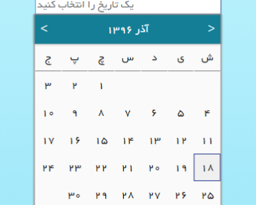
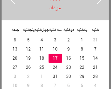
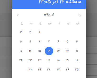
This is a Jalali date picker component for Vue.
این برنامه یک کامپوننت انتخاب تاریخ جلالی می باشد.
Demo
You can see a demo and several examples in this page: Demo & examples
Universal Module Definition(UMD)
In order to use datepicker without node package manager include these scripts and style sheet ( I recommend using unpkg ):
<link href="https://unpkg.com/vue2-persian-datepicker/dist/vue2-persian-datepicker.css" rel="stylesheet"></script> <script type=text/javascript src="https://unpkg.com/vue"></script> <script type=text/javascript src="https://unpkg.com/vue2-persian-datepicker/dist/vue2-persian-datepicker.js"></script>Then register the component :
Vue.component('pdatepicker', PDatePicker.PDatePicker);For a complete example you can see this jsFiddle .
NPM
$ npm install vue2-persian-datepickerThen register the component:
import Vue from 'vue' import PDatePicker from 'vue2-persian-datepicker' Vue.component('pdatepicker', PDatePicker)Usage
After registering the component you can use it in your markup:
<pdatepicker></pdatepicker>Basic usage
In most cases you use pdatepicker to provide a persian date picker for your users to pick a date from. So, you need a way to get selected date. You can easily achieve this by syncing a variable.
This is pretty much what you have to do in order to get selected date or display a date to a user:
<pdatepicker v-model="date"></pdatepicker>export default{ data(){ return { date : '1396/6/8' }; } }Properties
| Property | Type | Default | Description |
|---|---|---|---|
| placeholder | String | یک تاریخ را انتخاب کنید | Place holder of input |
| header-color | Color | 'white' | Header text color |
| header-background-color | Color | '#137e95' | Header background color |
| hover-day-back-color | Color | '#137e95' | Background color when mouse hovers an element |
| chosen-day-back-color | Color | '#137e95' | Background color for chosen day |
| dialog-color | 'black' | Color Dialog text color | |
| dialog-background-color | Color | '#fafafa' | Dialog background color |
| minimum-year | Number | 1300 | Minimum selectable year for user |
| maximum-year | Number | 1350 | Maximum selectable year for user |
| name | String | '' | Name element for normal http form submit |
| required | Boolean | false | value of HTML required attribute |
| id | String | '' | value of input's id attribute |
| input-class | String | '' | css class for input element |
| dialog class | String | '' | css class for dialog element |
| wrapper-class | String | '' | css class wrapper element of component |
| input-disabled | Boolean | true | for responsive reasons input is disabled by default but you can enable it if you need to. |
| initial-view | String | 'day' | Initial view of component (year or month or day) |
| inline-mode | Boolean | false | inline mode |
| format-date | String | 'yyyy/MM/dd' | formats output date. order of date element should not change |
| open-transition-animation | String | 'slide-fade' | you can specify a transition for opening and closing dialog. |
| persianDigits | Boolean | true | whether to use persian or english digits |
| availableDates | Boolean | false | If you want limit user to certain range of dates |
| availableDateStart | String | 1300/01/01 | In case of setting availableDates to true, use this to set start date |
| availableDateEnd | String | 1450/12/29 | In case of setting availableDates to true, use this to set end date |
| disableDatesBeforeToday | Boolean | false | This will disable all dates before today |
| modal-mode | Boolean | false | This will make dialog modal. |
| modal-open-transition-animation | String | 'scale-fade' | you can specify a transition for opening and closing dialog in modal mode. |
Events
| event | Parameters | description |
|---|---|---|
| opened | Date String | The picker's dialog is opened |
| closed | Date String | The picker's dialog is closed |
| monthChanged | Date String | Month page has changed |
| yearChanged | Date String | Year page has changed |
| selected | Date Object | A date has been selected |
| input | Date String | Input changed |
Get selected date
Using v-model you can sync a value to selected date. Or, you can listen to selected event and get selected date.
Date formatting
There are several ways you can print selected date on user input. Keep in mind that you have to keep order of date (year/month/date)
| token | desc | example |
|---|---|---|
| d | day | 3 |
| dd | day with 0 prefixed day | 03 |
| M | month number | 4 |
| MM | month with 0 prefix day | 04 |
| MMM | month name | فروردین |
| yy | two digits year | 96 |
| yyyy | four digits year | 1396 |
