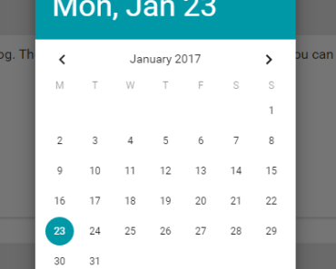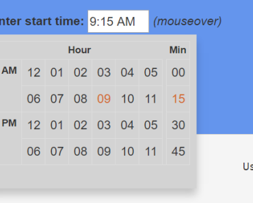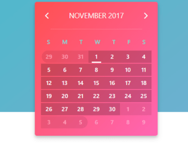


v2-datepicker
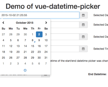
A simple datepicker component based Vue 2.x.
Installation
npm:
npm i --save v2-datepicker or yarn
yarn add v2-datepicker Get Started
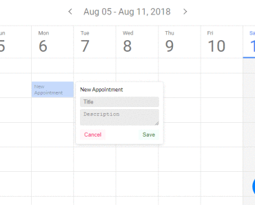
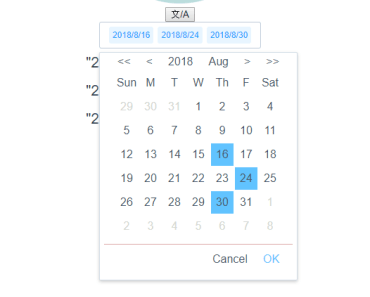
import Vue from 'vue'; import 'v2-datepicker/lib/index.css'; // v2 need to improt css import V2Datepicker from 'v2-datepicker'; Vue.use(V2Datepicker) // basic <v2-datepicker v-model="val"></v2-datepicker> <v2-datepicker-range v-model="val2"></v2-datepicker-range> //setting <v2-datepicker-range v-model="val" lang="en" format="yyyy-MM-DD" :picker-options="pickerOptions"></v2-datepicker-range> <v2-datepicker v-model="val2" format="yyyy-MM-DD" :picker-options="pickerOptions2"></v2-datepicker> export default { data () { return { pickerOptions: { shortcuts: [{ text: 'Latest Week', onClick (picker) { const end = new Date(); const start = new Date(); start.setTime(start.getTime() - 3600 * 1000 * 24 * 7); picker.$emit('pick', [start, end]); } }, { text: 'Latest Month', onClick (picker) { const end = new Date(); const start = new Date(); start.setTime(start.getTime() - 3600 * 1000 * 24 * 30); picker.$emit('pick', [start, end]); } }, { text: 'Latest Three Month', onClick (picker) { const end = new Date(); const start = new Date(); start.setTime(start.getTime() - 3600 * 1000 * 24 * 90); picker.$emit('pick', [start, end]); } }] }, pickerOptions2: { shortcuts: [{ text: 'Today', onClick (picker) { picker.$emit('pick', new Date()); } }, { text: 'Yesterday', onClick (picker) { const date = new Date(); date.setTime(date.getTime() - 3600 * 1000 * 24); picker.$emit('pick', date); } }, { text: 'A week ago', onClick (picker) { const date = new Date(); date.setTime(date.getTime() - 3600 * 1000 * 24 * 7); picker.$emit('pick', date); } }] } } } } More demo to visit here.
On Demand Import
This feature just apply to v2
You need to install babel-plugin-on-demand-import:
npm i babel-plugin-on-demand-import -D Then add it to your .babelrc:
// v2 { // ... "plugins": [ ["on-demand-import" { "libraryName": "v2-datepicker" }] ] } // v3 { // ... "plugins": [ ["on-demand-import" { "libraryName": "v2-datepicker", "libraryName": "lib/components" }] ] } // Only import DatePicker component import { DatePicker } from 'v2-datepicker'; Vue.use(DatePicker); <v2-datepicker v-model="val"></v2-datepicker> // Only import DatePickerRange component import { DatePickerRange } from 'v2-datepicker'; Vue.use(DatePickerRange); <v2-datepicker-range v-model="val2"></v2-datepicker-range> Custom Locales
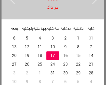
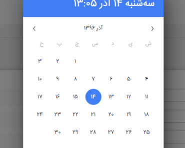
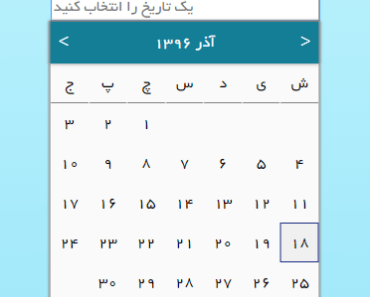
The components native supports only two languages: cn(chinese) and en(english) since v3.1.0, if you want to custom locale, do it by customLocals prop:
<template> <v2-datepicker format="MM/DD/YYYY" :lang="lang" :customLocals="locals" v-model="date"></v2-datepicker> </template> // js import locals from 'path/to/your/locals' export default { data () { return { lang: 'it', locales } } } // locales.js export default { 'it': { 'months': { 'original': ['Gennaio', 'Febbraio', 'Marzo', 'Aprile', 'Maggio', 'Giugno', 'Luglio', 'Agosto', 'Settembre', 'Ottobre', 'Novembre', 'Dicembre'], 'abbr': ['Gen', 'Feb', 'Mar', 'Apr', 'Mag', 'Giu', 'Lug', 'Ago', 'Set', 'Ott', 'Nov', 'Dic'] }, 'days': ['Dom', 'Lun', 'Mar', 'Mer', 'Gio', 'Ven', 'Sab'] }, 'lang-key': { 'months': { 'original': ['value1', 'value2', '...'], 'abbr': ['value1', 'value2', '...'] }, 'days': ['value1', 'value2', '...'] } }Available Props
The v2-datepicker component
| Attribute | Type | Accepted Values | Default | Description |
|---|---|---|---|---|
| value | Date | anything accepted by new Date() | - | default date of the date-picker |
| lang | String | cn(chinese)/en(english) | cn | set local language of the date-picker |
| customLocals | Object | - | {} | custom locale |
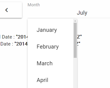
| format | String | year yyyy/YYYY, month MM, day dd | yyyy/MM/dd | format of the displayed value in the span box |
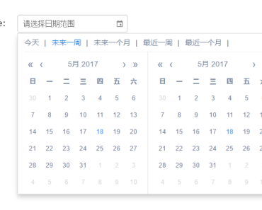
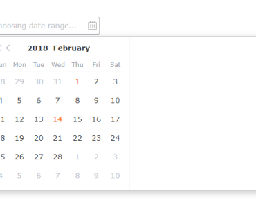
| placeholder | String | - | 选择日期/Choosing date... | placeholder text |
| disabled | Boolean | - | false | disabled date-picker |
| picker-options | Object | - | {} | additional options, check the table below |
| render-row | Number | 6/7 | 7 | render rows of datepicker |
| default-value | Date | anything accepted by new Date() | - | default date of the calendar |
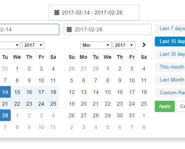
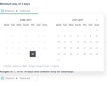
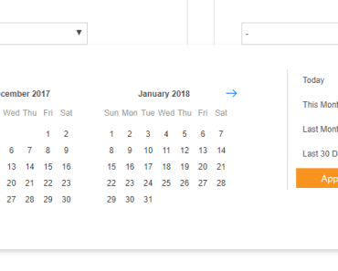
The v2-daterange-picker component
| Attribute | Type | Accepted Values | Default | Description |
|---|---|---|---|---|
| value | Array | anything accepted by new Date() | - | default date of the daterange-picker |
| lang | String | cn(chinese)/en(english) | cn | set local language of the daterange-picker |
| customLocals | Object | - | {} | custom locale |
| format | String | year yyyy/YYYY, month MM, day dd | yyyy/MM/dd | format of the displayed value in the span box |
| placeholder | String | - | 开始时间-结束时间/Choosing date range... | placeholder text |
| disabled | Boolean | - | false | disabled daterange-picker |
| range-separator | String | - | '-' | range separator |
| unlink-panels | Boolean | - | false | unlink two date-panels in range-picker |
| picker-options | Object | - | {} | additional options, check the table below |
| default-value | Date | anything accepted by new Date() | - | default date of the calendar |
Picker Options
| Attribute | Type | Accepted Values | Default | Description |
|---|---|---|---|---|
| shortcuts | Object[] | - | - | a { text, onClick } object array to set shortcut options, check the table below |
| disabledDate | Function | - | - | a function determining if a date is disabled with that date as its parameter. Should return a Boolean |
shortcuts
| Attribute | Type | Accepted Values | Default | Description |
|---|---|---|---|---|
| text | String | - | - | title of the shortcut |
| onClick | Function | - | - | callback function, triggers when the shortcut is clicked |
Event
| Event Name | Description | Parameters |
|---|---|---|
| change | triggers when the selected value changes | component's binding value |
Development
git clone git@github.com:dwqs/v2-datepicker.git cd v2-datepicker npm i npm startLICENSE
MIT