jQuery responsive google maps
What's it all about?
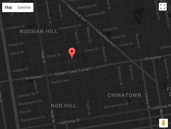
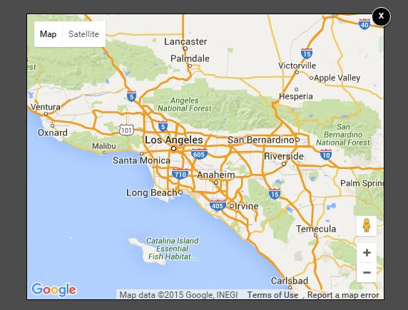
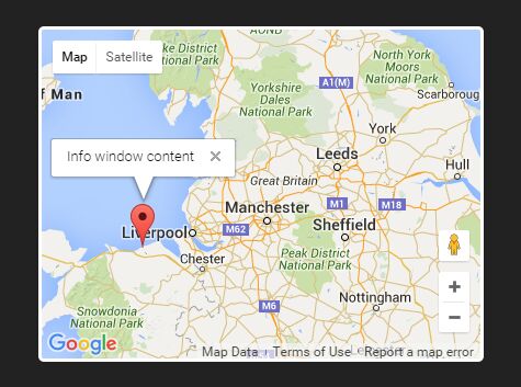
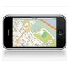
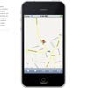
Well, when scrolling a website on your mobile device you can get trapped in a google map due to the Maps scrollbar of death™. This plugin gives you a native google maps on your website and a safe fallback to the static image API of google maps for smaller devices.
More info can be found here: http://joggink.com/2012/01/responsive-google-maps/
How to use?
Download the jquery.mobilegmap.js. Removing comments and minifying it will get you bonus points!
To use it:
$(document).ready(function(){ // your google map container $('.gmap').mobileGmap(); })You can optionally change these default parameters:
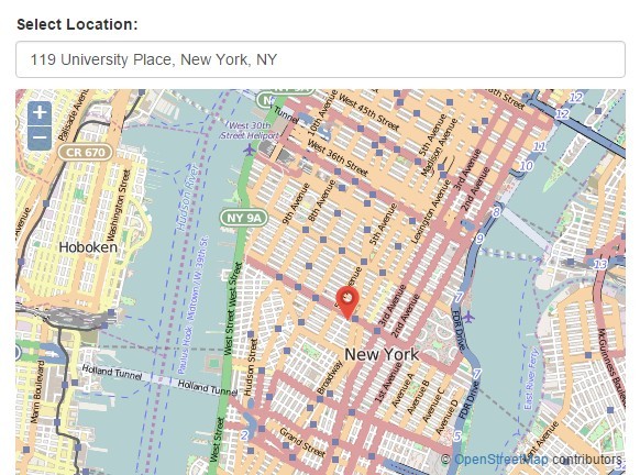
$(document).ready(function(){ // your google map container $('.gmap').mobileGmap({ deviceWidth: 480 // The select will be added for screensizes smaller than this }); })If you want to pass the address, zoom level and the maptype you can use HTML5 data-attributes
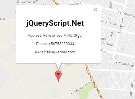
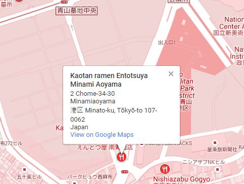
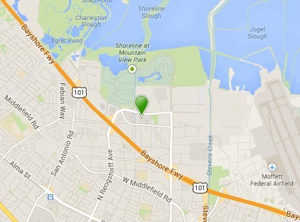
<div class="gmap" id="map" data-center="Brugse Heirweg 37 Aartrijke Belgium" data-zoom="15"> <address> <strong>builtbyrobot</strong><br /> Brugse Heirweg 37<br /> 8211 Aartrijke </address> </div>And that's it that's all.
However...
There are still some things that need to be taken care of:
- make it optional to show / hide the address marker
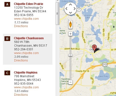
- add multiple markers with balloons containing more info / fallback with numbers or letters for the mobile version