vue-selectable
Overview
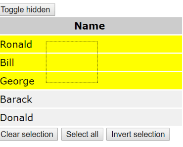
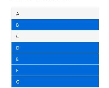
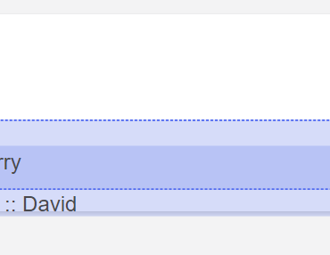
It's common task to make mouse selection of some objects on the page. This directive makes this task extremely easy, all you need to implement object selection is few lines of code. It was designed after jQuery Selectable interaction, with some details borrowed from angular-multiple-selection. It supports plain mouse selection and adding to previously selected values with Ctrl key pressed during selection. Single items can be excluded from selection with Ctrl + click on them. Scrolling of document or some specified block while selecting is also supported now, but only on Y axis.
Requirements
- vue: ^1.0
- vue2: ^2.0
- Browsers - briefly tested on Chrome 58, IE 11, Firefox 53
Install
From npm:
$ npm install vue-selectable --save Usage
To use directive normally you'll need two arrays, one for selected items - with boolean values for every selectable item, another for items under selection box. By default elements identified by selectable class will be considered as selectable items. Another thing that you'll definitely need is a element that will be selection box. Directive will change height, width, top, and left attributes of this element, and toggle its visibility by changing display attribute from block to none and vise versa.
Vue 1.x (ES6 syntax)
NB: for Vue 2.x all you need is to write v-for as v-for="(item, i) in items"
<div v-selectable="{ selectedGetter: selectedGetter, selectedSetter: selectedSetter, selectingSetter: selectingSetter }" id="app"> <div class="selection"></div> <div v-for="(i, item) in items" :class="{ selected: !!selected[i], selecting: !!selecting[i] }" class="selectable" >{{ item }}</div> </div>import selectable from 'vue-selectable'; new Vue({ el: '#app', data: { selected: [], selecting: [], items: ['abc', 'bcd', 'cde'] }, directives: { selectable }, methods: { selectedGetter() { return this.selected; }, selectedSetter(v) { this.selected = v; }, selectingSetter(v) { this.selecting = v; } } });Selection items list in directive can be updated by calling setSelectableItems(el, itemSelector), where el is element where directive applied. Optional argument itemSelector can be used to change selectable items selector. Function returns number of selectable items added or -1 in case of error.
Options
v-selectable requires one mandatory parameter - directive parameter - object with 3 functions, selectedGetter, selectedSetter, and selectingSetter, to get/set arrays 'selected' (selection status - array of boolean), 'selecting' (array of items selection status during selection drag, array of boolean; must be used to display realtime selection visual feedback).
selectedSetter function also receives "selecting" array as a second argument. This could help when we need some custom selection logic.
If you have 5 selectable items, selected array will have 5 elements initially set to false. When user selects some item(s), values change to true accordingly. The same applies for selecting array.
Also you can specify additional parameters in the object for JS selectable component underneath. For example you can set rootElement to some element other than "document" (to attach event listeners to it). Also it's possible to set rootElement to null initially and then set it when necessary element appears in the DOM tree; event listeners will attach right after (but the trick will work only once). Or you can set renderSelecting/renderSelection options to true to have directive manage CSS classes instead of Vue.js framework.
Other parameters available:
data-items- CSS selector to identify selectable items, by default it is set to.selectable(elements with CSS class "selectable")data-box- selection box element. By default it tries to use element withselectionCSS classdata-constraint- box that constrains selection area (selection box can be only inside area limited to this element), by default selection area limited to element with directive
Exported util functions
Two utility functions are exported with a directive to help configuring directive. Both require DOM node with directive as a first argument ("el").
setSelectableItems(el, [itemSelector])- if used without second argument, rereads DOM to fetch selectable items (useful after e.g. AJAX load of items). Another CSS selector can be specified to create a new list of selectable items.setOptions(el, options)- sets directive options on the fly. For now is required to setscrollingFrameinternal parameter for Vue.js v2 (seeexamples2/example3.html).
Internal options
Except already described selectedGetter, selectedSetter, and selectingSetter, directive has these internal options, that can be set using directive declaration (as getters/setters) or on the fly:
disableTextSelection(boolean) - disable browser text selection when selection box is active (turned on by default)scrollingFrame(DOM node) - element with scrollbar, that contains list of selectable itemsscrollSpeed(int) - speed of scroll (in px per 16ms, default 10px)scrollDistance(int) - distance from borders (in px, default 10px) when scroll begins to workscrollDocumentEnabled(boolean) - enable (default)/disable document scrolling while selecting items, ignored when scrollingFrame is configuredrenderSelected(boolean) - add CSS selectedClass to elements currently selected (w/o framework)renderSelecting(boolean) - add CSS selectedClass to elements currently under selection box (w/o framework)selectingClass(string) - CSS class used to mark items under selection box (".selecting" by default)selectedClass(string) - CSS class used to mark selected items (".selected" by default)overrideAddMode(boolean) - selection frame always adds items to selection when this flag is true, despite "Ctrl" or "Meta" keys being pressed (false by default)
Examples
Example usages can be found in examples directory for Vue.js v1 and examples2 for Vue.js v2. Examples for v2 were tested against version 2.3.3.
