Vue JSON Component


A collapsable tree view for JSON. This package has some similarites with vue-json-tree-view so I'll address the differences below. I'm not contributing this back to that package because it would require breaking API changes, and the code is entirely different. Contributions welcome!

Philosophy
This package has a few major improvements over predecessors: builds, styles, and customization. For builds, this package ships CommonJS, Module, and UNPKG builds with no dependencies. vue-json-tree-view bundles in lots of dependencies -- including lodash. I also export global Vue imports, local Vue imports, and TypeScript declarations. The code itself is about as small as it can be while being easy to follow.
The styles in this package are all scoped, with key colors still being customizable. There are no extra margins or overflow rules and text properties are all inherited from the page. This makes the view much easier to integrate anywhere you need it.
The default color theme is based on solarized, and font weights are modified to increase readability.
Usage
Install
npm i vue-json-component yarn add vue-json-componentImport Locally
import { JSONView } from "vue-json-component"; export default Vue.extend({ components: { "json-view": JSONView } });Import Globally
import JSONView from "vue-json-component"; Vue.use(JSONView)Use
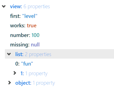
<template> <json-view :data="data" /> </template> Customize
The font size and font family are inherited from the page.
Props
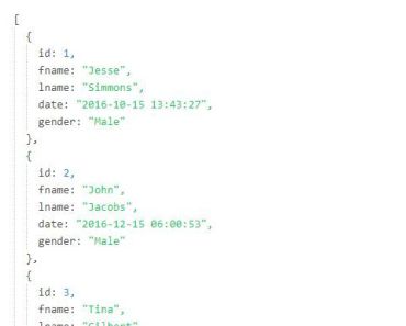
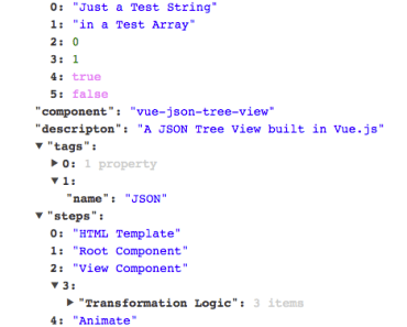
- data (JSON): The valid JSON object you want rendered as a tree.
- rootKey (String): The name of the top level root key; defaults to root.
- maxDepth (Number): Depth of the tree that is open at first render; defaults to 1.
- styles (Object): Override the color styles. Defaults shown below.
const defaultStyles = { key: "#002b36", valueKey: "#073642", string: "#268bd2", number: "#2aa198", boolean: "#cb4b16", null: "#6c71c4", arrowSize: "6px" };Example
<template> <json-view :data="data" rootKey="view" :maxDepth="1" :styles="{ key: '#0977e6' }" /> </template>Advanced Features
Selected Item Events
You can allow users to click elements, and receive an event when this occurs. The selected event will pass you the key, value, and path of the selected value. If you do not listen for the event, the styles will not indicate that values are clickable.
<json-view :data="data" v-on:selected="itemSelected" />Event
- key: string
- value: string
- path: string
Development
Install
yarnHot-Reload Hostapp
yarn serveBuild Component
yarn buildLints and fixes files
yarn lintContributing
Contributions are welcome via pull request. If you want to discuss your feature before committing development time, feel free to open an issue and we can refine the idea.
Thanks!