SlideOut
A Slide-Out component for Vue.js 2.0
Dependencies
- Vue.js 2.x
- Less
- v-scroll-lock
Install
npm i @hyjiacan/vue-slideoutor
yarn add @hyjiacan/vue-slideoutFor the latest code, you can:
git clone https://github.com/hyjiacan/vue-slideout.gitUsage
Global (recommend)
main.js
import Vue from 'vue' import SlideOut from '@hyjiacan/vue-slideout' import from '@hyjiacan/vue-slideout/lib/slideout.css' // import SlideOut component, and set the defaults props Vue.use(SlideOut, { // set props here })In Component
Foobar.vue
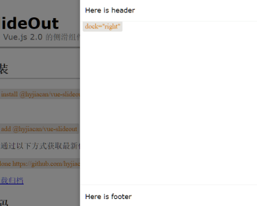
<slide-out @close="onClose"> <div slot="header" slot-scope="{title}"> </div> content </slide-out> <script> import SlideOut from '@hyjiacan/vue-slideout' import from '@hyjiacan/vue-slideout/lib/slideout.css' export default { name: 'Foobar', components: {SlideOut}, methods: { onClose (e) { // prevent close and wait e.wait = true // close after 3 seconds setTimeout(() => { // assign true to close, do nothing or assign false to cancel close. e.close = true }, 3000) } } } </script>For more usage, see https://hyjiacan.github.io/vue-slideout/
Properties
| name | type | required | description | default |
|---|---|---|---|---|
| size | String/Number | NO | The size of slide, both px and % available | 400px |
| zIndex | Number | NO | The z-index of slide | 1997 |
| visible | Boolean | YES | Is the slide visible,modifier .sync is available | false |
| title | String | NO | Slide title text, if this is empty and slot=header is empty too,the header would be hidden | - |
| closeOnMaskClick | Boolean | NO | Whether to close slide while mask clicked | true |
| customClass | String | NO | Customized stylesheet class name | - |
| showMask | Boolean | NO | Is mask visible | true |
| showClose | Boolean | NO | Is close button visible | true |
| maskColor | String | NO | Mask color | rgba(0, 0, 0, 0.5) |
| dock | String | NO | Slide dock position, optional values: top, right, bottom, left | right |
| appendTo | String/HTMLElement | NO | Append slide into specified element.Both string(selector) andHTMLElement(DOM object) available | null |
| disableAnimation | Boolean | NO | Whether to disable animation | false |
| allowResize | Boolean | NO | Whether to allow drag-resize | false |
| minSize | Number | NO | The min limit of drag-resize, value in px | 60 |
| maxSize | Number | NO | The max limit of drag-resize, value 0 makes no limit, value in px | 0 |
| ignoreEsc | Boolean | NO | Whether to ignore esc key, set false or keep default to close slide while press ESC | false |
| lockScroll | Boolean | NO | Whether to lock page (affected to body element only) scroll (except slide self) | false |
| fullscreen | Boolean | NO | Whether to enable fullscreen (resize is disabled if value is true),modifier .sync is available (will exit fullscreen after close) | false |
Note: Slide uses style
position: fixedand lockbodyscroll if propertyappendTonot specified.
Slots
| name | scope | description |
|---|---|---|
| header | {title} | Header content, take all the header bar, title will take no affected(and close button will be removed) if specified this,use slot-scope="{ title }" to get property title |
| btn | - | Extend header buttons,placed left side of the Close Button |
| default | - | Content |
| footer | - | Footer content |
Events
| name | parameter | description |
|---|---|---|
| open | - | Invoke after slide opened |
| close | e: {close: Boolean, wait: Boolean} | Invoke before slide close, in callback function, assign e.wait=true to prevent close,and assign e.close=true to close (async supported) |
| closed | - | Invoke after slide really closed, it's emit after event close |
Development
yarn # start dev server yarn serve # Build library yarn release