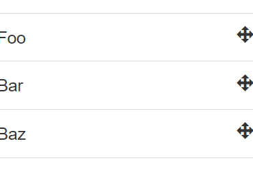
SwipeList component is just a helper for listing multiple SwipeOuts.
Props
Prop
Data Type
Required
Default
Description
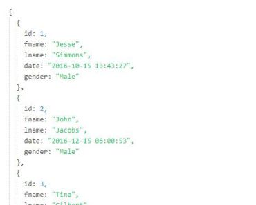
items
Array
*
An array with your data
item-key
String
id
Your key for :key when list is v-for-ed, if not found array index will used
disabled
Boolean
false
if true items will be disabled, and text selection will be possible (on desktop). adds class swipeout--disabled
item-disabled
Function
js () => false
A function that receives the item as parameter and returns true case disabled or false if not
threshold
Number
45
With that property you can fine tune when actions are considered open
revealed
Object
An object representing the revealed status of the items, key is the index and the value is either left or right, use it with the .sync modifier
Events
Event
Payload
Description
swipeout:click
item
Emitted on single click/tap on the item
active
Boolean
Emitted when the user is opening/closing the any of the actions
Methods
Method
Params
Description
revealRight
index (number)
Reveals right actions on given index
revealLeft
index (number)
Reveals left actions on given index
closeActions
index (number)?
Closes actions on given index, or all if no index given
isRevealed
index (number)
Returns the revealed status on a given index, either false for closed, or left or right
SwipeOut
SwipeOut is the main component, representing a single item with it's actions.
Props
Prop
Data Type
Required
Default
Description
disabled
Boolean
false
if true items will be disabled, and text selection will be possible (on desktop). adds class swipeout--disabled
threshold
Number
45
With that property you can fine tune when actions are considered open
Events
Event
Payload
Description
active
Boolean
Emitted when the user is opening/closing the any of the actions
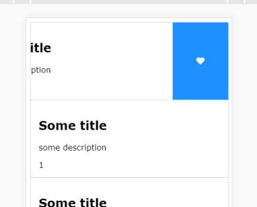
<swipe-listref="list"class="card":disabled="!enabled":items="mockSwipeList"item-key="id"@swipeout:click="itemClick" > <templatev-slot="{ item, index, revealLeft, revealRight, close }"> <!-- item is the corresponding object from the array --><!-- index is clearly the index --><!-- revealLeft is method which toggles the left side --><!-- revealRight is method which toggles the right side --><!-- close is method which closes an opened side --> <divclass="card-content"> <!-- style content how ever you like --> <h2>{{ item.title }}</h2> <p>{{ item.description }}</p> <span>{{ index }}</span> </div> </template> <!-- left swipe side template and v-slot:left="{ item }" is the item clearly --><!-- remove if you dont wanna have left swipe side --> <templatev-slot:left="{ item, close }"> <divclass="swipeout-action red"title="remove"@click="remove(item)"> <!-- place icon here or what ever you want --> <iclass="fa fa-trash"></i> </div> <divclass="swipeout-action purple"@click="close"> <!-- place icon here or what ever you want --> <iclass="fa fa-close"></i> </div> </template> <!-- right swipe side template and v-slot:right"{ item }" is the item clearly --><!-- remove if you dont wanna have right swipe side --> <templatev-slot:right="{ item }"> <divclass="swipeout-action blue"> <!-- place icon here or what ever you want --> <iclass="fa fa-heart"></i> </div> <divclass="swipeout-action green"> <!-- place icon here or what ever you want --> <iclass="fa fa-heart"></i> </div> </template> <templatev-slot:empty> <div> <!-- change mockSwipeList to an empty array to see this slot in action --> list is empty ( filtered or just empty ) </div> </template> </swipe-list>
