Star Rating Component for Vue 2.x
A simple, highly customisable star rating component for Vue 2.x.
Need more than stars? Check out vue-rate-it with hundreds of different raters built in!
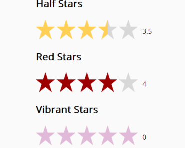
Screenshot
Features:
- SVG stars - scale without loss of quality.
- Customisable rating increments.
- Customisable colors.
- Customisable number of stars.
- Create read-only stars.
Usage
Via NPM
Install via npm:
npm install vue-star-rating
Then require in your project:
var StarRating = require('vue-star-rating');
or ES6 syntax:
import StarRating from 'vue-star-rating'
Then you can register the component globally:
Vue.component('star-rating', StarRating);
Or in your Vue component:
components: { StarRating }You can then use the following markup in your project:
<star-rating></star-rating>
Via CDN
You may also include vue-star-rating directly in to your webpage via Unpkg. Simply add the following script tag:
<script src="https://unpkg.com/vue-star-rating/dist/star-rating.min.js"></script>
You will need to register the component by doing:
Vue.component('star-rating', VueStarRating.default);You may also register the component locally via the components option.
Getting Started
To get started with vue-star-rating you will want to sync the rating values between the component and parent, you can then take a look at the props and custom events section of the docs to customise your star-rating component.
Syncing Rating Values with V-Model for Vue 2.2 +
vue-star-rating supports v-model when using Vue 2.2 and above, which is the simplest way to keep your ratings in sync:
<star-rating v-model="rating"></star-rating>Syncing Rating Values when using Vue 2.1.x and below
If you are using Vue 2.1.x or below the following is the equivelent to the v-model example above:
<star-rating @rating-selected="rating = $event" :rating="rating"></star-rating>Docs
Props
The following props can be passed to the component:
General Props
These props provide general functionailty to the star rating component
| Prop | Description | Default |
|---|---|---|
| increment | The rating increment, for example pass 0.5 for half stars or 0.01 for fluid stars. Expects a number between 0.01 - 1. | 1 |
| rating | The initial rating, this will automatically round to the closest increment, so for the most accurate rating pass 0.01 as increment or set the round-start-rating prop to false | 0 |
| max-rating | The maximum rating, this lets vue-star-rating know how many stars to display | 5 |
| star-points | The points defining a custom star shape. If no points are passed the default star shape is used. | [] |
| read-only | When set to true, the rating cannot be edited. Use in conjuction with increment to define rounding precision. | false |
| show-rating | Whether or not to show the rating next to the stars | true |
| fixed-points | Specify a fixed number of digits after the decimal point. | null |
| rtl | Pass true to display star rating using rtl (right-to-left) | false |
| round-start-rating | Pass false if you don't want the start rating value to round to the closest increment. The user will still only be able to select based on the given increment. | true |
Style Props
These props are used to style the star rating component
| Prop | Description | Default |
|---|---|---|
| star-size | The size of each star, this gets passed to the SVG width attribute, so larger numbers are larger stars | 50 |
| inactive-color | The color of the non-highlighted portion of a star. | #d8d8d8 |
| active-color | The color of the highlighted portion of a star. | #ffd055 |
| border-color | Sets the colour of the border for each star | #999 |
| border-width | Sets the width of the border for each star | 0 |
| padding | Pads the right of each star so distance between stars can be altered | 0 |
| rounded-corners | Whether or not to round the star's corners | false |
| inline | Sets the star rating to display inline | false |
| glow | Adds a subtle glow around each active star, this should be a number to spread the glow | 0 |
| glow-color | Sets the color for the glow (note, this effect can be very subtle) | #000 |
| text-class | A css class name to style the rating text for a specific star rating component | '' |
Important: Vue requires you to pass numbers and boolean values using v-bind, any props that require a number or bool should use v-bind: or the colon (:) shorthand.
Props Example
<star-rating v-bind:increment="0.5" v-bind:max-rating="3" inactive-color="#000" active-color="#f00" v-bind:star-size="90"> </star-rating>Custom Events
vue-star-rating fires the following custom events, simply use v-on:event or the @ shortand to capture the event.
| Event | Description | Return Value |
|---|---|---|
| rating-selected | Returns the rating the user selects via the click event | rating |
| current-rating | Returns the rating that the users mouse is currently over | rating |
Custom Events Example
<star-rating @rating-selected ="setRating"></star-rating>Then in your view model:
new Vue({ el: '#app', methods: { setRating: function(rating){ this.rating= rating; } }, data: { rating: 0 } }); Note: When writing methods to capture custom events, the rating param is automatically passed to the method. If you need to declare methods with multiple paramaters you will need to use $event to pass the rating to the method:
<star-rating @current-rating="setCurrentRating($event, anotherParam)"></star-rating>IE9 Support
vue-star-rating supports IE 9+; make sure you place the following in the head of your webpage to ensure that IE is in standards mode:
<meta http-equiv="X-UA-Compatible" content="IE=Edge">
Open-source should always be 100% FREE! but, if you're feeling generous, feel free to:
