vue-materialize-datatable 

A fancy Materialize CSS datatable VueJS component
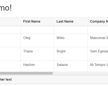
Demo
https://microdroid.github.io/vue-materialize-datatable/
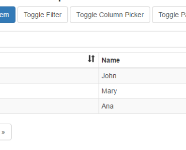
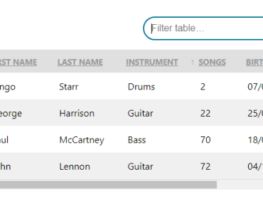
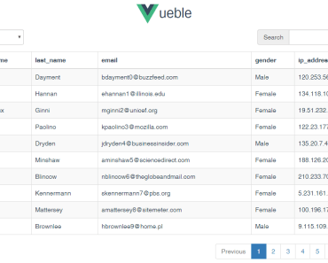
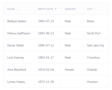
Features
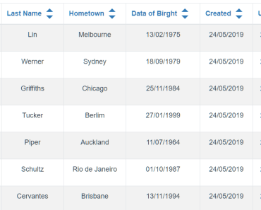
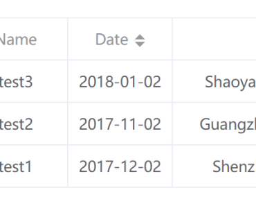
- Sorting, with numerical sorting
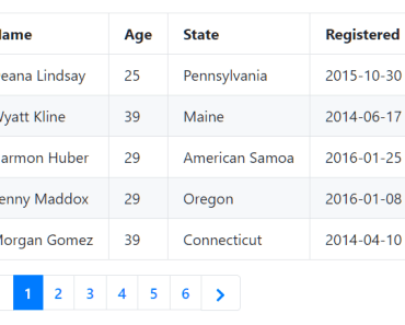
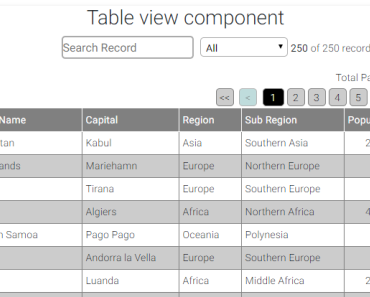
- Pagination
- Localization
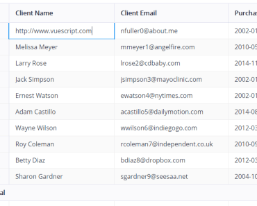
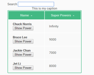
- Fuzzy searching
- Server searching
- Excel export
- Printing
- Custom topbar buttons
- Flexible data-from-row extractor
- Follows the Material Design spec
- Really, really efficient.. handles thousands of rows flawlessly
- And much more..
Requirements
materialize-css(and NOT any other MD library!)- VueJS 2
Installation
npm i vue-materialize-datatable --saveYou also need to include Material Design icons. You have two ways of doing this:
The first and the recommended way is loading via Google's CDN, by adding this tag to your HTML
<link href="https://fonts.googleapis.com/icon?family=Material+Icons" rel="stylesheet">Or this in your CSS/Sass files:
@import url(http://fonts.googleapis.com/icon?family=Material+Icons);Alternatively, you can use the NPM package and add the font to your bundle by:
npm i material-design-icons-iconfont -S and then include it in your Sass/CSS files
@import "~material-design-icons-iconfont/dist/material-design-icons";Usage
Include the component,
import DataTable from "vue-materialize-datatable";Then, register the component, however you like:
{ ... components: { ... "datatable": DataTable } }And then.. use the component:
<datatable></datatable>Of course, code above will render garbage. Here are the props it accepts to render some sensible data:
| Prop name | Description | Example |
|---|---|---|
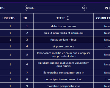
title | The title of the datatable | "Todos" // Name in top |
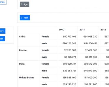
columns | Columns | |
rows | Rows | |
perPage | Numbers of rows per page | [10, 20, 30, 40, 50] (default) // Results per page |
defaultPerPage | Default rows per page | 10 (default) // Default results per page, otherwise it will be the first value of perPage |
initSortCol | Default column for sorting on component initialization | -1 (default) // By default table is not sorted by any column |
onClick | Function to execute on click | console.log('hey') // Function, row 1st param |
clickable | Clickable rows. Will fire row-click event | true (default) // Row is passed in the event payload |
sortable | Cause column-click to sort | true (default) // Whether sortable |
searchable | Add fuzzy search functionality | true (default) // Whether searchable |
exactSearch | Disable fuzzy search | true (default) // Whether only exact matches are returned |
serverSearch | Server search is used to fetch data from server | false (default) // If you wanna do server search then searchable and serverSearch must be true and use serverSearchFunc as callback. |
serverSearchFunc | Function for search search | function // For this searchSearch criteria is must. |
paginate | Add footer next/prev. buttons | true (default) // Whether paginated |
exportable | Add button to export to Excel | true (default) // Whether exportable |
printable | Add printing functionality | true (default) // Whether printable |
customButtons | Custom buttons thingy | |
Localization
You can use the property locale to set the display language. Available languages:
en(English, default)ar(Arabic)es(Spanish)cat(Catalan)br(Brazilian Portuguese)nl(Netherlands)fr(French)
You can very easily contribute a locale. Just clone
locales/en.jsonandrequireinlocales/index.js
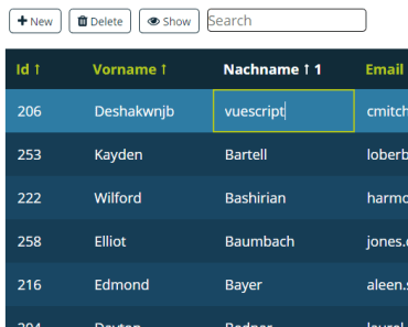
React to click on row
The datatable will emit the row-click event if clickable is set to true (default).
The events payload will contain the row object, you can bind to the event like this:
<datatable v-on:row-click="onRowClick"></datatable> <script> var app = new Vue({ el: '#app', ... methods: { onRowClick: function (row) { //row contains the clicked object from `rows` console.log(row) } }, }) </script> ...Rows per page
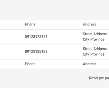
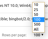
You can specify the options of rows per page with the perPage prop. The first value will be the default value and the array will be sorted, so you can put whatever number you want.
<!-- The default value will be 100 --> <datatable :perPage="[100, 10, 25, 50, 500]"></datatable>The options will be rendered as [10, 20, 50, 100, 500]
Otherwise, you can specify the default rows per page with the defaultPerPage prop.
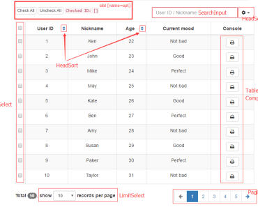
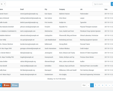
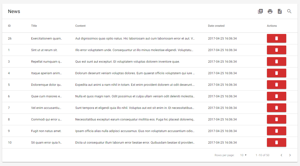
<!-- The default value will be 100 --> <datatable :perPage="[10, 25, 50, 100, 500]" :defaultPerPage="100"></datatable>Row buttons
Alright actually this is a hack. We probably should've implemented actual support for this but for now, here's an example on how to achieve something similar to the screenshot above:
<datatable title="News" ...> <th slot="thead-tr"> Actions </th> <template slot="tbody-tr" scope="props"> <td> <button class="btn red darken-2 waves-effect waves-light compact-btn" @click="(e) => deleteItem(props.row, e)"> <i class="material-icons white-text">delete</i> </button> </td> </template> </datatable>Feel free to copy paste the code above, heh.