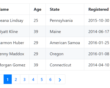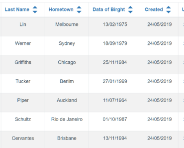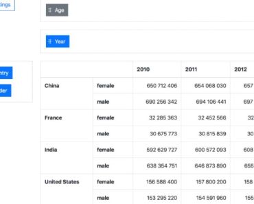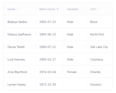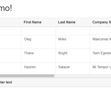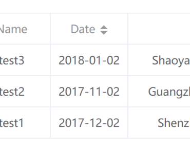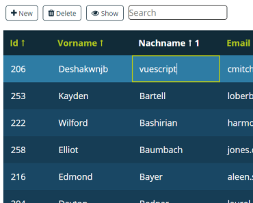
TableView
This will help to visualize large data sets in tabular format with pagination, sorting by column and search records on all columns or with selected column. It also provides option to customize layouts and features as per the application requirements.
Features
- Node JS, VueJs, Vue-router
- axios - for create promise based client interface
- classnames - simple javascript utility for conditionally joining classNames together.
- autoprefixer - Write your CSS rules without vendor prefixes (in fact, forget about them entirely)
- Karma, Mocha, chai, sinon - for unit test
- eslint - this is a tool for identifying and reporting based on patterns found in ECMAScript/JavaScript code. In many way, it is similar to JSLint and JSHint with a few exceptions.
- webpack - for bundling js, css and assets.
Components
Appliction is mainly using two components to visualize large sets of data in tabular format.
- Pagination Component
- Tabale View Component
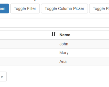
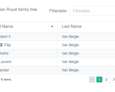
About Pagination Component
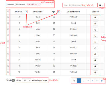
This component shows the pages and provides the functionality to navigate.
How to use this component with any page.
-
Import the pagination componet and pass all the required values as its attribute like below sample.
<script> import Pagination from '@/components/Pagination.vue'; </script>
<template> <pagination :current-page="pageOne.currentPage" :total-pages="pageOne.totalPages" :items-per-page="pageOne.itemsPerPage" @page-changed="pageOneChanged" :paginationClass="paginationOption.paginationClass" :navigationText="paginationOption.navigationText"> </pagination> </template> - Attributes:-
- :current-page # current page number from where you want to start.
- :total-pages # Total number of pages
- :items-per-page # Number of items needed to be shown on a page
- @page-changed # call a function on click of page number in pagination navigation control
- :paginationClass # class name which is used to set the look and feel of the pagination controls
- :navigationText # This is optional and helps to set text of navigation controls
{ first:{text:'<<',title:'First',arialabel:'First'}, last:{text:'>>',title:'Last',arialabel:'Last'}, next:{text:'>',title:'Next',arialabel:'Next',class:'btnPageNav'}, previous:{text:'<',title:'Previous',arialabel:'Previous',class:'btnPageNav'} }; About Table View Component
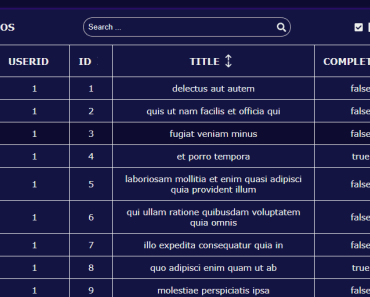
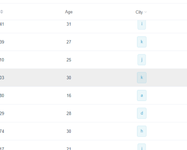
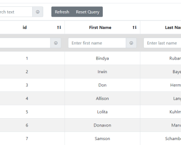
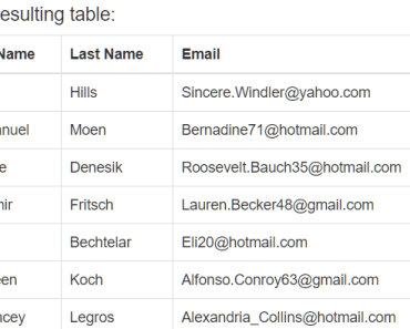
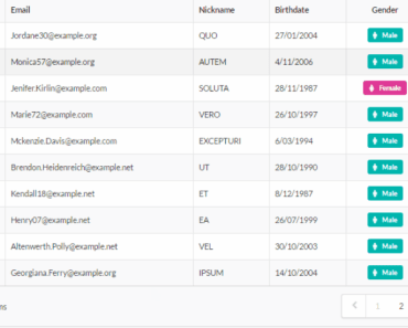
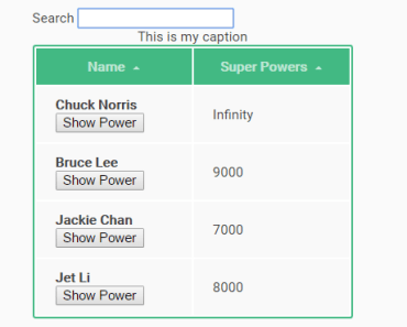
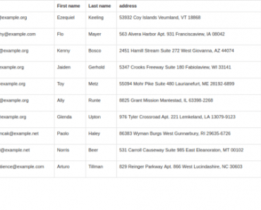
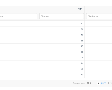
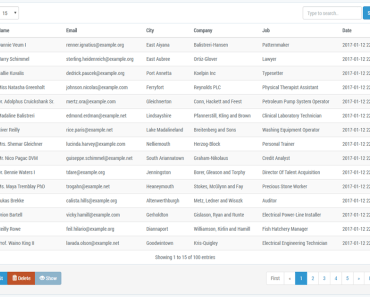
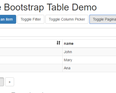
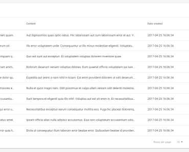
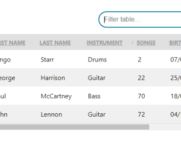
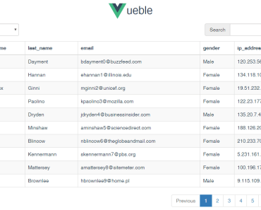
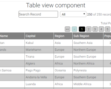
This component provides the complete feature to show the data with pagination, sorting and filtring options.
How to use this component with any page.
-
Import the TableView componet and pass all the required values as its attributes like below sample.
<script> import TableView from '@/components/TableView.vue'; </script>
<table-view :labels="labels" :sortablekey="sortkey" :className="'tableview'" :dataorder="order" :paginationOption="paginationOption" :dataSets="dataSets" :showTotalPages="true" :showFilter="true" :showSearch="true"> </table-view> - Attributes
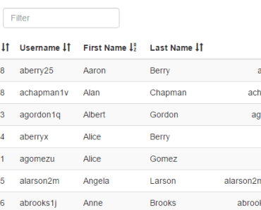
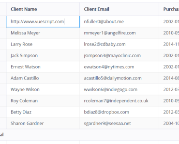
- :labels #All the column list which you want to show in table grid, it provides the following options to set its layout and column features.
Example- Let you have records with following format then how you can create label list. [{"name":"India","capital":"New Delhi","region":"Asia","subregion":"Southern Asia","population":1295210000,"cioc":"IND"},.... ] labels = [{key:'name',sortable:true,display:'Country Name',itemclass:'textleft',headclass:''}, {key:'capital',sortable:true,display:'Capital',itemclass:'textleft',headclass:''}, {key:'region',sortable:true,display:'Region',itemclass:'textleft',headclass:''}, {key:'subregion',sortable:true,display:'Sub Region',itemclass:'textleft',headclass:''}, {key:'population',sortable:true,display:'Population',itemclass:'textright',headclass:''}]; Properties are as follows- a) key -- column name as in the data list object b) sortable -- true or false to apply sorting on the column c) display -- What the column heading needs to be shown, if display name is not provided, show the key name as heading d) itemclass -- css class name to set look & feel of the perticullar column item e) headclass -- css class name to set look & feel of the perticullar column heading - :sortablekey # Set default sortable key column name.
- :className # apply your class to set look & feel of the table as parent css class.
- :dataorder # default order of the sortable column as asc or desc.
- :paginationOption # provide the complete pagination configuration object in below format
paginationOption = {position:'top',showPagination:true,itemsPerPage:10,navigationText:self.navigationText,paginationClass:'paginationClass'}; Properties are as follows- a) position -- set the position of the navigation controls along with table grid. value as - 'top' to set at top of the table. 'bottom' to set at bottom of the table. 'both' to make visible at both the position of table top and bottom. b) showPagination -- by default it is true, if you do not want to show pagination, set as false. c) itemsPerPage -- Number of item needs to be shown on a page. d) navigationText -- This is optional and helps to set text of navigation controls as above defined with pagination component. e) paginationClass -- class name which is used to set the look and feel of the pagination controls. - :dataSets -- pass the datasets complete array object, which needs to to be loaded on table grid.
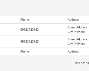
- :showTotalPages -- show and hide the total number of page text along with table grid.
- :showFilter -- include and exclude filter functionality on table grid. By default filter with apply on all columns.
- :showSearch -- include and exclude search functionality on table grid.
Build Setup
# install dependencies npm install # serve with hot reload at localhost:8080 npm run dev # build for production with minification npm run build # build for production and view the bundle analyzer report npm run build --report # run unit tests npm run unit # run e2e tests npm run e2e # run all tests npm testDependencies
Webpack (v2.3) is a bundler, which combines various JavaScript, CSS, HTML (and other) files and makes them ready to be handled by the client.
Babel (v6.22) is a compiler for ECMAScript 6 to ECMAScript 5. These are different JavaScript standards and currently browsers are not able to understand all of ECMAScript 6 and so it needs to be converted.
Testing Dependencies
Karma (v1.4) is a test runner, which spawns a web server with your project's application code inside and executes tests against it. Mocha (v3.2) is a testing framework for JavaScript. Chai (v4.1) is an assertion library which can be used with Mocha.
## Note: Application using Dummy data having *.json files to represent charts as dynamic style. Use your one API link with the required json data format response. Change base url from http-common.js file. For a detailed explanation on how things work, check out the [guide](http://vuejs-templates.github.io/webpack/) and [docs for vue-loader](http://vuejs.github.io/vue-loader). Demo
- Application live demo https://kind-dijkstra-569799.netlify.com.
License
MIT