vue-flexi-table
A flexible table component for Vue.js based on bulma
This component tries to be flexible by making stuff modular so you can implement your own template, methods, whatnot. Don't worry if you don't know how to or if you are just lazy making one,this package has a default implementations by providing a mixin.

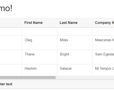
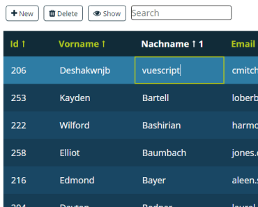
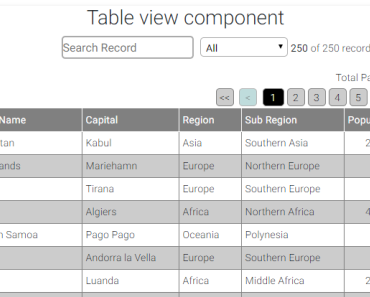
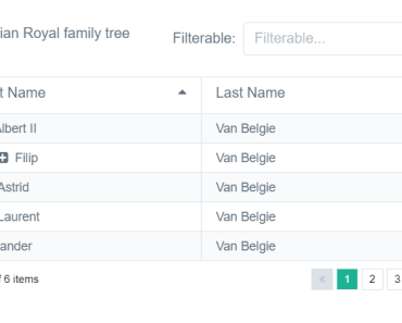
Demo
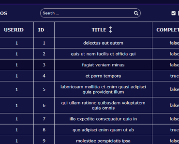
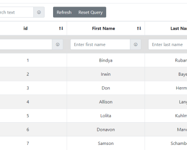
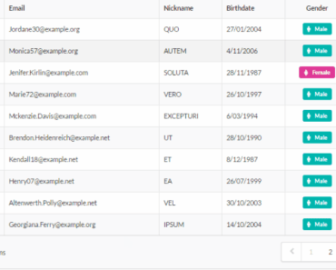
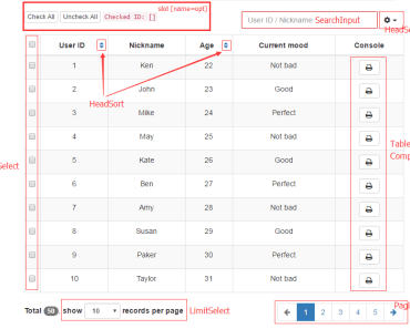
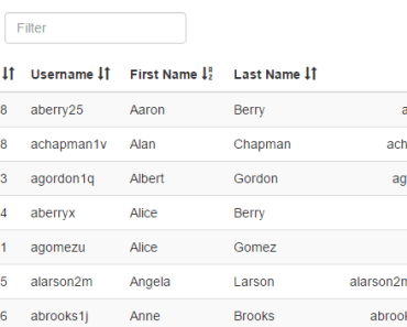
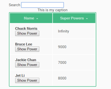
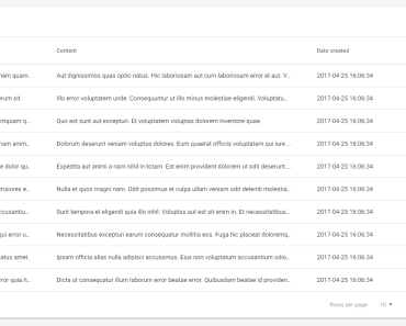
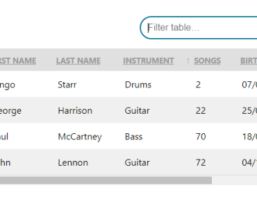
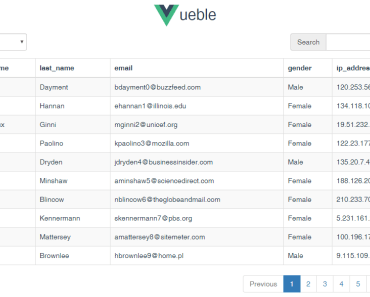
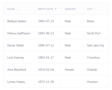
The Live demo can be found here: https://xxrockonxx.github.io/vue-flexi-table/demo/index.html
Usage
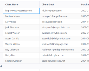
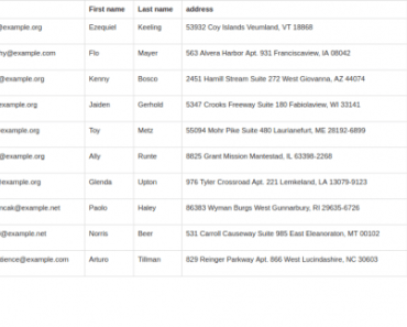
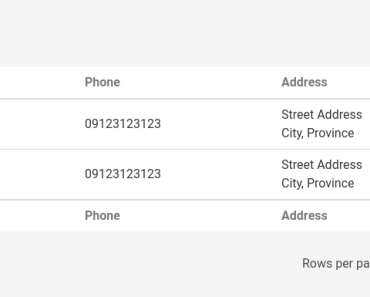
<template> <flexi-table-tools label="customer" link="/admin/customers/create" v-on:search="onSearch"></flexi-table-tools> <flexi-table :columns="columns" :rows="dtRows" :query="query" :search="searchOption" :page="dtPage" :perPage="dtPerPage"> <!-- Customize a column by making a template. Its slot value is the `name` in the `columns` --> <template slot="address" scope="props"> <td> <div>{{ props.value.address_1 }}</div> <div>{{ props.value.address_2 }}</div> <div>{{ props.value.city }}</div> </td> </template> <template slot="actions" scope="props"> <td> <router-link :to="`${api}/${props.value}`" class="button is-small is-outlined is-warning"><i class="fa fa-pencil"></i></router-link> <button type="button" class="button is-small is-outlined is-danger" v-on:click="onDeleteClick"><i class="fa fa-trash"></i></button> </td> </template> </flexi-table> <div class="table-pagination"> <div class="level"> <div class="level-left"></div> <div class="level-right"> <div class="level-item"> <flexi-table-length-control v-on:change="dtLengthChange"></flexi-table-length-control> </div> <div class="level-item"> <flexi-table-length :start="dtStart" :end="dtEnd" :total="dtTotalRecords"></flexi-table-length> </div> <div class="level-item"> <flexi-table-pagination :totalPages="dtTotalPages" :currentPage="dtPage" :pages="dtPagination" v-on:prevClick="dtGoPrev" v-on:pageClick="dtGoPage" v-on:nextClick="dtGoNext"></flexi-table-pagination> </div> </div> </div> </template> import {dtMixins, Length, LengthControl, Pagination, Table, Tools} from 'vue-flexi-table/src' export default { components: { 'flexi-table': Table, 'flexi-table-tools': Tools, 'flexi-table-length': Length, 'flexi-table-pagination': Pagination, 'flexi-table-length-control': LengthControl }, mixins: [dtMixins], data () { return { /* if you'll be using dtMixins, dtRows SHOULD be present */ dtRows: [], columns: [ { name: 'firstname', text: 'First Name' }, { name: 'lastname', text: 'Last Name' }, { name: 'phone', text: 'Phone' }, { name: 'address', text: 'Address' }, { name: 'actions', text: 'Actions' } ], query: '', searchOption: { server: false, settings: { fields: ['firstname', 'lastname', 'phone', 'address.address_1', 'address.address_2', 'address.city'], nesting: true } } } } } Components
Default components that comes with the package and their props
Table - The main component
| Props | Type | Required | Default |
|---|---|---|---|
| rows | Array | true | |
| columns | Object | true | |
| query | String | false | |
| search | Object | false | |
| page | Number | true | |
| perPage | Number | false | 10 |
columns - name is the key in your rows. text is the label to be shown on the template.
search - Search settings should look like this:
{ server: false, settings: {} } server by default is false
settings should look like: https://github.com/brianreavis/sifter.js/#api
Tools - A horizontal container that has search field on left side and create button on right. (Uses router-link)
| Props | Type | Required |
|---|---|---|
| label | String | true |
| link | String | true |
label - The label for the elements. (Search for label), (Create label)
link - Link for the create button.
| Events | Payload |
|---|---|
| search | query |
Pagination - Pagination buttons for navigating the table
| Props | Type | Required |
|---|---|---|
| currentPage | Number | true |
| totalPages | Number | true |
| pages | Array | true |
| Events | Payload |
|---|---|
| pageClick | pageNumber |
| prevClick | |
| nextClick |
pages - An array contaning the page numbers. empty value means ellipsis. Example: ['',51,52,53,'',100]
Length Control - Controls the number of rows to be shown on each page
| Events | Payload |
|---|---|
| change | rowLength |
Length - Just shows how many record and what record is shown on the current page. Example: (1 - 10 of 50)
| Props | Type | Required |
|---|---|---|
| start | Number | true |
| end | Number | true |
| total | Number | true |
Contribution
You are welcome to contribute to this project. Just fork this and make a PR and I'll review it.