Vue Date Table Component
Attention: new repo for Vue 2.x: https://github.com/OneWayTech/vue2-datatable


Intellectual property of Oneway.mobi
Notice
This component is not meant to fit all the business requirements
so diving into src/ to make it meets your needs is highly recommended
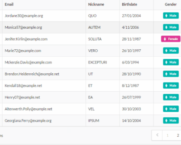
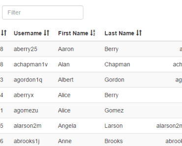
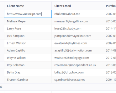
Example
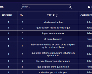
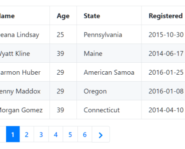
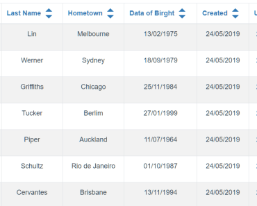
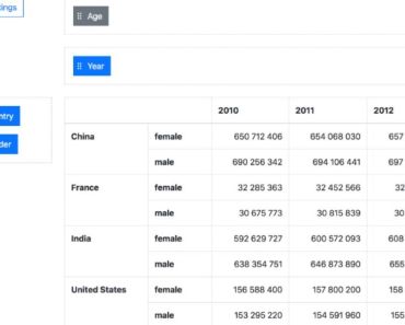
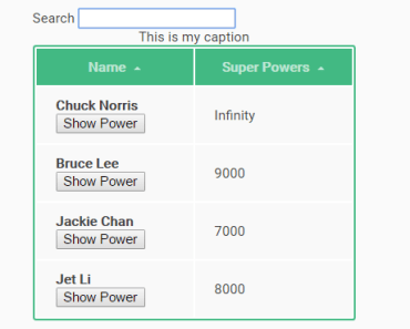
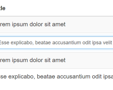
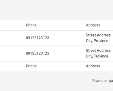
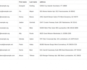
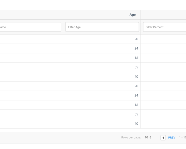
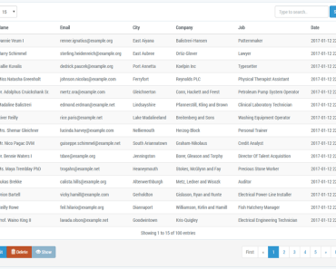
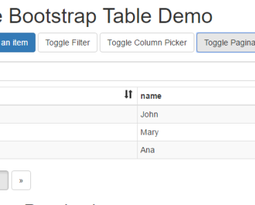
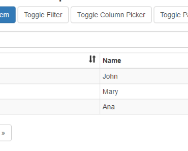
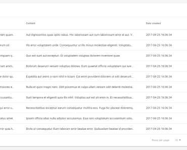
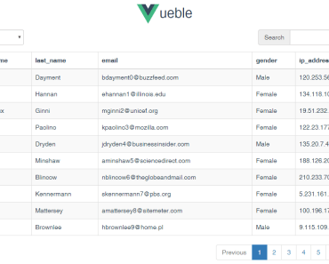
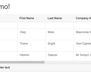
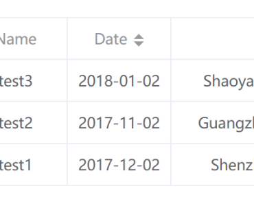
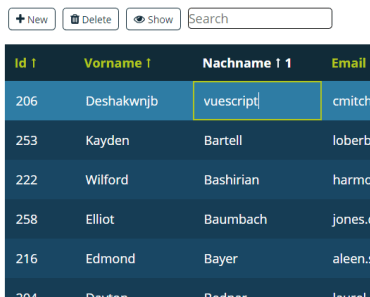
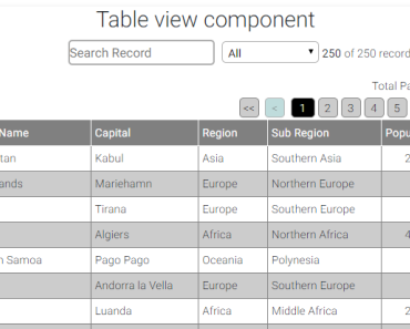
See here, source in example.html
Suggest inspecting it with devtools
Requirement
- Vue 1.x
- Vue Router 0.7.x
- vue-update-query-mixin
- vue-sync-query-mixin
- Lodash 4.x
- jQuery + BootStrap 3.x + Font Awesome 4.x (available globally)
Installation
npm i vue-datatable-component -S
alternatively:
<script src="dist/vue-datatable-component.min.js"></script>
which exposesVueDataTableas a global variable
Composition
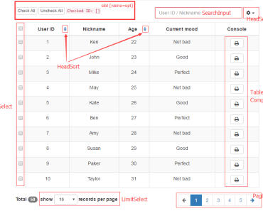
HeadSort/LimitSelect/Pagination/SearchInputwill keep in sync with$route.query
src/DataTable ├── HeadSort // sortBy={String} order=asc|desc │ ├── index.vue │ └── mixin.js ├── HeaderSettings.vue ├── LimitSelect.vue // limit={Number||10} ├── MultiSelect │ ├── index.vue │ └── mixin.js ├── Pagination.vue // offset={Number||0} ├── SearchInput.vue // search={String} └── index.vue 
Configuration
@prop columns: { type: Array, required: true } columns[i].field // {String}, required columns[i].title // {String}, required columns[i].sort // {Boolean||false}, is it sortable? columns[i].component // {String}, name of the table-cell-component columns[i].defaultHidden // {Boolean||false} @prop data: { type: Array, required: true } @prop total: { type: Number, required: true } // total number of records, instead of total records number per page (which named `limit`) @prop checkedIds: { type: Array, twoWay: true } // if component `MultiSelect` is enabled, this prop must be passed a `[]` in `.sync` mode @prop config: { type: Object, default: () => ({}) } // child components enabler config.multiSelect // {Boolean||true} config.headerSettings // {Boolean||true} config.limitSelect // {Boolean||true} config.pagination // {Boolean||true} config.searchInput // {Boolean/String||true} string type would be applied to `placeholder` config.idField // {String||'id'} specify the key field @slot name="opt" // table-cell component accessible props @prop row: { type: Object, twoWay: true } @prop field: { type: String } @prop value: { type: Any, twoWay: true } Notice
In terms of the usage of events ($dispatch / $broadcast / $on) of a table-cell component, you should be aware of that: its parent component is DataTable. You should use this.$parent.$dispatch(<event_name>, <payload>) instead of this.$dispatch since DataTable would not keep event propagation.
Build
npm run build
LICENSE
MIT