vue-pivot-table
A vue component for pivot table
Install
npm install --save @marketconnect/vue-pivot-table
Usage
This project includes 2 components:
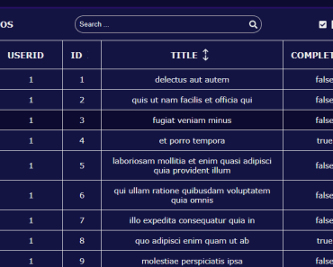
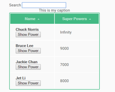
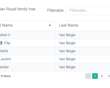
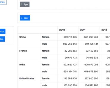
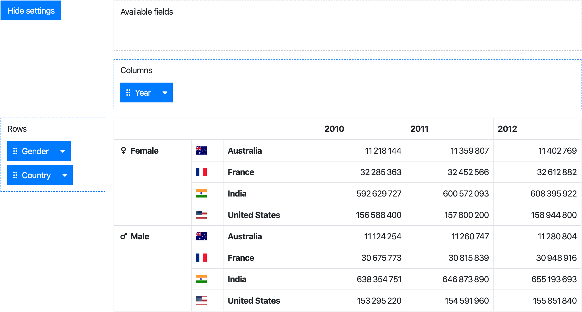
PivotTable: a component creating an aggregation table from data & specific rows/columnsPivot: a drag & drop user interface to configure rows/columns of aPivotTable
While the Pivot component provides the full experience, the PivotTable can be used standalone.
Javascript
Webpack
// Import the needed component(s) import Pivot from '@marketconnect/vue-pivot-table' import PivotTable from '@marketconnect/vue-pivot-table' export default { // Register the needed component components: { Pivot, PivotTable }, // Basic data for component props data: () => { return { data: Object.freeze([{ x: 0, y: 0, z: 0 }, { x: 1, y: 1, z: 1 }]), fields: [], rowFields: [{ getter: item => item.y, label: 'Y' }, { getter: item => item.z, label: 'Z' }], colFields: [{ getter: item => item.x, label: 'X' }], reducer: (sum, item) => sum + 1 } } ... }Browser
Vue.use(VuePivot)HTML
<pivot :data="data" :fields="fields" :row-fields="rowFields" :col-fields="colFields" :reducer="reducer"> <!-- Optional slots can be used for formatting table headers and values, see documentation below --> </pivot>Or
<pivot-table :data="data" :fields="fields" :row-fields="rowFields" :col-fields="colFields" :reducer="reducer"> <!-- Optional slots can be used for formatting table headers and values, see documentation below --> </pivot-table>API
Props
Pivot & PivotTable
| Prop | Type | Default | Description |
|---|---|---|---|
data | Array | [] | Dataset to use in the pivot ; each element should be an object |
fields | Array | [] | Fields to display in the "Available fields" zone |
row-fields | Array | [] | Fields to use as rows by default |
col-fields | Array | [] | Fields to use as columns by default |
reducer | function | (sum, item) => sum + 1 | Function applied to reduce data in the pivot table |
no-data-warning-text | String | 'No data to display.' | Text to display when data is empty |
is-data-loading | Boolean | false | Display a loading content instead of the table when the value is true (see slots for customization) |
Pivot only
| Prop | Type | Default | Description |
|---|---|---|---|
default-show-settings | Boolean | true | Show settings at component creation |
available-fields-label-text | String | 'Available fields' | Text for available fields drag area |
rows-label-text | String | 'Rows' | Text for the rows drag area |
cols-label-text | String | 'Columns' | Text for the columns drag area |
hide-settings-text | String | 'Hide settings' | Text for the "hide settings" button |
show-settings-text | String | 'Show settings' | Text for the "show settings" button |
Field format
Each element in the arrays fields, colFields or rowFields should be an Object with this format:
| Prop | Type | Description |
|---|---|---|
label | String | Text to display in the draggable button (Pivot only) |
getter | Function | Function to apply on an element of data to get the field value |
sort | Function | Optional - Function to order fields in the pivot table header ; if no value is provided, javascript-natural-sort will be applied |
showHeader | Boolean | Optional (default: true) - Whether the header should be displayed in the pivot table |
showFooter | Boolean | Optional (default: false) - Whether the footer should be displayed in the pivot table |
headerSlotName | String | Optional - Name of the slot to use to format the header in the pivot table ; if no slot name is provided, the value will be displayed as found in data |
footerSlotName | String | Optional - Same as above for the footer |
Slots
Table headers scoped slots
Pivot table headers can be customized with scoped slots:
<template slot="my-field-header-slot-name" slot-scope="{ value }">{{ value }}</template>The slot attribute must match the slotName previously set on your field prop.
value scoped slot
Pivot table values can be customized with the value scoped slot:
<template slot="value" slot-scope="{ value }">{{ value.toLocaleString }}</template>loading slot
If the data prop is loaded asynchronously, a loading feedback can be displayed by setting the data-is-loading prop to true. The default feedback is the text "Loading...".
It can be customized with the loading slot:
<template slot="loading">Loading data, please wait...</template>Large datasets
If this component is used with large datasets, consider applying Object.freeze on your data object to avoid useless change tracking on each data element.
See https://vuejs.org/v2/guide/instance.html#Data-and-Methods.
Build
# Install dependencies npm install # Serve with hot reload at localhost:8080 npm run dev # Build js libraries in dist folder npm run build