vue-scrolling-table
A Vue component to create tables with vertical and horizontal scrolling. Flexbox-based.
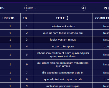
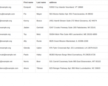
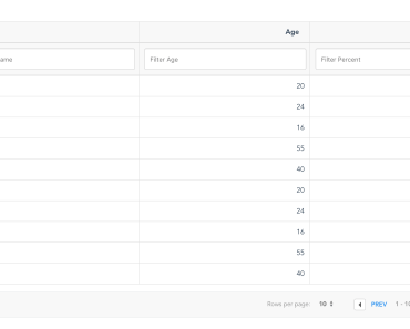
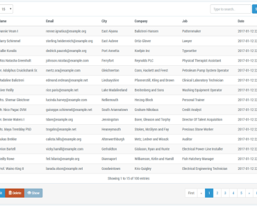
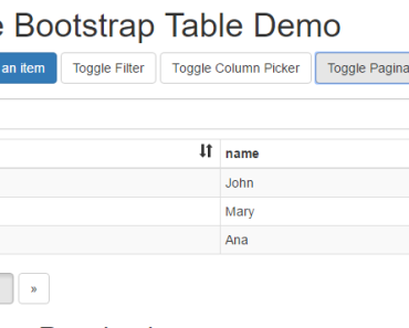
Demo
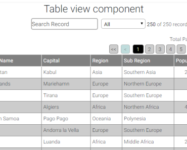
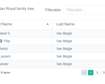
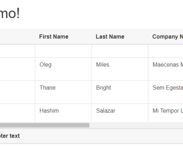
There is a live demo here: https://tallent.us/vue-scrolling-table
The demo will allow you to play with various options.
The repo for the demo application is here: https://github.com/richardtallent/vue-scrolling-table-sample
Intro
I recently needed a Vue component for a data grid in a desktop application I'm building. No need for responsiveness--in this case, I just need one huge table that scrolls vertically and horizontally, like a spreadsheet. I also needed the table to fit itself neatly into a flexbox layout, taking up any available space.
"No problem, this is late 2017, we have modern browsers with CSS2 sticky!" Nope. Browser support for sticky is still buggy and incomplete, and I also needed the solution to work on IE11 to support outdated corporate environments.
I found some very nice datagrid components, but none that suported everything on my wish list:
- Flexbox sizing
- Horizontal and vertical scrolling body
- Flexibility to render my
<th>and<td>cells however I want (which, for me, probably means lots of custom renderers, many of which will probably be Vue components of their own). - No built-in data model (I'd rather implement sorting, paging, etc. myself)
- English documentation (Vue has global popularity, which is awesome, but occasionally that means some great components are out of reach.)
So, I wrote this component. It is purposefully bare-bones, only drawing the table elements and synchronizing the horizontal scrolling of the header and body. It doesn't render any <tr>, <th>, or <td> elements itself. Instead, your parent component/application should render those using named slots. This gives you complete control over how those are handled, and allows this component to just focus on its sole task of making the table fit its parent and allowing the body to scroll.
If you're curious, before creating the Vue component, the proof of concept was done on CodePen: https://codepen.io/richardtallent/pen/rpWBQK
Example Usage
<vue-scrolling-table> <template slot="thead"> <tr> <th v-for="col in columns" :class="col.cssClasses" :key="col.id">{{ col.title }}</th> </tr> </template> <template slot="tbody"> <tr v-for="item in items" :key="item.id"> <td v-for="col in columns" :class="col.cssClasses" :key="col.id">{{ item[col.id] }}</td> </tr> </template> </vue-scrolling-table>Properties
deadAreaColor
This is a string value. The default is #CCC. This is the color used for the "dead area" within any scrolling table that isn't used for the table contents. This dead area is possible because the table fits its parent container, but the rows or columns may not fill the entire space. This property accepts any legal CSS color expression (triplets, rgb(), etc.).
includeFooter
Boolean, defaults to false. Set this to true if you are providing content for a tfoot slot, otherwise the element will not be rendered.
syncHeaderScroll
Boolean, defaults to true. Set to false if you do not want your header to scroll automatically when the user scrolls the body horizontally.
scrollHorizontal
Boolean, defaults to true. Set to false if you do not want the user to be able to scroll the body content horizontally (any overflow will be hidden).
scrollVertical
Boolean, defaults to true. Set to false if you do not want the user to be able to scroll the body content vertically (any overflow will be hidden).
Slots
To render your actual rows and cells, you'll be using named slots. This gives you full control of how the table contents are rendered.
thead
Required. Use this slot to inject the <thead> element's contents. The component will freeze it at the top, and will synchronize its horizontal scrolling with <tbody> scroll (there may be a short delay).
tbody
Required. Use this slot to inject the <tbody> element's contents. The component will make it scrollable.
tfoot
Optional. Use this slot if you want to inject contents for a <tfoot> element. The component will freeze it at the bottom, below the scrolled <tbody>. For now, this element is not scrolled automatically with the body. If you include this, you'll also need to set the includeFooter prop to true so the component knows to render the <tfoot> element.
Events
A scroll event is emitted by this component when the user scrolls the body. This event passes four arguments: the <tbody> scrollTop, scrollLeft, scrollHeight, and scrollWidth. You can use this to, for example, show icons indicating that the user can scroll (useful when the browser doesn't display a scrollbar). Since this is fired based on the DOM scroll event, the same usual caveat applies: this is a high-frequency event, so try not to do anything complicated in response (if you need to do so, debounce the events and/or use requestAnimationFrame).
A header-dragover event is emitted as the user drags a draggable element around over the THEAD element. This may be needed to, for example, implement resizable columns. The preventDefault call is made automatically by this component.
A header-dragenter event is emitted when the user drags a draggable element into the THEAD element. This may be needed to, for example, implement resizable columns.
A header-drop event is emitted when the user drops a draggable element on the THEAD element. This may be needed to, for example, implement resizable columns.
Browser Compatibility
This component has been tested on IE11, and the latest versions of Chrome (Mac and Windows, Firefox, Safari, and iOS Safari. I've also successfully tested it with a slower, mobile Android tablet running the Silk browser, it works fine there as well other than some lag in the headers keeping up with horizontal scrolling of the body. I have no other Android devices or browsers to test.
Slot Markup and Styling Requirements
An important requirement of this component is that all <td> and <th> cells must have a specific width set for them, either via CSS classes or style attributes. Cells can't auto-size based on contents because that would leave the header and body cells with different widths.
While it's theoretically possible to update the header column widths to match the body and vice versa, it's tricky, because unlike with scrolling, there are many events that can result in a table cell resize (content change, CSS change, window resize, layout resize, etc.). Most implementations, including one I've done in the past, just end up polling on a timer and checking for columns to resize.
You can implement this sort of column-width-tracking in your parent component if you want, but otherwise, you'll need to set the width, min-width, and max-width for all <th> and <td> cells to guarantee the width of all rows for a given column are the same. By default, they are all set to 10em. While you can't use percentage units, depending on your layout, you can use vw units to achieve a similar scaled effect.
Customizing the Style
What little default styling is provided on the table is purposefully very basic, and is not scoped, so it's easy to override in your calling application. Use table.scrolling as the base selector.
How do I "freeze" a column?
Here's some sample CSS for freezing the first column in a table. Unfortunately, it only works in Chrome and Safari as of December 2017:
table.scrolling td:first-child, table.scrolling th:first-child { position: -webkit-sticky; position: sticky; left:0; }Supporting this in every browser by simulating sticky is theoretically possible, but much more difficult than the scrolling implemented by this component due to differences in row height, etc. that would happen if the first column is removed from the normal flow to, say, use absolute positioning and update the scroll position with Javascript.
Future plans
I plan to actually use this on an upcoming project at work. It will be a good torture-test for the component. Some features I'm considering:
- Emitting events when the tbody is scrolled, so the caller can do other things.
- Optional footer scrolling.
- Get rid of the need for the includeFooter prop.
- Option to disable/enable scrolling in either direction.
- Avoid creating extra block on right of header if browser doesn't show scroll bars.
I'm open to other ideas, as long as they don't limit the flexibility of using slots for the header, body, and footer. But if someone wants to build a data grid component that has this as a dependency, I'm all for it.
Build Setup
# install dependencies npm install # build for production with minification npm run buildRelease History
| Date | Version | Notes |
|---|---|---|
| 2017.12.24 | 0.1.0 | First published version |
| 2017.12.24 | 0.1.1 | Patch based on sample app deveopment |
| 2017.12.24 | 0.1.2 | Fix: old version went to npm |
| 2017.12.25 | 0.2.0 | Added lots of options, updated README, fixed some display bugs when less data shown. |
| 2018.08-06 | 0.2.1 | Added header-dragenter, header-dragover, and header-drop events. |
| 2018.08-06 | 0.2.2 | $emit. sigh |