VueLinkPopover
Customisable, flexible, easy to use popover contents for Vue.js similar to that used by Facebook & Twitter
[Deprecated] This module has been deprecated
Inspired by this
Installation
In a Vue.js project, install with npm install --save vue-link-popover.
For browser based environments, download popover.js or use it from a CDN: <script src="https://unpkg.com/[email protected]/popover.js"><script>
Optionally but recommended, include the default stylings by either copying & tweaking the styles in themes/default.css or by including it via CDN - <link rel="stylesheet" href="https://unpkg.com/[email protected]/themes/default.css" />
Usage
Usage
For browser environments, the plugin is automatically initialized with the default options so it be used immediately with the <link-popover> tag.
Import it as a component:
// Import style import 'vue-link-popover/themes/default.css' import LinkPopover from 'vue-link-popover' // Register component components: { LinkPopover }To use it globally, import it from the package & then register it:
import Vue from 'vue' import 'vue-link-popover/themes/default.css' import LinkPopover from 'vue-link-popover' Vue.component('link-popover', LinkPopover)Available Options
- click: By default, the popover shows when hovered upon, however, you can change this behaviour to open the popup only when the click parameter is passed. Unlike the other options, this is used right on the popup container. For example:
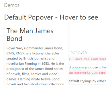
<link-popover click="true"> Opens the popover click. <div slot="content">Opened on click</div> </link-popover>-
transitionName: This is the name of the transition to be used. See the VueJS animation guide for how to use animations in Vue. You can use this by including it in the options when initializing the plugin.
Vue.use(LinkPopover, { transitionName: 'myAwesomeTransitionName' }) -
theme: This is the root class of the popup which you can use to easily customise the popup. You can use this by including it in the options when initializing the plugin -
Vue.use(LinkPopover, { theme: 'my-awesome-theme' }). The theme can then be used like this when styling:
.my-awesome-theme.popover { // Popup container &__text { // Visible text shown in browser } &__content { // Hidden popover content container } } } TODO
- Indicator arrow