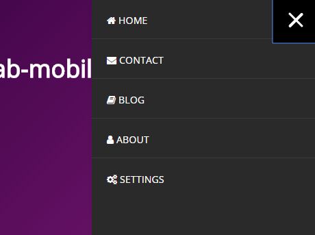
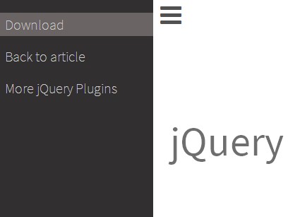
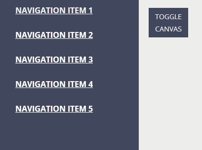
MA5 mobile menu
jQuery mobile menu with panels.
Features:
- Minified script only 9kB
- Good for very large phone menu
- IE 11 compatybility
- it's jQuery.js script
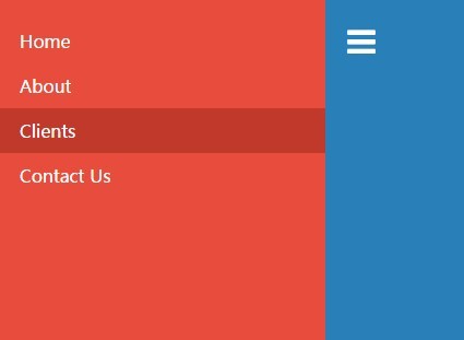
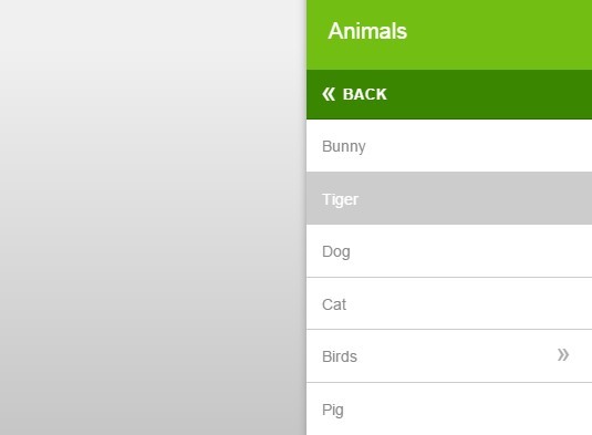
- Left and right side option
- HTML5
- SCSS
- BEM notation
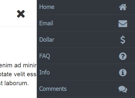
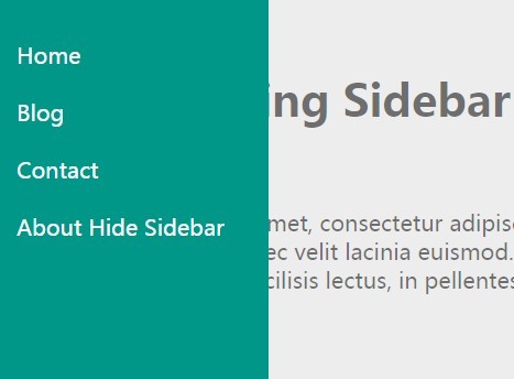
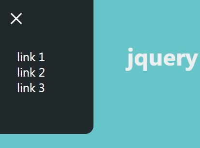
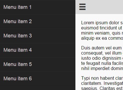
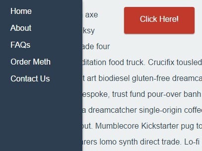
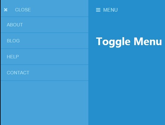
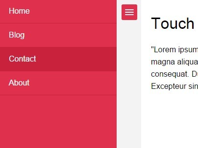
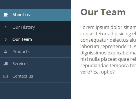
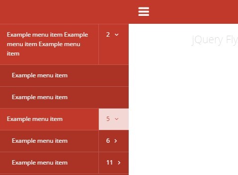
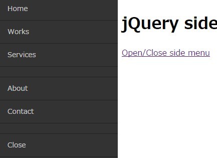
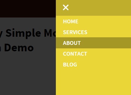
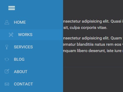
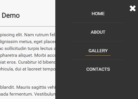
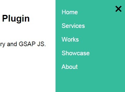
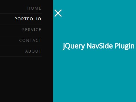
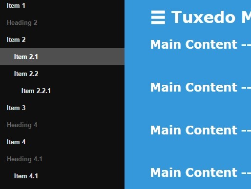
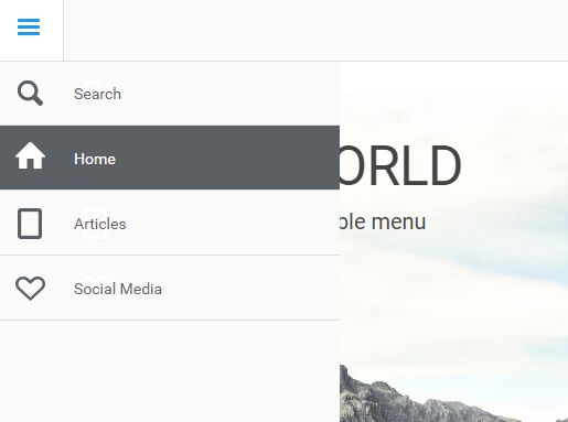
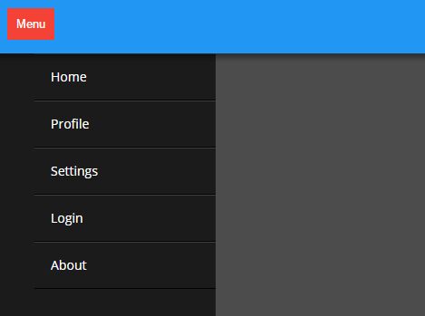
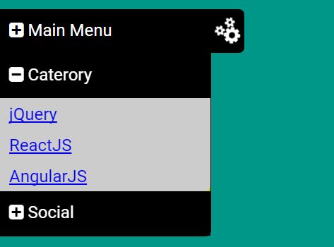
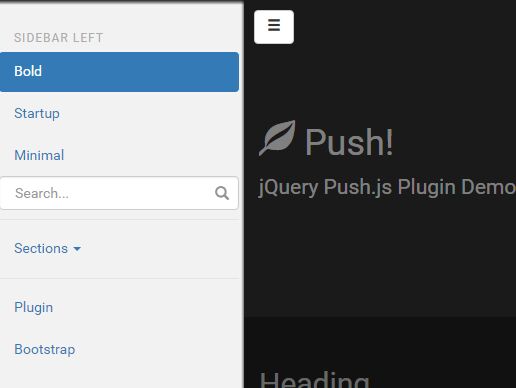
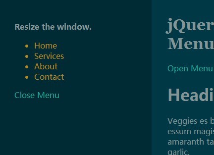
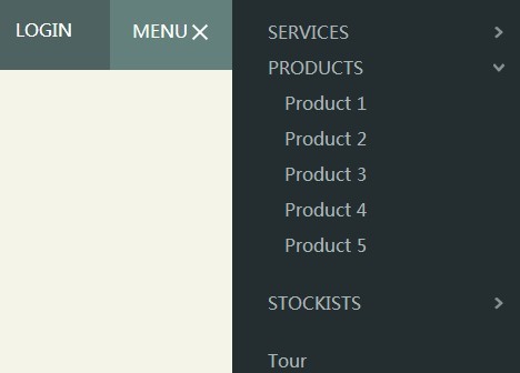
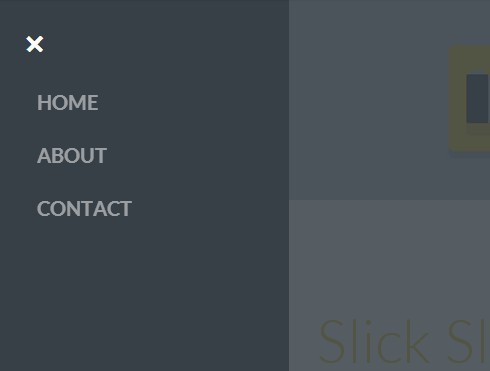
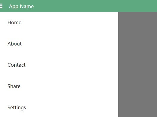
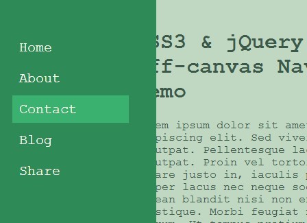
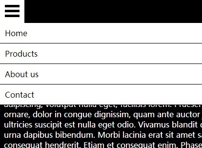
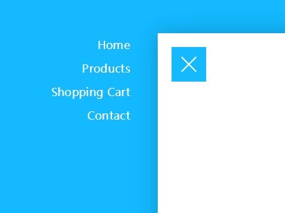
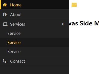
Example
How to use
The script copies the desktop menu and converts it to the mobile menu.
Select the desktop menu with the menu parameter to be transformed into the mobile menu. The HTML structure in the desktop menu can be any. The condition is to keep the structure of the unordered list in the desktop menu. Parameter should indicate the main <ul> desktop menu.
In the next step, enter the name of the active class in the desktop menu using the activeClass parameter.
You can add the footer of the mobile menu using the footer parameter, which should indicate the container <div id="ma5menu-tools" class="ma5menu__tools">...</div> containing the content for the footer.
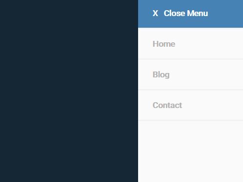
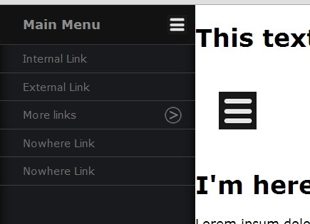
By using the position parameter ('left' / 'right'), you can set the left or right position for the mobile menu.
The closeOnBodyClick parameter (true / false) automatically closes the menu after clicking outside the menu area.
<script> $(document).ready(function () { ma5menu({ menu: '.site-menu', activeClass: 'active', footer: '#ma5menu-tools', position: 'left', closeOnBodyClick: true }); }); </script>In last step add to page menu toggle button.
<button class="ma5menu__toggle" type="button"> <span class="ma5menu__icon-toggle"></span><span class="ma5menu__sr-only">Menu</span> </button>Example
<!DOCTYPE html> <html lang='en'> <head> <meta charset="utf-8"> <title>MA5 mobile menu</title> <meta name="viewport" content="width=device-width, initial-scale=1, shrink-to-fit=no"> <meta name="MobileOptimized" content="width"> <meta name="HandheldFriendly" content="true"> <meta http-equiv="x-ua-compatible" content="IE=edge"> <!-- jQuery --> <script src="./js/jquery.js"></script> <!-- ma5menu --> <link href="./css/ma5-menu.min.css" rel="stylesheet" type="text/css"> <script src="./js/ma5-menu.min.js"></script> <!-- Call the script --> <script> $(document).ready(function () { ma5menu({ menu: '.site-menu', activeClass: 'active', footer: '#ma5menu-tools', position: 'left', closeOnBodyClick: true }); }); </script> </head> <body> <!-- mobile menu toggle button start --> <button class="ma5menu__toggle" type="button"> <span class="ma5menu__icon-toggle"></span><span class="ma5menu__sr-only">Menu</span> </button> <!-- mobile menu toggle button end --> <!-- source for mobile menu start --> <ul class="site-menu"> <li> <a href="index-page.html">Shop</a> <ul> <li><a href="index-page.html">Products</a></li> <li> <a href="index-page.html">Collections</a> <ul> <li><a href="index-page.html">Premium</a></li> <li><a href="index-page.html">Common</a></li> <li> <a href="index-page.html">Exclusive</a> <ul> <li><a href="index-page.html">First</a></li> <li><a href="index-page.html">Secound</a></li> </ul> </li> <li><a href="index-page.html">Other</a></li> </ul> </li> <li> <a href="index-page.html">Accesories</a> <ul> <li><a href="index-page.html">Small</a></li> <li><a href="index-page.html">Medium</a></li> <li><a href="index-page.html">Large</a></li> </ul> </li> <li><a href="index-page.html">Cards</a></li> <li> <a href="index-page.html">Sets</a> <ul> <li><a href="index-page.html">Example 1</a></li> <li><a href="index-page.html">Example 2</a></li> <li><a href="index-page.html">Example 3</a></li> <!-- active --> <li class="active"><a href="index-page.html">Example 4</a></li> <li><a href="index-page.html">Example 5</a></li> </ul> </li> </ul> </li> <li> <a href="index-page.html">Lookbook</a> <ul> <li><a href="index-page.html">For business</a></li> <li><a href="index-page.html">Premium Area</a></li> </ul> </li> <li> <a href="index-page.html">Campaigns</a> <ul> <li> <a href="index-page.html">Summer 2019</a> <ul> <li><a href="index-page.html">Winter 2018</a></li> <li><a href="index-page.html">Spring 2017</a></li> </ul> </li> </ul> </li> <li> <a href="index-page.html">Brand</a> <ul> <li><a href="index-page.html">About us</a></li> <li><a href="index-page.html">Press</a></li> </ul> </li> <li><a href="index-page.html">Contact</a></li> </ul> <!-- source for mobile menu start --> <!-- source for mobile menu footer start --> <div id="ma5menu-tools" class="ma5menu__tools"> footer <a href="index-page.html">content</a> here </div> <!-- source for mobile menu footer end --> </body> </html>History
v.1.0 Initial
v.1.1 Add animation options
v2.1.0 Changes for some CMS compatibility, transfer order css class attributes to data-ma5-order
v2.1.1 Clear js, add bower.json
v2.1.2 Modify toogle on action, add example
v3.0.0 Rewrite code for BEM standard, panel position options left and right, menu footer and more changes
v3.0.1 Example, smal changes CSS
v3.0.2 Add category, option
closeOnBodyClickand close byESCkey. From now is possible enter to next panel menu bycategoryorenter button
v3.0.3 Fix space after animation in tablet mediaqueries
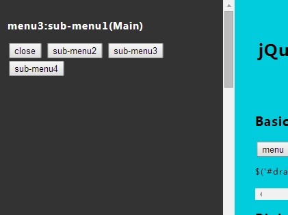
v4.0.0 Menu with builder
