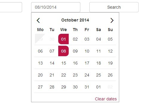
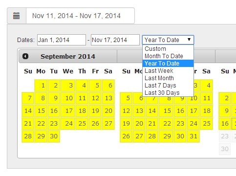
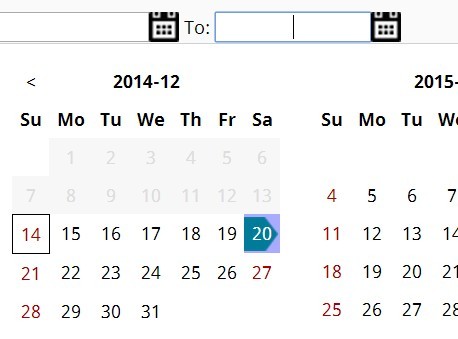
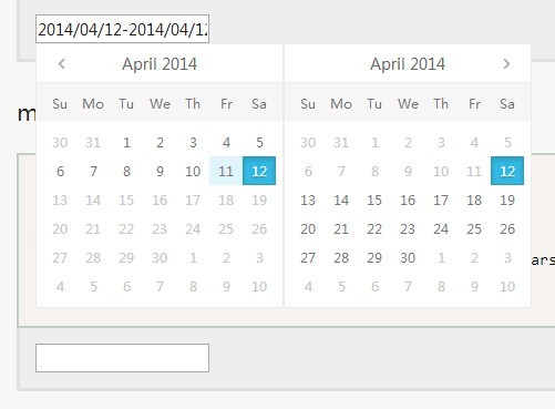
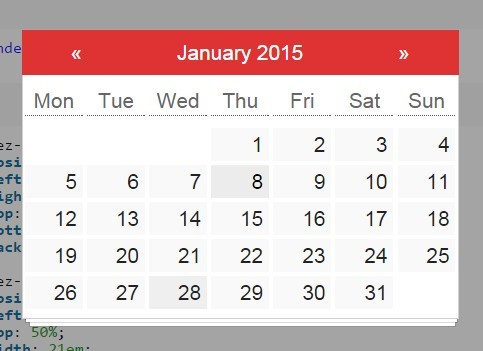
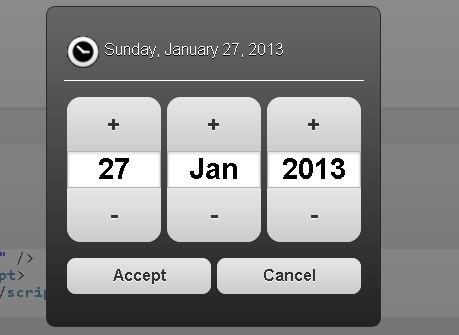
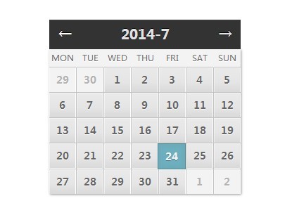
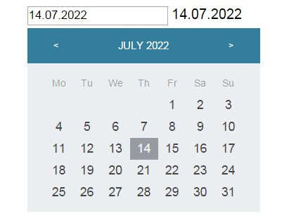
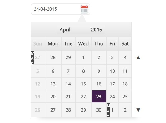
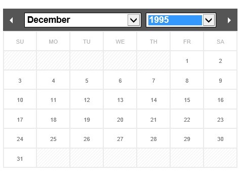
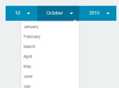
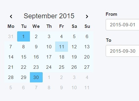
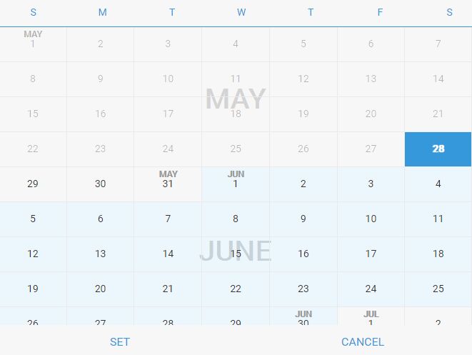
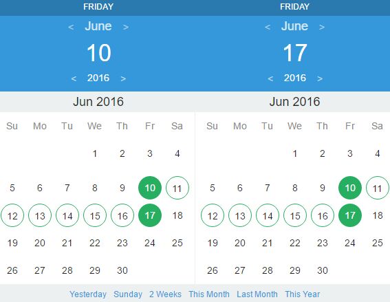
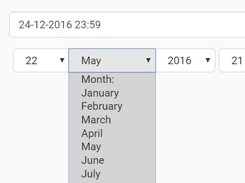
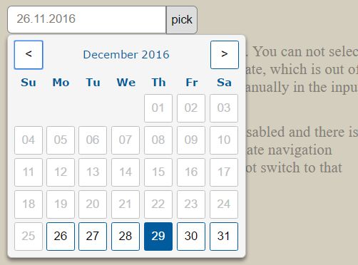
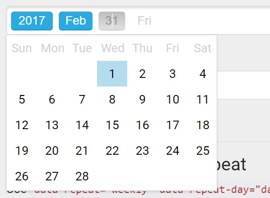
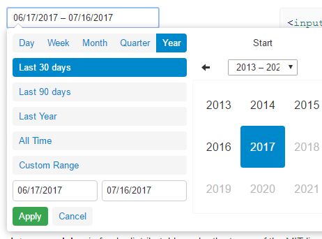
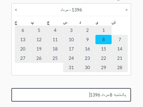
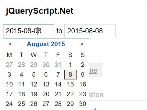
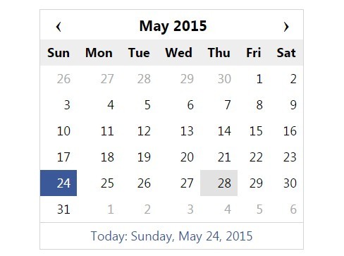
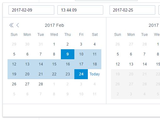
PickMeUp - Really simple, powerful, customizable and lightweight standalone datepicker
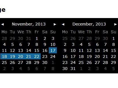
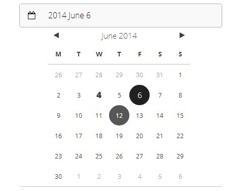
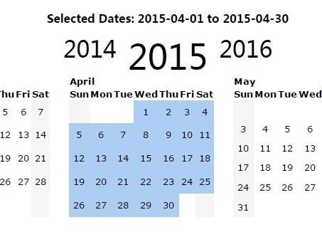
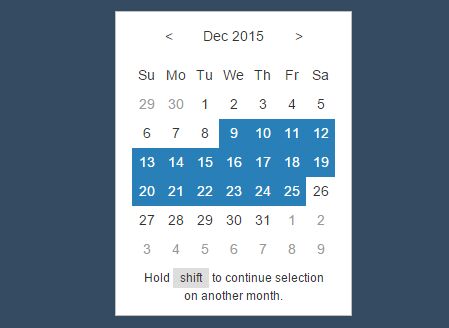
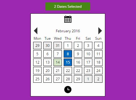
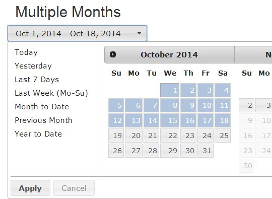
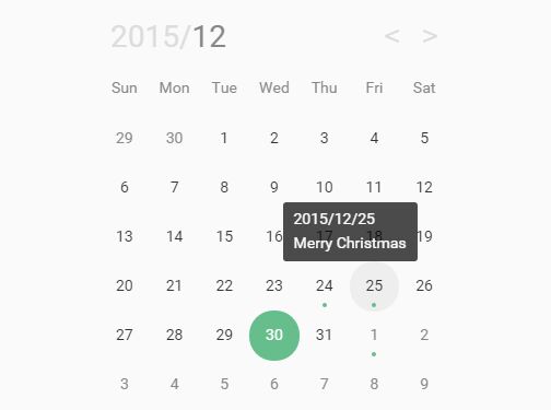
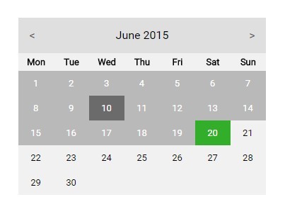
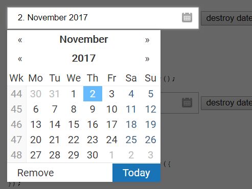
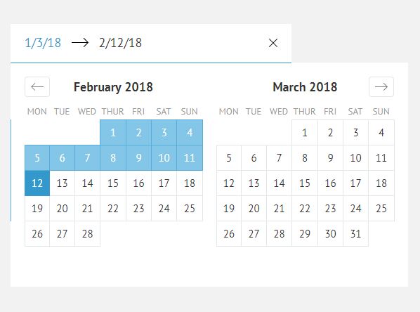
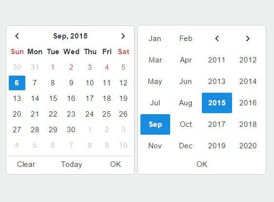
No dependencies, single/range/multiple selections, ability to put custom content into dates, very flexible styling and customization abilities.
Written and maintained by Nazar Mokrynskyi with the help of awesome contributors
Based on DatePicker by Stefan Petre
Browser support:
- IE 10+
- 2 latest stable versions of Firefox, Chromium, Opera and Edge
If you find this project useful, consider supporting its development on patreon.com/nazarpc, this would help me a lot!
Or if you are representing a company, here is Faircode page.
Demo
Getting started
You need only 2 files: dist/pickmeup.min.js and css/pickmeup.css.
The plugin can also be loaded as AMD or CommonJS module.
Then you can apply datepicker to any element:
pickmeup('.date');Global default options are stored in pickmeup.defaults
They can be redefined during initialization:
pickmeup('.date', { format : 'Y-m-d' });or with data-attributes with pmu- prefix:
<div class="date" data-pmu-format="Y-m-d"></div>Twitter Bootstrap integration
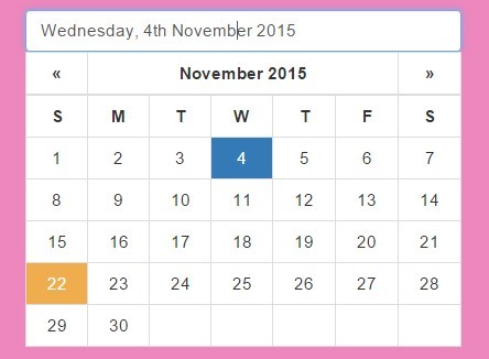
For Twitter Bootstrap integration you do not need to include style file, but you need to include jquery.pickmeup.twitter-bootstrap.js instead, that will read settings of current Bootstrap theme and apply them to PickMeUp, so that it will look similar to native Bootstrap elements.
To apply integrated version use $(...).pickmeup_twitter_bootstrap() plugin for initialization:
$('.date').pickmeup_twitter_bootstrap();All options and events are the same.
UIkit integration
For UIkit integration you do not need to include style file, but you need to include jquery.pickmeup.uikit.js instead, that will read settings of current UIkit theme and apply them to PickMeUp, so that it will look similar to native UIkit elements.
To apply integrated version use $(...).pickmeup_uikit() plugin for initialization:
$('.date').pickmeup_uikit();All options and events are the same.
Configuration options
| Option | Value type | Default | Description |
|---|---|---|---|
| date | array/number/object/string | new Date | Selected date after initialization. Can be single date string/object or array depending on selection mode |
| default_date | boolean | true | If false will keep empty value until date selected |
| current | number/object/string | date | Represents date that will be in the center of rendered calendar, defaults to date option's value |
| flat | boolean | false | Whatever if the date picker is appended to the element or triggered by an event |
| first_day | 0/1 | 1 | First day of week: 0 - Sunday, 1 - Monday |
| prev | string | ◀ | Previous button content |
| next | string | ▶ | Next button content |
| mode | single/multiple/range | single | Date selection mode |
| select_day | boolean | true | Allow or deny days selection |
| select_month | boolean | true | Allow or deny months selection |
| select_year | boolean | true | Allow or deny year selection |
| view | days/months/years | days | View mode after initialization |
| calendars | int | 1 | Number of calendars, that will be rendered |
| format | string | d-m-Y | Date format (aAbBCdeHIjklmMpPsSuwyY are supported) |
| title_format | string/function | B, Y | Date format for calendar title in days view (aAbBCdeHIjklmMpPsSuwyY are supported). If function, must return the full title as a string. The date and locale are provided as parameters. |
| position | top/right/bottom/left/function | bottom | Date picker's position relative to the triggered element, if function - must return an object with left and top keys and include units |
| class_name | string | Class to be added to root datepicker element | |
| hide_on_select | boolean | false | If true - datepicker will be hidden after selection (for range mode allows to select first and last days) |
| min | number/object/string | Min date available for selection | |
| max | number/object/string | Max date available for selection | |
| separator | string | - | Is used for joining separate dates in multiple mode and first/last dates in range mode |
| locale | string | en | String, that specifies current locale. |
| locales | object | see Localization | Key-value object, where keys are locales and values contain localized days of week names and months |
| render | function | Executed for each day element rendering, takes date argument, allows to select, disable or add class to element | |
| instance_template | function | (look at source code) | Responsible for rendering simple PickMeUp instance with header and days of weeks |
| instance_content_template | function | (look at source code) | Responsible for rendering instance content container (which contains years, months or days) |
Selecting/disabling dates with custom logic
render options might return object with any of following keys:
selected: iftrue- date will be selecteddisabled: iftrue- date will be disabledclass_name: will be added to class of day element
Example:
var now = new Date; pickmeup(element, { render : function (date) { if (date < now) { return {disabled : true, class_name : 'date-in-past'}; } return {}; } })Events callbacks
In PickMeUp events are native DOM events fired on element when pickmeup() was called and always have pickmeup- prefix.
pickmeup-change
Triggered at date change. Example:
pickmeup(element); element.addEventListener('pickmeup-change', function (e) { console.log(e.detail.formatted_date); // New date according to current format console.log(e.detail.date); // New date as Date object })pickmeup-show
Triggered at showing. Example:
pickmeup(element); element.addEventListener('pickmeup-show', function (e) { e.preventDefault(); // Showing can be canceled if needed })pickmeup-hide
Triggered at hiding. Example:
pickmeup(element); element.addEventListener('pickmeup-hide', function (e) { e.preventDefault(); // Hiding can be canceled if needed })pickmeup-fill
Triggered after filling of PickMeUp container with new markup of days, months, years. May be needed for inner datepicker markup editing.
pickmeup(element); element.addEventListener('pickmeup-fill', function (e) { // Do stuff here })Methods
Methods allows external control on datepicker
Hide
pickmeup('.date').hide();Show
pickmeup('.date').show();Prev
pickmeup('.date').prev();Next
pickmeup('.date').next();Get date
pickmeup('.date').get_date(formatted);formatted - boolean or string (default false)
false-Dateobjecttrue- string formatted in accordance withformatoption- string is used to specify custom format instead if given during initialization
Set date
pickmeup('.date').set_date(new Date);date - can be single date string/object or array depending on selection mode
Clear multiple selection
pickmeup('.date').clear();Update datepicker
pickmeup('.date').update();Destroy datepicker
Destroys PickMeUp instance, removes created markup, restores everything that was changed to original state.
pickmeup('.date').destroy();Localization
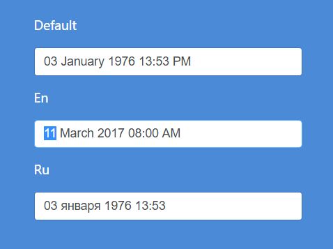
You can add locales to global defaults and then use different locales in particular instance with locale option. Sample object for English language (no need to add, already included in source code):
pickmeup.defaults.locales['en'] = { days: ['Sunday', 'Monday', 'Tuesday', 'Wednesday', 'Thursday', 'Friday', 'Saturday'], daysShort: ['Sun', 'Mon', 'Tue', 'Wed', 'Thu', 'Fri', 'Sat'], daysMin: ['Su', 'Mo', 'Tu', 'We', 'Th', 'Fr', 'Sa'], months: ['January', 'February', 'March', 'April', 'May', 'June', 'July', 'August', 'September', 'October', 'November', 'December'], monthsShort: ['Jan', 'Feb', 'Mar', 'Apr', 'May', 'Jun', 'Jul', 'Aug', 'Sep', 'Oct', 'Nov', 'Dec'] };Russian:
pickmeup.defaults.locales['ru'] = { days: ['Воскресенье', 'Понедельник', 'Вторник', 'Среда', 'Четверг', 'Пятница', 'Суббота'], daysShort: ['Вс', 'Пн', 'Вт', 'Ср', 'Чт', 'Пт', 'Сб'], daysMin: ['Вс', 'Пн', 'Вт', 'Ср', 'Чт', 'Пт', 'Сб'], months: ['Январь', 'Февраль', 'Март', 'Апрель', 'Май', 'Июнь', 'Июль', 'Август', 'Сентябрь', 'Октябрь', 'Ноябрь', 'Декабрь'], monthsShort: ['Янв', 'Фев', 'Мар', 'Апр', 'Май', 'Июн', 'Июл', 'Авг', 'Сен', 'Окт', 'Ноя', 'Дек'] };Other
Current options (for whatever reason) can be accessed as element.__pickmeup.options.
Root pickmeup element can be accessed as element.__pickmeup.element.
Styling
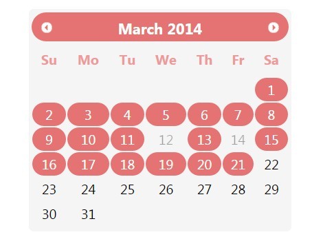
If you want other colors - just change several variables in scss file.
To change size - adjust font-size for root datepicker element, everything will scale nicely.
Contribution
Feel free to create issues and send pull requests, they are highly appreciated!
Before reporting an issue, be so kind to prepare reproducible example on jsfiddle.net, please.
You can start with working demo of latest stable version of PickMeUp: jsfiddle.net/0kg5jL3p
License
Zero-Clause BSD
