jQuery.futureDatepicker
Simple jQuery plugin that allows you to create awesome datepicker for the future dates. Design is fully responsive and have clean and minimalist design and it is primarily built for the mobile devices. It's relaying on CSS flexbox so it is only compatible with modern web browser that supports this property.
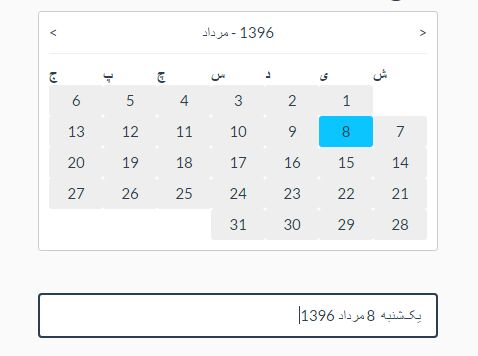
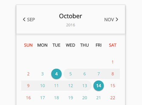
Demo
Check out the demo example here.
Dependencies
The plugin requires jQuery 2.xx version.
Installation
To start using the plugin, simply include css file in the head section and script file somewhere after jQuery library, preferably at the bottom of the page, like on the example below:
<!DOCTYPE html> <html> <head> <!-- css --> <link href="~/jquery.futureDatepicker.min.css" rel="stylesheet" /> </head> <body> <!-- your html code --> <!-- scripts --> <script src="~/jquery.{2.xx}.min.js"></script> <script src="~/jquery.futureDatepicker.js"></script> </body> </html>Usage
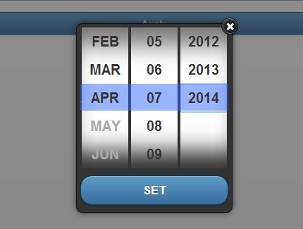
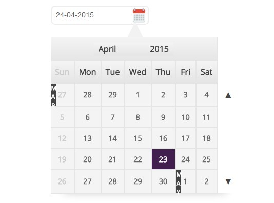
After you included script into your page, you need to create an element that will initialize future datepicker and save the value of the chosen date. To do that, you can simply add an input element with unique ID and then add a plugin call, like in the example below:
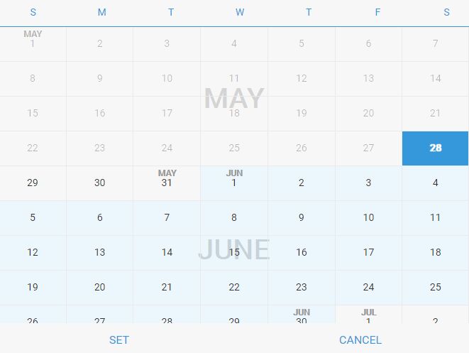
<!DOCTYPE html> <html> <head> <!-- css --> <link href="~/jquery.futureDatepicker.min.css" rel="stylesheet" /> </head> <body> <!-- your html code --> <!-- input field --> <input id="element" type="text" name="element" placeholder="Click here to pick a date"> <!-- scripts --> <script src="~/jquery.{2.xx}.min.js"></script> <script src="~/jquery.futureDatepicker.js"></script> <script> $(document).ready(function () { $('#element').futureDatepicker({ displayWeekAbbr: true, startIn: 0, futureMonths: 12, datepicker: true, statusBar: true, showBgMonths: true, additionalClass: 'default', beforePick: function () { }, afterPick: function () { } }); }); </script> </body> </html>###element This needs to be an <input> element with type="text".
###options (defaults)
- displayWeekAbbr [Boolean] : Format of the week day labels. It can be
true- Sat orfalse- Saturday. - startIn [Integer]: First day of the week.
0- Sunday,1- Monday, ... ,6- Saturday. - futureMonths [Integer]: Number of future months to show.
- datepicker [Boolean]: Choose whether plugin should work as a datepicker or as a full page calendar. This feature is in progress and for now only datepicker should be used, or
truevalue. - statusBar [Boolean]: Show
trueor hidefalsebottom status bar within the datepicker. If visible, then after the date is picked, SET button needs to be clicked to save the value. If not visible value will be automatically saved by clicking on the date. - showBgMonths [Boolean]: Show
trueor hidefalselabels of the months, standing behind the days labels. - additionalClass [String]: Additional class can be added for optional
CSSstyling orJavaScriptpurpose. - beforePick [Function]: Code triggered before the date is selected.
- afterPick [Function]: Code triggered after the date is selected.
Licence
(The MIT License)