You might want to checkout the duDatepicker plugin.
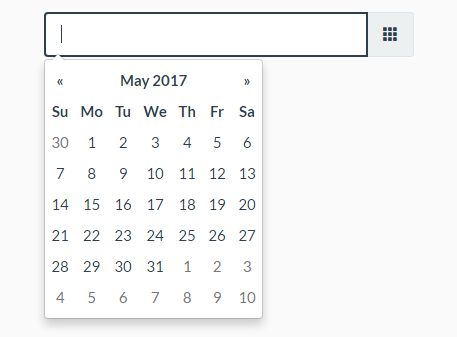
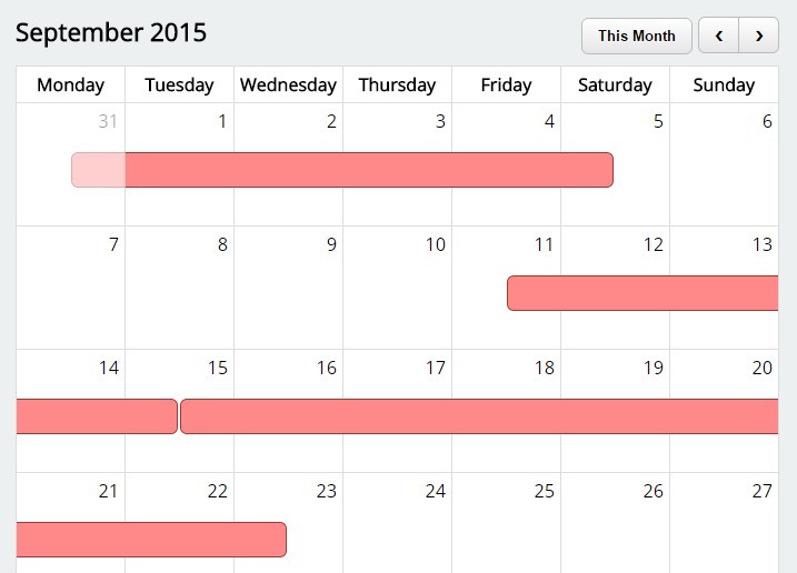
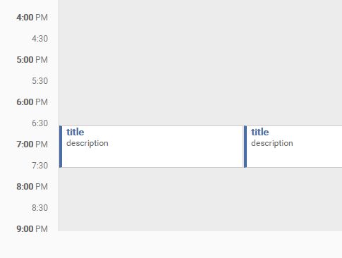
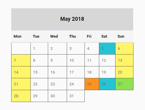
DCalendar
JQuery calendar plugin plus date picker for input fields.

How to use
Make sure you include the jQuery library first. Include dcalendar.picker.css and dcalendar.picker.js in your html file:
<link rel="stylesheet" type="text/css" href="dcalendar.picker.css"> <script type="text/javascript" src="dcalendar.picker.js"></script>Add a reference on your input element for later use:
<input type="text" id="datepicker"/>Then add this piece of code in your script tag:
<script> $(document).ready(function(){ $('#datepicker').dcalendarpicker(); //Initializes the date picker }); </script>Formatting
The default string format of the date is mm/dd/yyyy. You can specify the format you want by adding a parameter on initialization:
<script> $(document).ready(function(){ $('#datepicker').dcalendarpicker({format: 'mm-dd-yyy'}); //Initializes the date picker and uses the specified format }); </script>The above code will output a date in this format mm-dd-yyyy, for example: 10-31-2016 - which is October 31, 2016. You can specify other format you want, like mmm dd, yyyy which would output something like Oct 01, 2016.
| Variable | Code | Output |
|---|---|---|
| Month | m | 1 |
mm | 01 | |
mmm | Jan | |
mmmm | January | |
| Date | d | 1 |
dd | 01 | |
| Year | yy | 16 |
yyyy | 2016 |
Min and Max
You can also specify the mininum and/or maximum date the user can select on othe date picker. Just specify data-mindate and/or data-maxdate attributes on your input element. The acceptable values for these attributes are today or a specific date using this format: mm/dd/yyyy:
<input type="text" id="datepicker" data-mindate="today"/> //Dates enabled ranges from the current date onwards. <input type="text" id="datepicker" data-mindate="10/30/2016"/> //Dates enabled ranges from October 30, 2016 onwards. <input type="text" id="datepicker" data-maxdate="today"/> //Dates enabled ranges from earlier dates until current date. <input type="text" id="datepicker" data-maxdate="10/30/2016"/> //Dates enabled ranges from previous dates of October 10, 2016 until October 10, 2016You can also specify the mininum and maximum date to create a specific date range acceptable:
<input type="text" id="datepicker" data-mindate="1/1/2016" data-maxdate="2/1/2016"/> //Dates enabled ranges from January 1 to February 1, 2016Range From and To
For situations where you have two inputs representing a date range (from & to), you can restrict the minimum and maximum date based on the values of the input elements - the maximum allowed date for date from (input element) is the value of date to (input element), and the minimum allowed date for date to is the value of the date from input.
You can do this by adding the data-rangefrom and/or data-rangeto attributes. The value for these attributes is the id reference of the input element.
Example:
<input type="text" id="datefrom" data-rangeto="#dateto"/> //Maximum enabled date is <= value of #dateto <input type="text" id="dateto" data-rangefrom="#datefrom" data-maxdate="today"/> //Minimum enabled date is >= value of #datefromEvent
The event datechanged is fired after selection of date in the date picker. You can use this to get the new date value:
<script> $(document).ready(function(){ $('#datepicker').dcalendarpicker({format: 'mm-dd-yyy'}).on('datechanged', function(e){ alert(e.date); }); }); </script>The above code will alert the new date selected. For example: 01-16-2016 or January 16, 2016
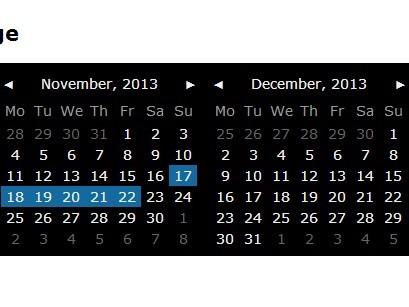
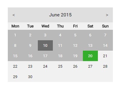
Themes
You can specify the color theme of the date picker by adding theme option upon initialization:
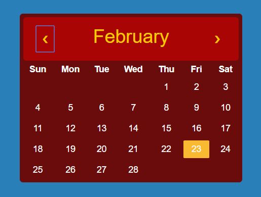
<script> $(document).ready(function(){ $('#datepicker').dcalendarpicker({theme: 'green'}); }); </script>Predefined themes are: red,blue (default), green, purple, indigo and teal. If you don't specify the theme to use or specify a theme which isn't there, the default theme will be used.


