t-datepicker
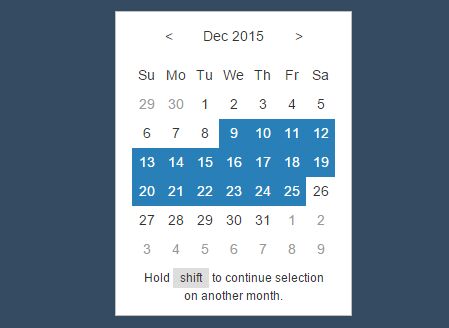
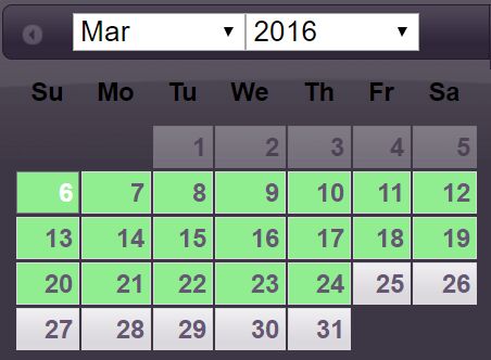
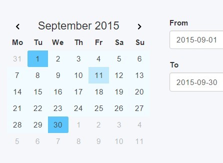
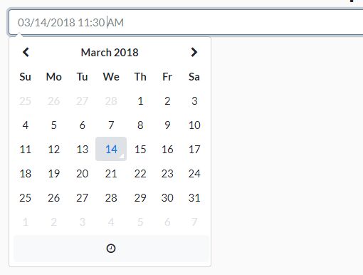
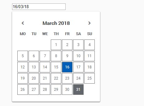
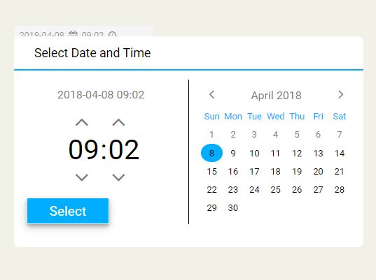
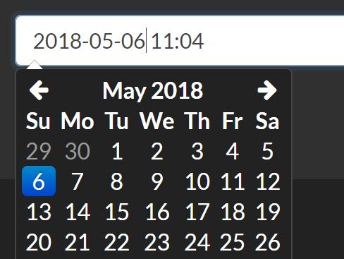
jQuery-based date picker! This date picker provides an easy way of creating both single and multi-viewed calendars capable of accepting single, range, and multiple selected dates. Easy to style, with many example styles.
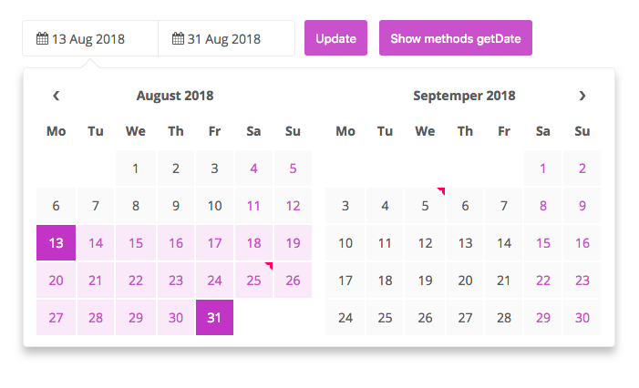
t-datepicker is a responsive, flexible, elegant, themeable, highly-configurable data range picker written in JavaScript (jQuery) and CSS(SASS).
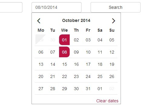
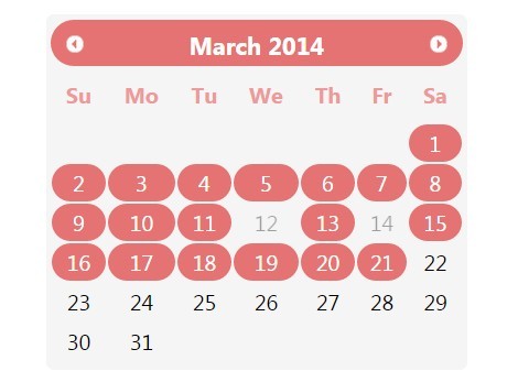
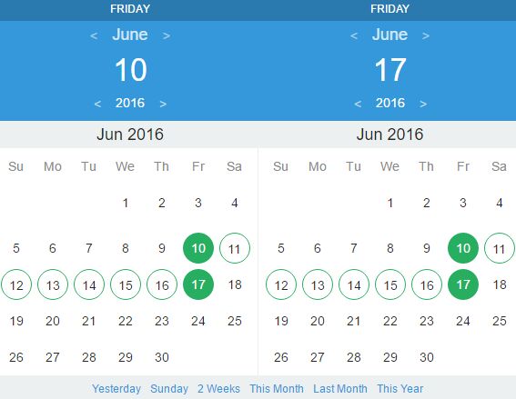
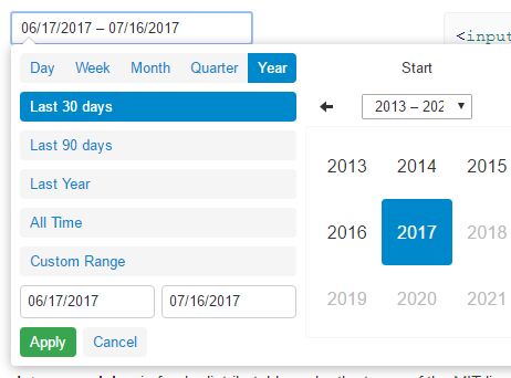
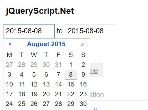
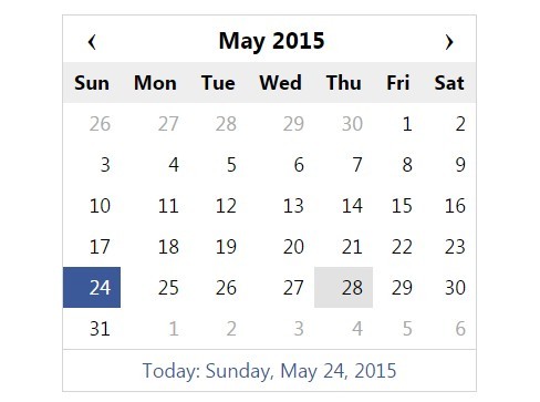
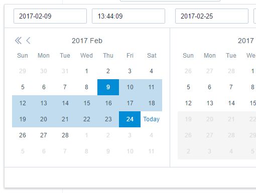
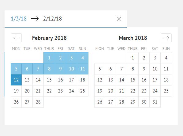
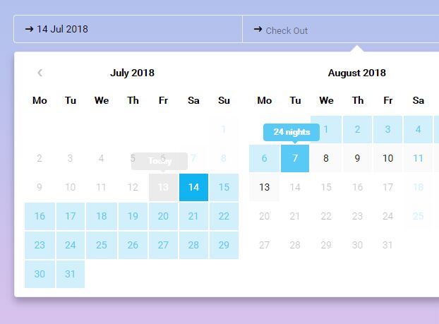
Suitable for hotel app that enables the users to quickly select check-in and check-out dates in a convenient calendar popup.


Quick start t-datepicker
- Clone the repo:
git clone [email protected]:crazychicken/t-datepicker.git - Install with npm:
npm install --save-dev t-datepicker - Install with npm:
npm install --save-dev crazychicken/t-datepicker - Or download the latest release
Demos
https://t-datepicker.getqwerty.com/demos.html https://t-datepicker.getqwerty.com/demo-only-calendar.html
Documentation
https://t-datepicker.getqwerty.com/documents.html
Options
https://t-datepicker.getqwerty.com/options.html
Events
https://t-datepicker.getqwerty.com/events.html
Methods
https://t-datepicker.getqwerty.com/methods.html
How to use
- First, include CSS files into your HTML head:
<link rel="stylesheet" href="public/theme/css/t-datepicker.min.css"> <link rel="stylesheet" href="public/theme/css/theme/t-datepicker-main.css">- Include file
t-datepicker.min.jsinto the footer.
<script src="your-part/jquery.min.js"></script> // ~1.9.2 <script src="public/theme/js/t-datepicker.min.js"></script>- Set HTML
<div class="t-datepicker"> <div class="t-check-in"></div> <div class="t-check-out"></div> </div>Call global the function
<script type="text/javascript"> $(document).ready(function(){ $('.t-datepicker').tDatePicker({ // options here }); }); </script>- If you want use two different calendar, you just insert the new class.
<div class="t-datepicker class_a"> <div class="t-check-in"></div> <div class="t-check-out"></div> </div> <div class="t-datepicker class_b"> <div class="t-check-in"></div> <div class="t-check-out"></div> </div>Call only the function
<script type="text/javascript"> $(document).ready(function(){ // Call global the function $('.t-datepicker').tDatePicker({ // options here }); $('.class_a').tDatePicker({ // options only here }); $('.class_b').tDatePicker({ // options only here }); }); </script>Call only picker
- You need add class .t-picker-only include .t-check-in.
<div class="t-datepicker"> <div class="t-check-in t-picker-only"></div> </div>- Now call the tDatePicker initializer function and your tDatePicker is ready. View Demo
<script type="text/javascript"> $(document).ready(function(){ $('.t-datepicker').tDatePicker({ autoClose: true, limitNextMonth: 3, numCalendar : 1, dateRangesHover: false }); }); </script>You can choose more themes color:
- t-datepicker-blue.css
- t-datepicker-bluegrey.css
- t-datepicker-cyan.css
- t-datepicker-green.css
- t-datepicker-lime.css
- t-datepicker-main.css
- t-datepicker-orange.css
- t-datepicker-purple.css
- t-datepicker-teal.css
- t-datepicker-yellow.css
Options
// Action
- autoClose
- durationArrowTop
- valiDation
// Format
- formatDate
// Date
- dateCheckIn
- dateCheckOut
- startDate
- endDate
- limitPrevMonth
- limitNextMonth
- limitDateRanges
- fnDataEvent
- mergeDataEvent
- showFullDateRanges
// Theme
- numCalendar
- titleCheckIn
- titleCheckOut
- titleDateRange
- titleDateRanges
- titleToday
- titleDays
- titleMonths
- titleMonthsLimitShow
- replaceTitleMonths
- showDateTheme
// Icons
- iconArrowTop
- iconDate
- arrowPrev
- arrowNext
// Active date
- toDayShowTitle
- dateRangesShowTitle
- dateRangesHover
- toDayHighlighted
- nextDayHighlighted
- daysOfWeekHighlighted
- dateDisabled
Tree
public/ └── theme/ └── css/ | └── t-datepicker.min.css | └── themes/ | └── t-datepicker-main.css | └── more themes └── js/ └── t-datepicker.min.js sass/ ├── // Themes Color └── t-datepicker-v1.0.0.scss // @import 'path sass file your project'; Template full feature list
- Semantically Correct / Valid HTML Code
- HTML5, CSS3
- Javascript / JS6
- Full project and seed project (build with: Gulp, Sass, Javascript, Npm, Babel, Webpack)
- Cross browser compatible ( Internet Explorer 10+, Firefox, Safari, Opera, Chrome etc. )
- W3C Valid source code, properly formatted and commented
- Animations CSS3
Creators
Tuds - Crazychicken (CLGT Groups)
- website: http://getqwerty.com/
- Github: https://github.com/crazychicken/t-datepicker
- Facebook: https://www.facebook.com/tudscss/
- Youtube: https://www.youtube.com/channel/UCDACe-7BFGDucQoxTDfPotw
- Twtter: https://twitter.com/mtu_truong
Copyright and license
Code and documentation copyright 2018, MIT license.