jQuery DateTimePicker Plugin
A jQuery plugin to allow users to select a date and time without additional library requirements.
Requirements
jQuery (Tested on v3.1.1)
datetimepicker.js
datetimepicker.css
Functionality
Creates a button for users to click, which shows a picker dropdown from which they can select date(s) and time(s). The selected dates and times are then displayed on the button. Hidden inputs are produced with the date and time values selected, to be easily submit with HTML forms as normal.
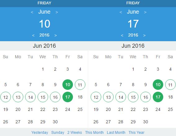
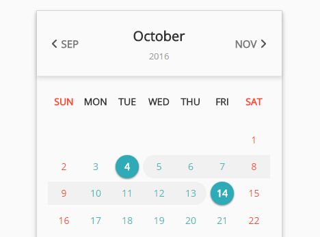
Users can click between Months and then select date(s). For times, the user can either use the time spinner buttons, or they can click on the time and manually enter one, which will be validated.
Setup
Include the necessary files stated in Requirements i.e.
<script type="text/javascript" src="/path/to/jquery-latest.js"></script> <script type="text/javascript" src="/path/to/datetimepicker.js"></script> <link rel="stylesheet" type="text/css" href="/path/to/datetimepicker.css"> It can be setup on any regular HTML DOM element, e.g. div, article, section etc. Initialise the element with the following:
$(document).ready(function(){ $('#myElement').dateTimePicker(); }) et voilà! You're all set to go. By default, it will only let the users pick a single date from 'today' onwards. There are a number of options you can change though:
Options
To add an option to your DateTimePicker, simply include it in the initialisation as follows:
$(document).ready(function(){ $('#myElement').dateTimePicker({ optionName: value(s) }); }) | optionName | Description | Valid Parameters | Default Value |
|---|---|---|---|
| allowPast | Allow a user to select a date in the past | true / false | false |
| buttonText | Text to display on the button to open the dateTimePicker | Any string | "Select Date" |
| calendarSVG | The SVG icon for the calendar button | Any full SVG HTML object, i.e. <svg xmlns=......></svg> | Calendar-4 IconMonstr |
| defaultMonth | Set the default month to begin the calendar on when opened | 0-11 Integer, where 0 is January and 11 is December | Current Month |
| defaultTime | Set the default time to begin the time picker on when opened | HH:MM String, must contain preleading zeroes, i.e. 04:00 | 12:00 |
| defaultYear | Set the default year to begin the calendar on when opened | Any valid full YYYY integer, i.e. 2017 | Current Year |
| inputName | Prefixes the names and IDs of the output input HTML elements to be submitted with the form. | Any valid ID string with no spaces or special characters | "DateTimePicker" or the ID of the DateTimePicker element [if one exists] |
| lang | Sets the language of the DateTimePicker. Tries to pull from <html lang="en"> initially, but can be overriden using this. | en for English, de for Deutsch, expect more to be added in the future | en |
| multiple | Allow users to select more than one date | true / false | false |
| startDay | Which day of the week to begin the weekly layout | 0 for Sunday, 1 for Monday, ... , 6 for Saturday | 0 [Sunday] |
| style | Used to select different DateTimePicker styles. | Not currently in use, placeholder for future CSS to be included | default |
| timeIncrement | Amount to in/decrement the time by when corresponding hours/minutes arrows are clicked | An object with the following names, followed by integers {hours: 1, minutes: 10} | {hours: 1, minutes: 5} |
| timeSVG | The SVG icon for the clock button | Any full SVG HTML object, i.e. <svg xmlns=......></svg> | Time-1 IconMonstr |
Outputs
Creates <input type="hidden"> elements within the DateTimePicker. So long as you include the initialised DateTimePicker element within your form, these will be sent to the server. If no values are selected, no inputs are created or sent to the server. These are contained within the <div class="outputs"> sub-element.
The inputs will have the following names/values (where the DateTimePicker prefix will be the value selected from the inputName parameter as detailed above )
| Name/ID | Description | Value |
|---|---|---|
| DateTimePicker-count | The number of dates selected | Integer |
| DateTimePicker-date-X | Where X is the incrementation of the count number, i.e. if this is the first date X = 0, second date X = 1 | YYYY-MM-DD |
| DateTimePicker-time | The time selected by the user | HH:MM |
For example, if a user selects the date & time of 25th December 2016 at 14:30, and the element has no ID, the inputs would be:
<input type="hidden" id="DateTimePicker-count" name="DateTimePicker-count" value="1"> <input type="hidden" id="DateTimePicker-date-0" name="DateTimePicker-date-0" value="2016-12-25"> <input type="hidden" id="DateTimePicker-time" name="DateTimePicker-time" value="14:00">