ngx-select-dropdown


ngx-select-dropdown Custom Dropdown component for Angular 4+ with multiple and single selection options
Features
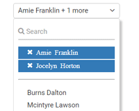
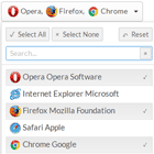
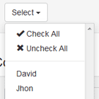
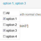
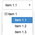
- single select dropdown
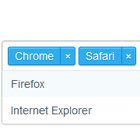
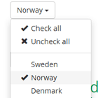
- multi select dropdown
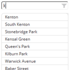
- search dropdown list
- arrows keys support
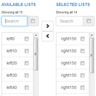
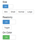
- limit number of items displayed in dropdown
- custom sort
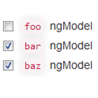
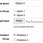
- angular forms support
- angular v4 and above supported
- cross browser support
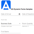
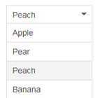
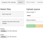
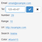
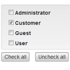
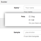
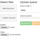
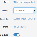
Examples
Installation
npm install ngx-select-dropdown
Using with webpack and tsc builds/ angular-cli builds
- import
SelectDropDownModuleinto your app.module;
import { SelectDropDownModule } from 'ngx-select-dropdown' - add
SelectDropDownModuleto the imports of your NgModule:
@NgModule({ imports: [ ..., SelectDropDownModule ], ... }) class YourModule { ... } - include css styles in you
angular-cli.json.
"styles": [ "../node_modules/ngx-select-dropdown/dist/assets/style.css" ], - use
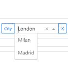
<ngx-select-dropdown></ngx-select-dropdown>in your templates to add the custom dropdown in your view like below
<ngx-select-dropdown (change)="selectionChanged($event)" [multiple]="true" [(ngModel)]="dataModel" [config]="config" [options]="dropdownOptions"></ngx-select-dropdown> - use with reactive form like
<ngx-select-dropdown (change)="selectionChanged($event)" formControlName="selectData" [multiple]="true" [config]="config" [options]="dropdownOptions"></ngx-select-dropdown> Config
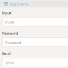
Input
multiple: boolean-true/falsebeased if multiple selection required or notDefaults to false.options: Array- Array of string/objects that are to be the dropdown options.disabled: boolean- disabled attribute to disable the dropdown when required.config: Object- configuration object.
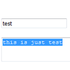
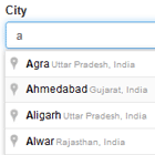
config = { displayKey:"description", //if objects array passed which key to be displayed defaults to description search:true //true/false for the search functionlity defaults to false, height: 'auto' //height of the list so that if there are more no of items it can show a scroll defaults to auto. With auto height scroll will never appear placeholder:'Select' // text to be displayed when no item is selected defaults to Select, customComparator: ()=>{} // a custom function using which user wants to sort the items. default is undefined and Array.sort() will be used in that case, limitTo: options.length // a number thats limits the no of options displayed in the UI similar to angular's limitTo pipe moreText: 'more' // text to be displayed whenmore than one items are selected like Option 1 + 5 more noResultsFound: 'No results found!' // text to be displayed when no items are found while searching searchPlaceholder:'Search' // label thats displayed in search input, searchOnKey: 'name' // key on which search should be performed this will be selective search. if undefined this will be extensive search on all keys } Output
change: Event- change event when user changes the selected optionsopen: Event- open event when the dropdown toogles onclose: Event- close event when the dropdown toogles off
Change detection
As of now ngx-select-dropdown uses Default change detection startegy which means dirty checking checks for immutable data types. And in Javascript Objects and arrays are mutable. So when changing any of the @Input parameters if you mutate an object change detection will not detect it. For ex:-
this.options.push({id: 34, description: 'Adding new item'}); // or config.height = '200px'; Both the above scenarios will not trigger the change detection. In order for the componet to detect the changes what you need to do is:-
this.options = [...this.options, {id: 34, description: 'Adding new item'}]; // or config = {...config, height:'200px'}; Changelog
- v0.1.0
Added a change event so that user can attach a change event handler. If multiselect the selected text will display first item and + count for eg. (Option 1 + 2 more) . - v0.2.0
Angular 4 and above support. Bug with search functionality fixed. - v0.3.0
Support for Observable data source for options and async pipe. IE bug with styling. Few other minor bug fixes. - v0.4.0
Use arrows keys and enter to select items from available options. Case insensitive search. Few other minor bug fixes. - v0.5.0
Support for scroll bar with too many list items. Few other minor bug fixes. - v0.7.0
Support for limito pipe to limit number of options displayed in case of too many options. Support for customComparator / custom sort function Few other minor bug fixes. - v0.7.2
Support for angular 6 Removed dependency on rxjs - v0.8.0
No Results found indicator with custom text passed with config Custom text for *more* when more than 1 items selected Open event emitted Close event emitted Search placeholder text - v1.0.0
Search on a specified key value. Support for Reactive forms Few other minor imoprovements and fixes Help Improve
Found a bug or an issue with this? Open a new issue here on GitHub.
Contributing to this project
Anyone and everyone is welcome to contribute. Please take a moment to review the guidelines for contributing.
