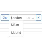
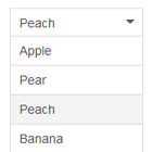
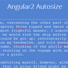
ngMultiselectDropdown | Angular multi select dropdown
An elegant, easily customizable multi select dropdown in Angular built on top of my ngPopover directive.
Description
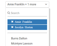
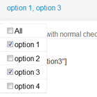
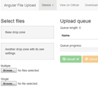
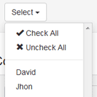
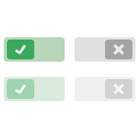
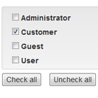
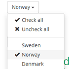
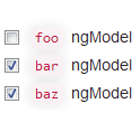
- An angular directive for multiple selections using checkboxes.
- Allows callbacks for opening and closing the multiselect dropdown.
- Allows callbacks for selection event.
- Restrict the number of items a user can select.
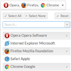
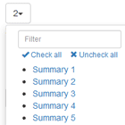
- Select All / None feature.
- Custom Direction for the dropdown (top, bottom, left, right).
- Restric No. of items that you want to display on the dropdown button.
- Works well with/without Bootstrap/Foundation.


Dependecies
- Angular.js
- Google Material Icons (Optional | Required for material theme)
Installation
- Get the ngPopover.js, ngMultiselectDropdown.js, corresponding css files from src/dist folder (dist folder contains compiled css and minified JS).
Usage
- Make sure you include the
ngPopover&multiselectDropdownmodules in you angular app:
angular.module('myApp', ['ngPopover', 'multiselectDropdown']); - once you've added the modules in your app. Use the code below to get the multiselect dropdown up and running:
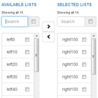
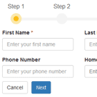
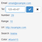
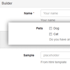
<multiselect-dropdown options:="itemList" // [required] List of items to be selected (Must be an array of objects) ngModel="selection.model" // [required]Model to which the selected items are binded onSelect="selectCallback()" //Funtion to be executed on selection of a value onClose="closeCallback()" // Function to be executed on closing the selection dropdown onOpen="openCallback()" // Funtction to be executed on opening the selection dropdown displayProp="name" // [required] The key in options with text that you want to be display next to checkboxes valueProp="value" // [required] The key in options that you want to be pushed to the model on selection maxItemsDisplay="4" // Max no. of items that you want to display on the selection button (Default is 3) triggerId="uniqueId" // [required]Unique Id for the dropdown ddDirection="top" // Direction in which you want to open the dropdown relative to selection button (Can be 'left', 'right', 'top', 'bottom' | default is 'bottom') placeholder="Select Items" // The placeholder for selections (Default is 'Select') maxSelectionsAllowed="4", //Maximum number of selections allowed enableSelectAll="true" // Enable the select all button theme="material" // set it equal to 'material' for material checkboxes (needs google material icons) dropdownClass="myClass" // Custom class for selection dropdown to override styles> </multiselect-dropdown> ###Customization
- You can easily customize the look and feel of the dropdown by changing the following variables in the theme.scss file as per your requirement.:
$border-color: #EAEAEA; // border color for the dropdown & the list inside the dropdown $background: #FFF; // backgrond of the dropdown $global-radius: 3px; // Radius of dropdown $icon-color: #666; // Color of tick icon (for material theme) - Run
gulp sassto get the complied css file from css/multiselectdropdown.css
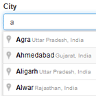
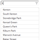
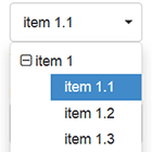
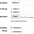
###Demo visit http://fauzankhan.github.io/angular-multiselect-dropdown/ to see the dropdown in action
