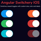
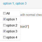
Angular Custom Checkbox

This is a very simple library to create custom checkboxes with Angular 2+ projects.
PS: This library use pretty-checkbox to create the customs checkboxes.
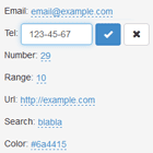
Demo
http://rafaelferreira.info/angular-custom-checkbox/
Quick start
- Install with npm.
npm install angular-custom-checkbox --save- Into your
app.module.tsload theCustomCheckboxModuleand add your imports.
import { CustomCheckboxModule } from 'angular-custom-checkbox';Adding in your imports.
imports: [ ... CustomCheckboxModule, ... ],Ok, your library is installed :) Let's go create the first checkbox.
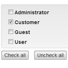
Basic Configuration
TS
import { CustomCheckBoxModel } from 'angular-custom-checkbox'; ... export class AppExampleComponent implements OnInit { isSelected: boolean = false; jsonModel: CustomCheckBoxModel = new CustomCheckBoxModel(); } HTML
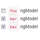
<ngx-checkbox [configuration]="jsonModel" [(ngModel)]="isSelected" name="isSelected"></ngx-checkbox>PS: Use variable on ngModel as boolean.
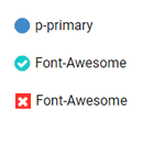
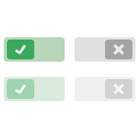
Colors Available:
- p-primary
- p-success
- p-danger
- p-info
- p-warning
Advanced Configuration
this.jsonModel.color = 'p-success'; this.jsonModel.colorHex = '#F500FF'; this.jsonModel.rounded = true; this.jsonModel.icon = 'mdi mdi-check';Icons:
You can use some icons frameworks like Material Design Icons or Font-Awesome.
npm install mdi --saveOR
npm install font-awesome --saveImport the css files to your .angular-cli.json like:
"styles": [ "styles.css", "../node_modules/mdi/css/materialdesignicons.min.css", "../node_modules/font-awesome/css/font-awesome.min.css" ],And use for example:
this.jsonModel.icon = 'fa fa-check';
